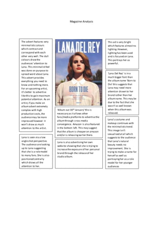
Magazine Analysis
The advert features very
minimalisticcolours
which contrastand
correspond with each
other very well. The dull
colours drawthe
audiences’attention to
Lana. This minimalistfeel
was done on purpose to
spread word about Lana.
This advert provides
everything you need to
know and nothing more.
For an upcoming artist,
it’s better to advertise
likethis to gain maximum
potential attention. As an
artist,if you make an
albumadvert extremely
complex with high
production costs,the
audiencemay be more
impressed however it
won’t draw as much
attention to the artist.
Lana is seen via a low
angleshot perspective.
The audience arelooking
up to Lana suggesting
that she is a rolemodel
to many fans.She is also
positioned centrally
which draws all the
attention to her.
This ad is very bright
which features almostno
lighting.However,
lightinghas been used
and is focused on Lana.
This portrays her as
powerful.
‘Lana Del Rey’ is in a
much bigger font than
the albumname ‘Born to
Die’ this suggests that
Lana may need more
attention drawn to her
brand rather than her
albumname. This may be
due to the fact that she
wasn’t as well known
when this albumwas
released.
Lana’s costume and
makeup continues with
the minimalistictrend.
This image isn’t
sexualised atall which
suggests to the audience
that Lana’s natural
beauty needs no
improvement. She is
trying to make a name for
herself as well as
portrayingher as a role
model for her younger
audiences
‘Album out 30th January’this is
necessary as itallows other
fans/media platforms to advertisethe
albumthrough cross media
convergence. Amazon is also featured
in the bottom left. This may suggest
that the album is cheaper on amazon
and/or is releasingearlier there.
Lana is also advertisingher own
website showingthat she is tryingto
increasethe exposure of her personal
brand through the releaseof her
studio album.

Magazine analysis

  • 1.
    Magazine Analysis The advertfeatures very minimalisticcolours which contrastand correspond with each other very well. The dull colours drawthe audiences’attention to Lana. This minimalistfeel was done on purpose to spread word about Lana. This advert provides everything you need to know and nothing more. For an upcoming artist, it’s better to advertise likethis to gain maximum potential attention. As an artist,if you make an albumadvert extremely complex with high production costs,the audiencemay be more impressed however it won’t draw as much attention to the artist. Lana is seen via a low angleshot perspective. The audience arelooking up to Lana suggesting that she is a rolemodel to many fans.She is also positioned centrally which draws all the attention to her. This ad is very bright which features almostno lighting.However, lightinghas been used and is focused on Lana. This portrays her as powerful. ‘Lana Del Rey’ is in a much bigger font than the albumname ‘Born to Die’ this suggests that Lana may need more attention drawn to her brand rather than her albumname. This may be due to the fact that she wasn’t as well known when this albumwas released. Lana’s costume and makeup continues with the minimalistictrend. This image isn’t sexualised atall which suggests to the audience that Lana’s natural beauty needs no improvement. She is trying to make a name for herself as well as portrayingher as a role model for her younger audiences ‘Album out 30th January’this is necessary as itallows other fans/media platforms to advertisethe albumthrough cross media convergence. Amazon is also featured in the bottom left. This may suggest that the album is cheaper on amazon and/or is releasingearlier there. Lana is also advertisingher own website showingthat she is tryingto increasethe exposure of her personal brand through the releaseof her studio album.