
More Related Content
What's hot
What's hot (20)
Similar to Lana del rey magazine advert
Similar to Lana del rey magazine advert (20)
More from Lorren Myall
More from Lorren Myall (20)
Recently uploaded
Recently uploaded (20)
Lana del rey magazine advert
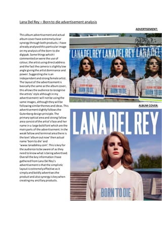
- 1. Lana Del Rey – Born to die advertisement analysis Thisalbumadvertisementandactual albumcoverhave extremelyclear synergythroughbothproducts.I have alreadyanalysedthisparticularimage on myanalysisof the born to die digipak. Some thingswhichI commentedonwere the use of colour,the artistusingdirectaddress and the fact the camera isslightlylow angle givingthe artistdominance and power.Suggestingshe isan independentandstrongfemaleartist. The layoutof the advertisementis basicallythe same asthe albumcover, thisallowsthe audience torecognise the artists’style althoughinmy advertisementIwill notbe usingthe same images,althoughtheywillbe followingsimilarthemesandideas.This advertisementslightlyfollowsthe Gutenbergdesignprinciple.The primaryoptical areaand strong fallow area consistof the artist’sface and her name ina large boldfont whichare the mainparts of the advertisement.Inthe weakfallow and terminal areathere is the text‘albumoutnow’thenactual name ‘bornto die’and ‘www.lanadelrey.com’.Thisiskeyfor the audience tobe aware of as they needtoknowwhat isbeingadvertised. Overall the keyinformationIhave gatheredfromLana Del Rey’s advertisementisthatthe simplistic layoutisextremelyeffective asit simplyandboldlyadvertisesthe productand alsosynergyiskeywhen creatingmy ancillaryproducts. ADVERTISEMENT: ALBUM COVER: