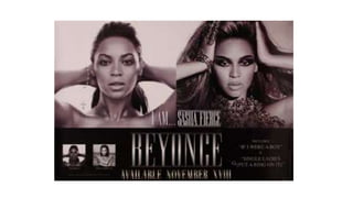
3. Main Image and Analysis
The main focus point is the close up image of the artist herself- the image is split into two, which suggests there
is deeper meaning to the advertisement than just the promotion of the album. On the left side of the album
presents an image of the artist with a very pure natural look, with her hair scraped back with very little make up,
also with very little clothing, therefore presenting herself as bare which could express an emotional side of the
album which presents one half of her, therefore she comes across vulnerable, timid and shy. Whereas on the
right side of the contrasts the image on left in several different ways, the artist is presented to be wearing much
heavier makeup, with bold eye make up which shadows and defines her facial features much more, her hair is
much bigger portraying the artist to be much more confident and fierce, this also allows her target audience to be
identified as young females who have similar sides and therefore they will be able to relate to the artist herself
but also the songs which will feature upon the album allowing her to create a personal identity. Also this also
portrays a message to the target audience in the sense of beauty as everyone is beautiful in their own way and
therefore you should express your true self no matter what. This is reinforced by the title ‘I AM SASHA FIERCE’
written in a bold large font in the centre of the advert as this represents the artist's alter ego.
4. Colour Scheme and Lighting
The sepia colour scheme for this advertisement creates a classy and womanly appearance, immediately
attracting a young female audience. The lighting is extremely direct and focuses on the artist natural beauty
and facial features. The lighting also clarifies the shadow on her face, emphasising her neck and facial
features. The similar convention of having of her hand scraping back her hair from her face that she is
purposely showing the audience her most desirable features.
The artist herself is known to be an extremely strong independent woman, therefore by having a close up of
her face as the main image and focus of the advert reinforces this idea, making the young female target
audience aspire to be just like her.
In addition to the colour scheme, it is presented as elegant and sophisticated, the typography used also
relates well with the theme. The long lettering is similar to that an old, vintage fashioned adverts. Also but by
keeping the colour scheme black and white allows focus upon the artist and her beauty which creates a
selling point for the products. The vintage colour scheme/theme links to the young female target audience as
it is seen as feminine and elegant.