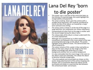
Advert Analysis
Katy Perry ‘One of the boys’ Advert
• This poster is a landscape so if presented in a magazine would take up a
double page spread.
• The advert takes place in a floral garden area with the main image of Katy
Perry standing besides the text. She is presented quite provocatively with
sexualised, bright clothes such as a crop top and shorts. This could link to
the theory of the male gaze where the media is portrayed through the
eyes of men in order to appeal to men by sexualising women.
• The text then presents an image of the album in a small box, from this you
can see this advert is set in the same location as the album’s cover, this
makes the environment recognisable and associable with the album.
• Font for the artists name and album title differs from the other texts, it is
presented in brighter colours and a handwritten style front, this also
becomes associable with both the artist and album as it is the same font
that appears on the album making it more recognisable if, for example, it
is seen in the shops.
• This advert follows the conventions of a music magazine advert with text
detailing the name of the album and some of its most popular tracks to
encourage fans of the song to purchase the album and finally the release
date.
• This example also advertises the artists website, this is a conventional
aspect on any piece of marketing by an artist along with a record labels,
however this example doesn’t seem to show that. This could suggest that
they don’t deem it necessary to show this.
Jessie J ‘who you are’
poster.• This poster is portrait so will only take up one page if
presented in a magazine, this could suggest that due to
this being this artists first album, they don’t yet have the
‘star power’ to take two pages.
• The poster revolves around a colour scheme of black and
gold. This is reflective of the artists name/logo on the
poster and all other texts follows accordingly.
• The image is a close up shot of the artists face as she
looks directly at the camera, this could be done to create
a sense of intimacy between viewer and artist.
• This poster also follows the noticeable conventions of a
music poster, displaying the artist’s and album’s name in
stylistic fonts that are used on the album cover so they
will be instantly recognisable, whilst the information
positioned beneath it is shown in bold font.
• Popular tracks from the album are advertised to
encourage fans of those songs/ potential audience to buy
this album. This is also reinforced by the highlighting of it
being a ‘debut’ album so they could potentially be a
strong fan and follow her work.
• No mention of release date hints that the album was
released before the poster was produced.
• Mention of established artist B.O.B. also increases
popularity as it gains interest of fans of his work.
• The artists website and record label are also shown
towards the bottom of the poster.
Lana Del Rey ‘born
to die poster’• This poster uses a mid shot of the artist that takes up
the entirety of a portrait page, this could highlight her
recognisability and popularity.
• The artist is looking down upon the camera with a
straight facial expression, this could be considered to
link to the title of the album, as it would be a major
tone contrast to be smiling.
• The artists name is shown in at the top of the page in a
large bold font, this emphasises her names importance.
• Comparatively all other font on the page is smaller with
the second largest being the album name.
• The release date of the album is shown underneath this
in a more stylised font.
• Although not as prominent as in other examples,
conventions are followed in this music poster of the text
promoting featured songs on the album. This poster
highlights three different tracks. This demonstrates the
albums popularity.
• The colour scheme of this poster is blue and white as
they are the main colours on the image so the font
follows accordingly with white font on a blue
background and blue font on a white background.
• It is also noticeable that this main image is the same as
the album covers but extended. This allows the album
to become instantly recognisable.
• The artist website and record label are shown on this
poster along advertisement of the online shopping site
amazon, this is to promote where the album can be
purchased and eludes to a partnership deal between
this artist/record label and amazon.

Advert analysis

  • 1.
  • 2.
    Katy Perry ‘Oneof the boys’ Advert
  • 3.
    • This posteris a landscape so if presented in a magazine would take up a double page spread. • The advert takes place in a floral garden area with the main image of Katy Perry standing besides the text. She is presented quite provocatively with sexualised, bright clothes such as a crop top and shorts. This could link to the theory of the male gaze where the media is portrayed through the eyes of men in order to appeal to men by sexualising women. • The text then presents an image of the album in a small box, from this you can see this advert is set in the same location as the album’s cover, this makes the environment recognisable and associable with the album. • Font for the artists name and album title differs from the other texts, it is presented in brighter colours and a handwritten style front, this also becomes associable with both the artist and album as it is the same font that appears on the album making it more recognisable if, for example, it is seen in the shops. • This advert follows the conventions of a music magazine advert with text detailing the name of the album and some of its most popular tracks to encourage fans of the song to purchase the album and finally the release date. • This example also advertises the artists website, this is a conventional aspect on any piece of marketing by an artist along with a record labels, however this example doesn’t seem to show that. This could suggest that they don’t deem it necessary to show this.
  • 4.
    Jessie J ‘whoyou are’ poster.• This poster is portrait so will only take up one page if presented in a magazine, this could suggest that due to this being this artists first album, they don’t yet have the ‘star power’ to take two pages. • The poster revolves around a colour scheme of black and gold. This is reflective of the artists name/logo on the poster and all other texts follows accordingly. • The image is a close up shot of the artists face as she looks directly at the camera, this could be done to create a sense of intimacy between viewer and artist. • This poster also follows the noticeable conventions of a music poster, displaying the artist’s and album’s name in stylistic fonts that are used on the album cover so they will be instantly recognisable, whilst the information positioned beneath it is shown in bold font. • Popular tracks from the album are advertised to encourage fans of those songs/ potential audience to buy this album. This is also reinforced by the highlighting of it being a ‘debut’ album so they could potentially be a strong fan and follow her work. • No mention of release date hints that the album was released before the poster was produced. • Mention of established artist B.O.B. also increases popularity as it gains interest of fans of his work. • The artists website and record label are also shown towards the bottom of the poster.
  • 5.
    Lana Del Rey‘born to die poster’• This poster uses a mid shot of the artist that takes up the entirety of a portrait page, this could highlight her recognisability and popularity. • The artist is looking down upon the camera with a straight facial expression, this could be considered to link to the title of the album, as it would be a major tone contrast to be smiling. • The artists name is shown in at the top of the page in a large bold font, this emphasises her names importance. • Comparatively all other font on the page is smaller with the second largest being the album name. • The release date of the album is shown underneath this in a more stylised font. • Although not as prominent as in other examples, conventions are followed in this music poster of the text promoting featured songs on the album. This poster highlights three different tracks. This demonstrates the albums popularity. • The colour scheme of this poster is blue and white as they are the main colours on the image so the font follows accordingly with white font on a blue background and blue font on a white background. • It is also noticeable that this main image is the same as the album covers but extended. This allows the album to become instantly recognisable. • The artist website and record label are shown on this poster along advertisement of the online shopping site amazon, this is to promote where the album can be purchased and eludes to a partnership deal between this artist/record label and amazon.