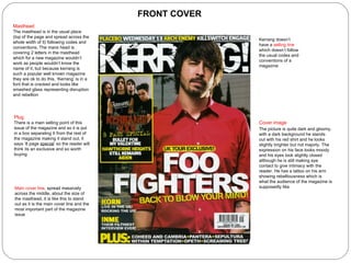
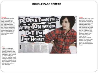
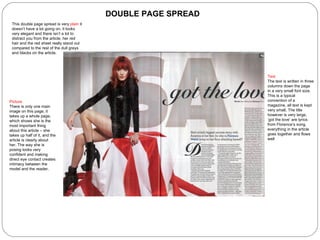
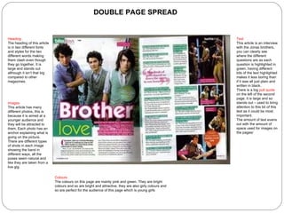
The document summarizes and analyzes the covers of three different magazines - Top of the Pops, Classic FM, and Kerrang.
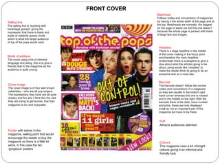
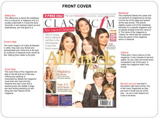
For Top of the Pops, it notes the large headline, bright colors, informal language and extras being used to attract younger readers. For Classic FM, it observes the formal, sophisticated look with few colors and neat layout. For Kerrang, it describes the dark, moody image and lack of selling line to portray rebellion for its audience.


![Evaluation[1]](https://cdn.slidesharecdn.com/ss_thumbnails/evaluation1-120305073155-phpapp01-thumbnail.jpg?width=640&height=640&fit=bounds)


