Download to read offline

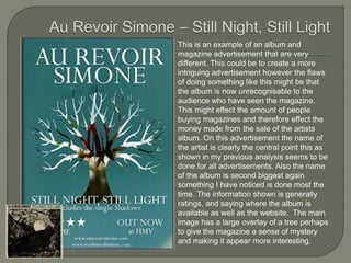

The document discusses and analyzes several magazine advertisements and album covers for consistency between the images used and important information presented. It finds that advertisements generally use the same images as the album covers to create clear synergy and recognition for consumers. Key details like the artist's name and album title are prominently displayed in a simple, clear format across advertisements. Consistency in imagery and information presentation helps drive album sales and recognition.


