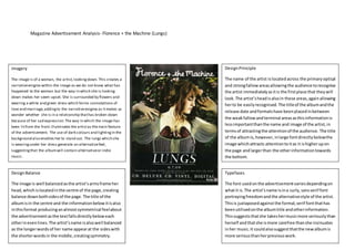
Magazine Advertisement Analysis- Florence + the Machine (Lungs) 
Design Principle 
The name of the artist is located across the primary optical 
and strong fallow areas allowing the audience to recognise 
the artist immediately as it is the first place that they will 
look. The artist’s head is also in these areas, again allowing 
her to be easily recognised. The title of the album and the 
release date and formats have been placed in between 
the weak fallow and terminal areas as this information is 
less important than the name and image of the artist, in 
terms of attracting the attention of the audience. The title 
of the album is, however, in large font directly below the 
image which attracts attention to it as it is higher up on 
the page and larger than the other information towards 
the bottom. 
Typefaces 
The font used on the advertisement varies depending on 
what it is. The artist’s name is in a curly, sans serif font 
portraying freedom and the alternative style of the artist. 
This is juxtaposed against the formal, serif font that has 
been utilised on the album title and other information. 
This suggests that she takes her music more seriously than 
herself and that she is more carefree than she insinuates 
in her music. It could also suggest that the new album is 
more serious than her previous work. 
Imagery 
The image is of a woman, the artist, looking down. This creates a 
narrative enigma within the image as we do not know what has 
happened to the woman but the way in which she is looking 
down makes her seem upset. She is surrounded by flowers and 
wearing a white and green dress which forms connotations of 
love and marriage, adding to the narrative enigma as it makes us 
wonder whether she is in a relationship that has broken down 
because of her sad express ion. The way in which the image has 
been lit from the front illuminates the artist as the main feature 
of the advertisement. The use of dark colours and lighting in the 
background also enables her to stand out. The lungs which she 
is wearing under her dress generate an alternative feel, 
suggesting that the album will contain alternative or indie 
music. 
Design Balance 
The image is well balanced as the artist’s arms frame her 
head, which is located in the centre of the page, creating 
balance down both sides of the page. The title of the 
album is in the centre and the information below it is also 
in this format producing an almost symmetrical feel about 
the advertisement as the text falls directly below each 
other in even lines. The artist’s name is also wel l balanced 
as the longer words of her name appear at the sides with 
the shorter words in the middle, creating symmetry.

Magazine advertisement analysis florence and the machine

  • 1.
    Magazine Advertisement Analysis-Florence + the Machine (Lungs) Design Principle The name of the artist is located across the primary optical and strong fallow areas allowing the audience to recognise the artist immediately as it is the first place that they will look. The artist’s head is also in these areas, again allowing her to be easily recognised. The title of the album and the release date and formats have been placed in between the weak fallow and terminal areas as this information is less important than the name and image of the artist, in terms of attracting the attention of the audience. The title of the album is, however, in large font directly below the image which attracts attention to it as it is higher up on the page and larger than the other information towards the bottom. Typefaces The font used on the advertisement varies depending on what it is. The artist’s name is in a curly, sans serif font portraying freedom and the alternative style of the artist. This is juxtaposed against the formal, serif font that has been utilised on the album title and other information. This suggests that she takes her music more seriously than herself and that she is more carefree than she insinuates in her music. It could also suggest that the new album is more serious than her previous work. Imagery The image is of a woman, the artist, looking down. This creates a narrative enigma within the image as we do not know what has happened to the woman but the way in which she is looking down makes her seem upset. She is surrounded by flowers and wearing a white and green dress which forms connotations of love and marriage, adding to the narrative enigma as it makes us wonder whether she is in a relationship that has broken down because of her sad express ion. The way in which the image has been lit from the front illuminates the artist as the main feature of the advertisement. The use of dark colours and lighting in the background also enables her to stand out. The lungs which she is wearing under her dress generate an alternative feel, suggesting that the album will contain alternative or indie music. Design Balance The image is well balanced as the artist’s arms frame her head, which is located in the centre of the page, creating balance down both sides of the page. The title of the album is in the centre and the information below it is also in this format producing an almost symmetrical feel about the advertisement as the text falls directly below each other in even lines. The artist’s name is also wel l balanced as the longer words of her name appear at the sides with the shorter words in the middle, creating symmetry.