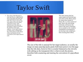
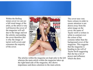
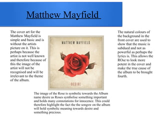
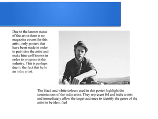
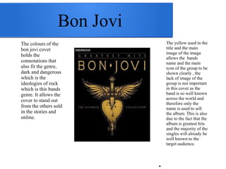
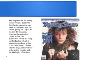
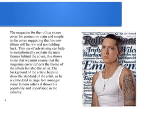
Ancillary Research into 
Digi-packs and Posters
Conventions of a Digi-pack 
● Album Logo 
● Album title 
● Artist name 
● Release date 
● Singles to be included 
● How it is accessible 
● Copy right 
● CD design 
The conventions of the digi-pack 
will be our main focus that 
we wish to meet however above 
all we need to ensure the 
ancillary pack looks as 
professional and includes all the 
information needed in order to 
the album to be sold.
Taylor Swift 
The size of the title is unusual for her target audience, as usually the 
image on many pop digi-packs packs hold more power over the page 
than the title does, however this is counter balanced as the cleverly 
with editing as the transparent title is what reveals the picture, 
therefore both countering and meeting the convention of a pop album 
cover. 
● The colour of the Digi-pack is 
clear and obvious, supporting the 
title of the album and makes the 
case itself stand out from other 
CD's/ This is due to the fact that 
most album covers use mainly 
earth based colours. THis 
therefore gives this album an 
advantage to stand out and draw 
the attention of the target 
audience. As the target audience 
of Taylor swift is teenage girls, 
they will be drawn to the vibrant 
colour and therefore fits the 
conventions of her target audience 
well. 
The artist ensures that her 
name stands out from the base 
red colour of the album colour 
by using white instead of 
black, this is a clear contrast of 
pop. Due to the artist being 
extremely well known the 
name of the artist is therefore 
not as needed as she would be 
immediately reconsigned by 
her fan base who would have 
been awaiting them album.
Within the Rolling 
stones cover we can see 
a full sized image of the 
artist, as the artist is very 
well known the cover of 
the magazine will sell 
due to the image and not 
the articles surrounding 
the cover therefore this 
is why the image of 
taylor swift covers and 
consumes the majority 
of the cover. 
The cover uses very 
basic colours in order to 
ensure attention is not 
drawn away from the 
artist image on the 
cover, the name of 
Taylor swift is written in 
white to contrast over 
the colour of her 
costume rather than the 
background cover of the 
magazine. This suggests 
that the magazine is 
bending to the will of 
Taylor Swift suggesting 
that she has a lot of 
power and influence 
The articles within the magazine are kept only to the left which she does. 
whereas the main article within the magazine takes up 
the right hand side of the magazine, this shows 
importance and draws attention to the main article.
Matthew Mayfield 
The cover art for the 
Matthew Mayfield is 
simple and basic and is 
without the artists 
picture on it. This is 
perhaps because the 
artist is not well known 
and therefore because of 
this the image of the 
artist will not be 
recognised and will be 
irrelevant to the theme 
of the album. 
The image of the Rose is symbolic towards the Album 
name desire as Roses symbolise something important 
and holds many connotations for innocence. This could 
therefore highlight the fact the the songsw on the album 
will hold symbolic meaning towards desire and 
something precious. 
The natural colours of 
the background in the 
front cover are used to 
show that the music is 
subdued and not as 
powerful as perhaps the 
lyrics is. This allows the 
ROse to look more 
potent in the cover and 
make the true cause of 
the album to be brought 
fourth.
Due to the known status 
of the artist there is no 
magazine covers for this 
artist, only posters that 
have been made in order 
to publicise the artist and 
make him well known in 
order to progress in the 
industry. This is perhaps 
due to the fact that he is 
an indie artist. 
The black and white colours used in this poster highlight the 
connotations of the indie artist. They represent fol and indie artists 
and immediately allow the target audience to identify the genre of the 
artist to be identified
Bon Jovi 
The colours of the 
bon jovi cover 
holds the 
connotations that 
also fit the genre, 
dark and dangerous 
which is the 
ideologies of rock 
which is this bands 
genre. It allows the 
cover to stand out 
from the others sold 
in the stories and 
online. 
The yellow used in the 
title and the main 
image of the image 
allows the bands 
name and the main 
icon of the group to be 
shown clearly , the 
lack of image of the 
group is not important 
in this cover as the 
band is so well known 
across the world and 
therefore only the 
name is used to sell 
the album. This is also 
due to the fact that the 
album is greatest hits 
and the majority of the 
singles will already be 
well known to the 
target audience. 
●
The magazine for the rolling 
stones bon jovi due to the 
fact that the magazine was 
made several years ago, the 
colour quality isn’t up to the 
modern day standard, 
however the contrast of 
colour is clear, the 
purple/blue colour is a fairly 
subdued colour which is 
strange for the band as that 
is not there image. I do not 
like this magazine cover due 
to the colour contrast with 
the ideologies of the band 
●
Eminem 
The cover for the eminem cover 
is clearly symbolic due to the 
fact that the metaphor for 
recovery is a long road which is 
what is being personified on the 
cover, this gives a clear image 
of the songs and the main theme 
of the album. I like the idea of a 
symbolic cover design as it will 
represent the story and journey 
through the album and will help 
the target audience understand 
the written theme of the lyrics 
within the album 
●
The magazine for the rolling stones 
cover for eminem is plain and simple 
in the cover suggesting that his new 
album will be raw and not holding 
back. This use of advertising can help 
to metaphorically explain the main 
themes behind the cover, this shows 
to me that we must ensure that the 
magazine cover reflects the theme of 
the album but also the artist. The 
background of the article helps to 
show the standard of the artist, as he 
is embedded in large font amongst 
many famous artists it shows his 
popularity and importance in the 
industry. 
●
This is a raw basic set up of a digi 
pack that we will be following, the 
conventions of the digi pack will 
be met using this frame. 
WE will however ensure that the 
digipack is se tup for internet use 
also so businesses such as itunes 
can sell the said album online.

Ancillary tasks digi- packs

  • 1.
    Ancillary Research into Digi-packs and Posters
  • 2.
    Conventions of aDigi-pack ● Album Logo ● Album title ● Artist name ● Release date ● Singles to be included ● How it is accessible ● Copy right ● CD design The conventions of the digi-pack will be our main focus that we wish to meet however above all we need to ensure the ancillary pack looks as professional and includes all the information needed in order to the album to be sold.
  • 3.
    Taylor Swift Thesize of the title is unusual for her target audience, as usually the image on many pop digi-packs packs hold more power over the page than the title does, however this is counter balanced as the cleverly with editing as the transparent title is what reveals the picture, therefore both countering and meeting the convention of a pop album cover. ● The colour of the Digi-pack is clear and obvious, supporting the title of the album and makes the case itself stand out from other CD's/ This is due to the fact that most album covers use mainly earth based colours. THis therefore gives this album an advantage to stand out and draw the attention of the target audience. As the target audience of Taylor swift is teenage girls, they will be drawn to the vibrant colour and therefore fits the conventions of her target audience well. The artist ensures that her name stands out from the base red colour of the album colour by using white instead of black, this is a clear contrast of pop. Due to the artist being extremely well known the name of the artist is therefore not as needed as she would be immediately reconsigned by her fan base who would have been awaiting them album.
  • 4.
    Within the Rolling stones cover we can see a full sized image of the artist, as the artist is very well known the cover of the magazine will sell due to the image and not the articles surrounding the cover therefore this is why the image of taylor swift covers and consumes the majority of the cover. The cover uses very basic colours in order to ensure attention is not drawn away from the artist image on the cover, the name of Taylor swift is written in white to contrast over the colour of her costume rather than the background cover of the magazine. This suggests that the magazine is bending to the will of Taylor Swift suggesting that she has a lot of power and influence The articles within the magazine are kept only to the left which she does. whereas the main article within the magazine takes up the right hand side of the magazine, this shows importance and draws attention to the main article.
  • 5.
    Matthew Mayfield Thecover art for the Matthew Mayfield is simple and basic and is without the artists picture on it. This is perhaps because the artist is not well known and therefore because of this the image of the artist will not be recognised and will be irrelevant to the theme of the album. The image of the Rose is symbolic towards the Album name desire as Roses symbolise something important and holds many connotations for innocence. This could therefore highlight the fact the the songsw on the album will hold symbolic meaning towards desire and something precious. The natural colours of the background in the front cover are used to show that the music is subdued and not as powerful as perhaps the lyrics is. This allows the ROse to look more potent in the cover and make the true cause of the album to be brought fourth.
  • 6.
    Due to theknown status of the artist there is no magazine covers for this artist, only posters that have been made in order to publicise the artist and make him well known in order to progress in the industry. This is perhaps due to the fact that he is an indie artist. The black and white colours used in this poster highlight the connotations of the indie artist. They represent fol and indie artists and immediately allow the target audience to identify the genre of the artist to be identified
  • 7.
    Bon Jovi Thecolours of the bon jovi cover holds the connotations that also fit the genre, dark and dangerous which is the ideologies of rock which is this bands genre. It allows the cover to stand out from the others sold in the stories and online. The yellow used in the title and the main image of the image allows the bands name and the main icon of the group to be shown clearly , the lack of image of the group is not important in this cover as the band is so well known across the world and therefore only the name is used to sell the album. This is also due to the fact that the album is greatest hits and the majority of the singles will already be well known to the target audience. ●
  • 8.
    The magazine forthe rolling stones bon jovi due to the fact that the magazine was made several years ago, the colour quality isn’t up to the modern day standard, however the contrast of colour is clear, the purple/blue colour is a fairly subdued colour which is strange for the band as that is not there image. I do not like this magazine cover due to the colour contrast with the ideologies of the band ●
  • 9.
    Eminem The coverfor the eminem cover is clearly symbolic due to the fact that the metaphor for recovery is a long road which is what is being personified on the cover, this gives a clear image of the songs and the main theme of the album. I like the idea of a symbolic cover design as it will represent the story and journey through the album and will help the target audience understand the written theme of the lyrics within the album ●
  • 10.
    The magazine forthe rolling stones cover for eminem is plain and simple in the cover suggesting that his new album will be raw and not holding back. This use of advertising can help to metaphorically explain the main themes behind the cover, this shows to me that we must ensure that the magazine cover reflects the theme of the album but also the artist. The background of the article helps to show the standard of the artist, as he is embedded in large font amongst many famous artists it shows his popularity and importance in the industry. ●
  • 11.
    This is araw basic set up of a digi pack that we will be following, the conventions of the digi pack will be met using this frame. WE will however ensure that the digipack is se tup for internet use also so businesses such as itunes can sell the said album online.