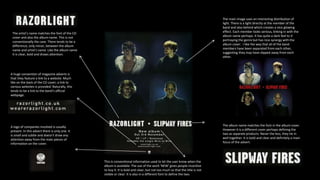
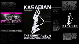
The title is bold and clear. Its positioning makes it
easy to see and becomes a main point of focus for
the advert. The underscores under each is a nice
and niche feature that captures the essence of the
band. This style of text also mirrors the text used
on the album cover creating a synergy between
the media products.
The main image reflects the cover of the album
being advertised. It is interesting as it combines all
four band members and edits them together with
an eagle. The image comes together to create one
whole face which is very unique and may
represent the genre. The colours have been
edited interestingly to create a dark green tinge.
This also represents the genre of the album.
This is a conventional feature of magazine adverts.
Many adverts feature tracks listed on the album.
Some singles are released before the album. For
example ‘Sex on fire’. Some people will have
listened to the song and therefore be inclined to
buy the rest of the album.
This bold text stands out from the rest because it uses a different
font along with a bold red. Conventionally,. Many music magazine
adverts will feature this to let the audience know that the album is
available to purchase.
The album name is in a similar format to the name
of the band. However, a different colour has been
used to establish the difference. This is a
conventional feature. This text is parallel to the
band’s name which is also a convention. It gives
an order and structure to the page.
Many magazine adverts feature companies where the album can
be purchased and also of companies involved with the album,
perhaps ones used on the album itself.
The main image uses an interesting distribution of
light. There is a light directly at the member of the
band and also behind which creates a nice glowing
effect. Each member looks serious, linking in with the
album name perhaps. It has quite a dark feel to it
portraying the genre but has nice synergy with the
album cover. I like the way that all of the band
members have been separated from each other,
suggesting they may have slipped away from each
other.
The album name matches the font in the album cover.
However it is a different cover perhaps defining the
two as separate products. Never the less, they tie in
well together. It is bold and clear and definitely a main
focus of the advert.
The artist’s name matches the font of the CD
cover and also the album name. This is not
conventionally the case. There tends to be a
difference, only minor, between the album
name and artist's name. Like the album name
it is clear, bold and draws attention.
A huge convention of magazine adverts is
that they feature a link to a website. Much
like on the back of the CD cover, a link to
various websites is provided. Naturally, this
tends to be a link to the band’s official
webpage.
A logo of companies involved is usually
present. In this advert there is only one. It
is small and subtle and doesn’t draw any
attention away from the main pieces of
information on the cover.
This is conventional information used to let the user know when the
album is available. The use of the work ‘NEW’ gives people incentive
to buy it. It is bold and clear, but not too much so that the title is not
visible or clear. It is also in a different font to define the two.
Conventionally, a relevant website is
featured. The website will be of reference
to the band in some way. For this example
it is a direct link to the artist’s main
website. It allows users to see new and
existing products they may want to
purchase. It also promotes the band by
featuring tour dates, merchandise and
images.
Here is the Kasabian website homepage.
Magazine adverts usually feature some
singles on the advert. Some singles are
released before the album. For
example ‘REASON IS TREASON’. Some
people will have listened to the song
and therefore be inclined to buy the
rest of the album.
The artist’s name is the main focus of text
in this advert. It is bold and intriguing and
captures the attention of anyone looking at
it. I like that the colour scheme of the
whole advert is black and white. It really
captures the essence of the genre. It is not
too over the top but also makes for a very
pleasurable viewing product. Its font is
block like and is different to all other text
on the page.
The main image is
simple but very
effective. The style of
the advert ties in
directly with the
album cover. It is
interesting and
unique and forces
people to look at it
for longer than they
would a regular
image. This may be
because they are
trying to work out
what it is. The
synergy of text and
image ties in with the
album cover perfectly
and the graphics used
for the image itself
are successful.
The album name doesn’t exist so they
are making a point of it being a debut
album for effect. This text matches the
singles text but is different from the
main title. It is still bold and clear and in
keeping with the house style of the
whole magazine advert.

Magazine Advert Analysis

  • 1.
    The title isbold and clear. Its positioning makes it easy to see and becomes a main point of focus for the advert. The underscores under each is a nice and niche feature that captures the essence of the band. This style of text also mirrors the text used on the album cover creating a synergy between the media products. The main image reflects the cover of the album being advertised. It is interesting as it combines all four band members and edits them together with an eagle. The image comes together to create one whole face which is very unique and may represent the genre. The colours have been edited interestingly to create a dark green tinge. This also represents the genre of the album. This is a conventional feature of magazine adverts. Many adverts feature tracks listed on the album. Some singles are released before the album. For example ‘Sex on fire’. Some people will have listened to the song and therefore be inclined to buy the rest of the album. This bold text stands out from the rest because it uses a different font along with a bold red. Conventionally,. Many music magazine adverts will feature this to let the audience know that the album is available to purchase. The album name is in a similar format to the name of the band. However, a different colour has been used to establish the difference. This is a conventional feature. This text is parallel to the band’s name which is also a convention. It gives an order and structure to the page. Many magazine adverts feature companies where the album can be purchased and also of companies involved with the album, perhaps ones used on the album itself.
  • 2.
    The main imageuses an interesting distribution of light. There is a light directly at the member of the band and also behind which creates a nice glowing effect. Each member looks serious, linking in with the album name perhaps. It has quite a dark feel to it portraying the genre but has nice synergy with the album cover. I like the way that all of the band members have been separated from each other, suggesting they may have slipped away from each other. The album name matches the font in the album cover. However it is a different cover perhaps defining the two as separate products. Never the less, they tie in well together. It is bold and clear and definitely a main focus of the advert. The artist’s name matches the font of the CD cover and also the album name. This is not conventionally the case. There tends to be a difference, only minor, between the album name and artist's name. Like the album name it is clear, bold and draws attention. A huge convention of magazine adverts is that they feature a link to a website. Much like on the back of the CD cover, a link to various websites is provided. Naturally, this tends to be a link to the band’s official webpage. A logo of companies involved is usually present. In this advert there is only one. It is small and subtle and doesn’t draw any attention away from the main pieces of information on the cover. This is conventional information used to let the user know when the album is available. The use of the work ‘NEW’ gives people incentive to buy it. It is bold and clear, but not too much so that the title is not visible or clear. It is also in a different font to define the two.
  • 3.
    Conventionally, a relevantwebsite is featured. The website will be of reference to the band in some way. For this example it is a direct link to the artist’s main website. It allows users to see new and existing products they may want to purchase. It also promotes the band by featuring tour dates, merchandise and images. Here is the Kasabian website homepage. Magazine adverts usually feature some singles on the advert. Some singles are released before the album. For example ‘REASON IS TREASON’. Some people will have listened to the song and therefore be inclined to buy the rest of the album. The artist’s name is the main focus of text in this advert. It is bold and intriguing and captures the attention of anyone looking at it. I like that the colour scheme of the whole advert is black and white. It really captures the essence of the genre. It is not too over the top but also makes for a very pleasurable viewing product. Its font is block like and is different to all other text on the page. The main image is simple but very effective. The style of the advert ties in directly with the album cover. It is interesting and unique and forces people to look at it for longer than they would a regular image. This may be because they are trying to work out what it is. The synergy of text and image ties in with the album cover perfectly and the graphics used for the image itself are successful. The album name doesn’t exist so they are making a point of it being a debut album for effect. This text matches the singles text but is different from the main title. It is still bold and clear and in keeping with the house style of the whole magazine advert.