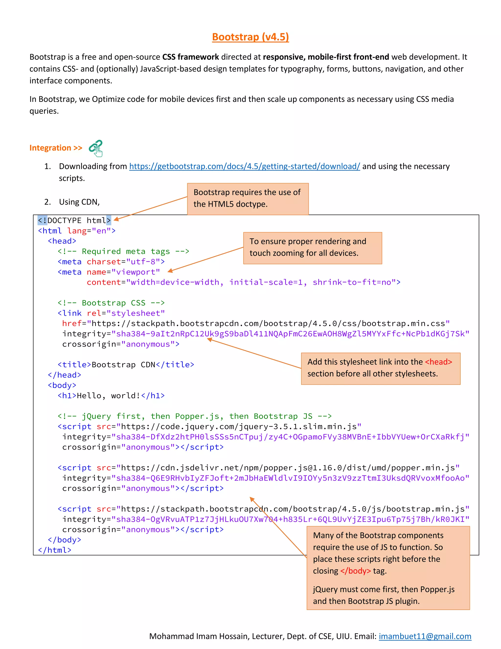


Bootstrap is a free and open-source CSS framework for responsive mobile-first front-end web development. It contains CSS and JavaScript templates for common interface components like typography, forms, buttons, navigation etc. Bootstrap optimizes code for mobile devices first using CSS media queries to scale components as necessary. It can be downloaded or used via a CDN link in HTML. Key aspects covered include the grid system, typography, images, buttons, forms, alerts and modal popups.


![Bootstrap [part 1]](https://cdn.slidesharecdn.com/ss_thumbnails/bootstrappart-11-170208154053-thumbnail.jpg?width=640&height=640&fit=bounds)