Downloaded 725 times
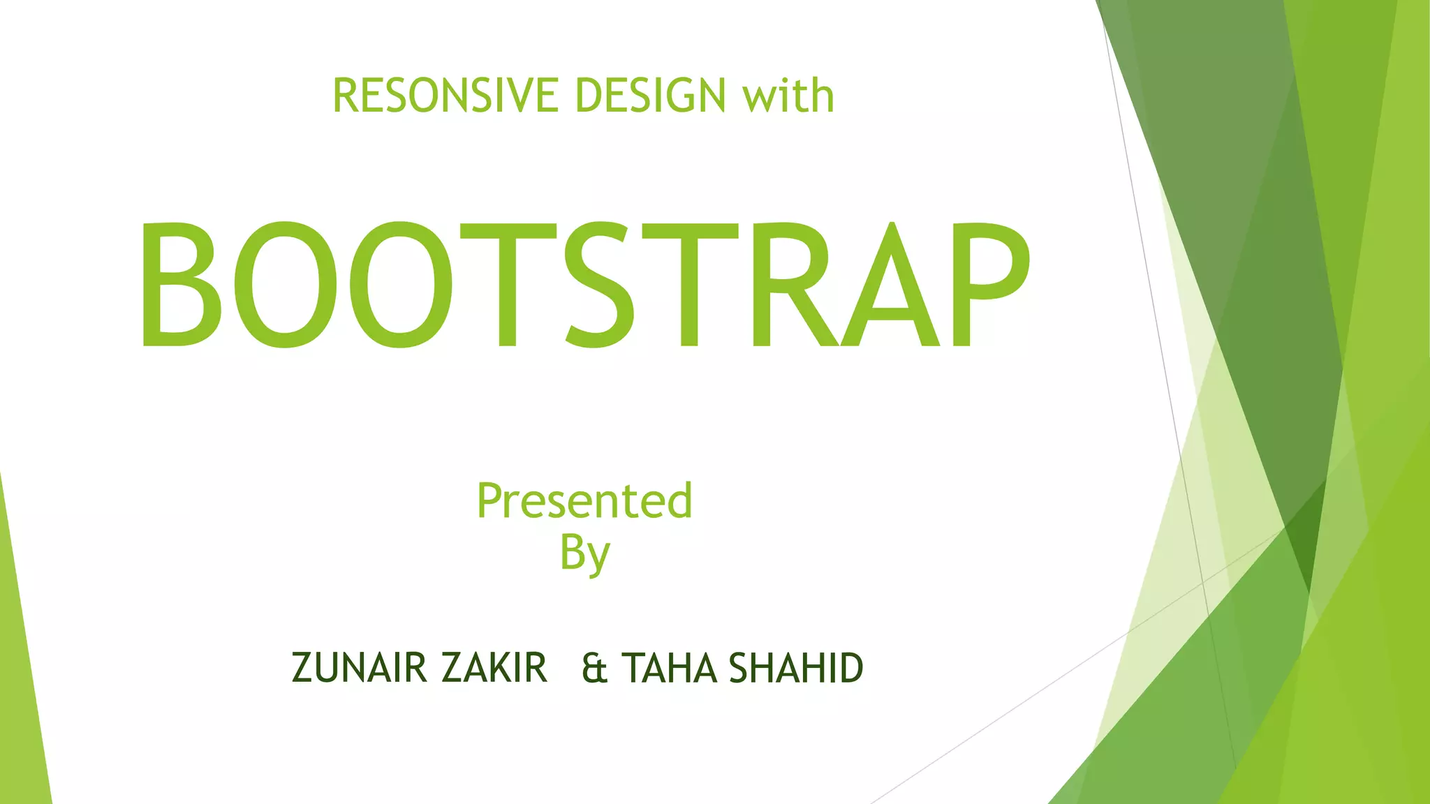
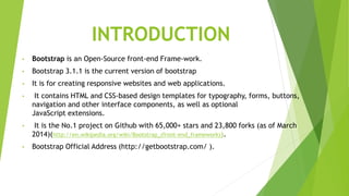
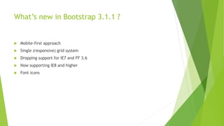


This document discusses responsive design with Bootstrap. It introduces Bootstrap as an open-source front-end framework that allows developers to create responsive websites. It highlights new features in Bootstrap 3.1.1 like a mobile-first approach and support for different screen resolutions. The document also explains the Bootstrap grid system which uses rows and columns to layout responsive content. It provides an example of the grid system and discusses other Bootstrap components like glyphs, buttons, and JavaScript plugins.


![Bootstrap [part 1]](https://cdn.slidesharecdn.com/ss_thumbnails/bootstrappart-11-170208154053-thumbnail.jpg?width=640&height=640&fit=bounds)


