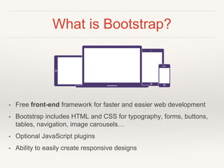
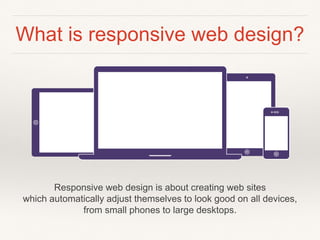
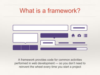
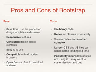
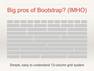
SlideShare a Scribd company logo
Module 3
Bootstrap
Framework
The most popular responsive,
mobile-first HTML5 and CSS3
framework
What is Bootstrap?
• Free front-end framework for faster and easier web development
• Bootstrap includes HTML and CSS for typography, forms, buttons,
tables, navigation, image carousels…
• Optional JavaScript plugins
• Ability to easily create responsive designs
What is responsive web design?
Responsive web design is about creating web sites
which automatically adjust themselves to look good on all devices,
from small phones to large desktops.
What is a framework?
A framework provides code for common activities
performed in web development — so you don’t need to
reinvent the wheel every time you start a project
History of Bootstrap
• Developed by Mark Otto and Jacob
Thornton at Twitter
• Released as an open source product in
August 2011
• Currently on version 3
• Popularity and usage is rising
Goals for Module 3
What we’ll cover in Module 3 (Feb 10 and Feb 17)
This week (Feb 10):
1. Overview of what Bootstrap is and how it can be used
2. Experiment with the grid system
3. Experiment with other elements: tables and buttons
Next week (Feb 17):
1. Create a simple-one page site
Examples
Pros and Cons of Bootstrap
• Save time: use the predefined
design templates and classes
• Responsive features
• Consistent design across
elements
• Easy to to use
• Compatible with all modern
browsers
• Open Source: free to download
and use
• Div-heavy code
• Relies on classes extensively
• Source code can be rather
complex
• Larger CSS and JS files can
cause some loading lag time
• Popularity means lots of sites
are using it… may want to
customize to stand out
Pros: Cons:
Big pros of Bootstrap? (IMHO)
Start simple, get more complex as needed
Big pros of Bootstrap? (IMHO)
Built-in styles look clean, modern but can easily be customized
Big pros of Bootstrap? (IMHO)
Simple, easy to understand 12-column grid system
Class demos
Download Bootstrap.zip
1. Download:
module-3-bootstrap
(in eLearn - Module 3)
2. Unzip
3. Define a new site using
Dreamweaver, point it to
this folder
Download Bootstrap.zip
4. Open the index.html file
5. Note the links to the css files:
• bootstrap.css - this contains all the styles to create the
layouts (DON’T EDIT THIS FILE)
• bootstrap-theme.css - additional css for a visually
enhanced experience (DON’T EDIT THIS FILE)
• custom-styles.css - this is where you create custom
styles to modify the design
The grid and containers
Container element wraps contents and houses the grid system, options:
.container - responsive fixed-width container
.container-fluid - full-width, spans the entire width of the screen
Step 1: create a container
1. In the index.html file create a <div>
2. Apply the container class:
<div class="container">
</div>
The Grid
The grid creates page layouts with a series of rows and
columns that house the content
Blocks of content are created by specifying the number of
columns you wish to span
Media Queries
Key breakpoints in the grid system:
/* Extra small devices (phones, less than 768px) */
/* No media query since this is the default in Bootstrap */
/* Small devices (tablets, 768px and up) */
@media (min-width: @screen-sm-min) { ... }
/* Medium devices (desktops, 992px and up) */
@media (min-width: @screen-md-min) { ... }
/* Large devices (large desktops, 1200px and up) */
@media (min-width: @screen-lg-min) { ... }
Step 2: add a row
1. Inside <div class=“container”>, create a <div>
2. Apply the row class:
<div class=“row">
</div>
Rows and columns
• Rows must be placed within a container for proper
alignment and padding
• Use rows to create horizontal groups of columns
Grid options
• Including the class prefix options allows you to have
more control over how the columns stack/don’t stack on
smaller devices
Step 3: add a column
1. Within the row, create a <div></div>
2. Apply the class for a 12 column-wide column
using extra small:
<div class="col-xs-12">12 columns (x small)</div>
Looks like:
Note: I’ve added some custom styles in <link href="css/custom-styles.css"
rel=“stylesheet"> to show the difference between xs, sm, md and lg
Step 4: add columns at xs
1. Create another row:
<div class=“row">
</div>
2. Create a div and apply the class for 3 column width
using xs (extra-small): col-xs-3
<div class=“col-xs-3”>3 columns (x small)</div>
3. Copy and paste so there are 4 of these <div>s
Looks like:
Step 6: columns at sm
1. Create another row
<div class=“row">
</div>
2. Create a div and apply the class for 3 column width
using sm (small): col-sm-3
<div class=“col-sm-3”>3 columns (small)</div>
3. Copy and paste so there are 4 of these divs
Looks like:
Step 7: columns at md
1. Create another row
<div class=“row">
</div>
2. Create a div and apply the class for 3 column width
using md (medium): col-md-3
<div class=“col-md-3”>3 columns (medium)</div>
3. Copy and paste so there are 4 of these divs
Looks like:
Step 7: columns at lg
1. Create another row
<div class=“row">
</div>
2. Create a div and apply the class for 3 column width
using lg (large): col-lg-3
<div class=“col-lg-3”>3 columns (large)</div>
3. Copy and paste so there are 4 of these divs
Looks like:
Looks like this on a small device:
Notice how the teal and red rows (medium
and large) have stacked at a smaller size…
but the yellow and orange (xsmall and small)
continue to sit side-by-side
Using the class-prefixes allows you to define
how content will look on a smaller device…
Combine for more control…
• Want more control?
• Combine the sizes:
<div class="row">
<div class="col-xs-12 col-md-8”>xs at 12, md at 8</div>
<div class="col-xs-6 col-md-4”>xs at 6, md at 4</div>
</div>
Looks like:
Combining class-prefixes
allows for different layouts on
smaller devices
More great features…
Headings
Styles for headings 1 through 6
Paragraphs
• Bootstrap's global default font-size is 14px, with a line-height of 1.428
• Applied to the <body> and all paragraphs
• <p> tags receive a bottom margin of half their computed line-height
(10px by default)
Making a paragraph stand out
• Make a paragraph stand out by adding the class .lead
Formatting options
Many other classes exist for:
• Inline text elements
• Alignment classes
• Transformation classes
• Abbreviations
• Addresses
• Blockquotes
One of my favourites…
Horizontal definitions:
• Make terms and descriptions in <dl> line up side-by-side
• Starts off stacked like default <dl>s, but when the navbar
expands, so do these
Tables
Open the table.html file
• Add the class “table" to the <table> tag
• Style creates an attractive, easy to read table
Try adding these classes: (e.g. class=“table table-bordered”)
• table-bordered
• table-hover
• table-striped
Responsive table option
Try adding a <div> around the table with the
class"table-responsive"
• Note how the table behaves when viewed on a
small screen
Links and buttons
• Bootstrap has custom button and link styles
<button type="button" class="btn btn-default”>Default</button>
<button type="button" class="btn btn-primary”>Primary</button>
…etc…
Links and buttons
Open the button.html file
• Note the buttons have the class “btn” applied
Try adding these classes:
• btn-default to the button in the left column
• btn-lg to the button in the middle column
• btn-block to the button in the right column
What is the effect of each class?
Putting it all
together…
• Open theme.html
• Check out how some elements work
• E.g. the Carousel at the very bottom
• Shrink your window and see how the
layout changes and adapts
Next week we’ll take some elements
from this theme and build a simple,
one-page website
Interested in learning more?
• Check out the Bootstrap
website at getbootstrap.com

More Related Content

What's hot

Bootstrap
BootstrapBootstrap
Bootstrap
AvinashChunduri2
 
jQuery PPT
jQuery PPTjQuery PPT
jQuery PPT
Dominic Arrojado
 
Javascript 101
Javascript 101Javascript 101
Javascript 101
Shlomi Komemi
 
CSS Day: CSS Grid Layout
CSS Day: CSS Grid Layout CSS Day: CSS Grid Layout
CSS Day: CSS Grid Layout
Rachel Andrew
 
CSS Grid
CSS GridCSS Grid
Javascript Basic
Javascript BasicJavascript Basic
Javascript Basic
Kang-min Liu
 
Introduction to Html5
Introduction to Html5Introduction to Html5
Introduction to Html5
www.netgains.org
 
GET and POST in PHP
GET and POST in PHPGET and POST in PHP
GET and POST in PHP
Vineet Kumar Saini
 
React-JS Component Life-cycle Methods
React-JS Component Life-cycle MethodsReact-JS Component Life-cycle Methods
React-JS Component Life-cycle Methods
ANKUSH CHAVAN
 
html5.ppt
html5.ppthtml5.ppt
html5.ppt
Niharika Gupta
 
Css
CssCss
CSS Basics
CSS BasicsCSS Basics
CSS Basics
Sanjeev Kumar
 
Introduction to CSS Grid Layout
Introduction to CSS Grid LayoutIntroduction to CSS Grid Layout
Introduction to CSS Grid Layout
Rachel Andrew
 
1. introduction to html5
1. introduction to html51. introduction to html5
1. introduction to html5
JayjZens
 
Introducing CSS Grid
Introducing CSS GridIntroducing CSS Grid
Introducing CSS Grid
Jason Yingling
 
CSS3 Media Queries
CSS3 Media QueriesCSS3 Media Queries
CSS3 Media Queries
Russ Weakley
 
Dom(document object model)
Dom(document object model)Dom(document object model)
Dom(document object model)
Partnered Health
 
ReactJS presentation.pptx
ReactJS presentation.pptxReactJS presentation.pptx
ReactJS presentation.pptx
DivyanshGupta922023
 
Bootstrap Components Quick Overview
Bootstrap Components Quick OverviewBootstrap Components Quick Overview
Bootstrap Components Quick Overview
Perumal N K
 
Html & CSS
Html & CSSHtml & CSS
Html & CSS
JainilSampat
 

What's hot (20)

Bootstrap
BootstrapBootstrap
Bootstrap
 
jQuery PPT
jQuery PPTjQuery PPT
jQuery PPT
 
Javascript 101
Javascript 101Javascript 101
Javascript 101
 
CSS Day: CSS Grid Layout
CSS Day: CSS Grid Layout CSS Day: CSS Grid Layout
CSS Day: CSS Grid Layout
 
CSS Grid
CSS GridCSS Grid
CSS Grid
 
Javascript Basic
Javascript BasicJavascript Basic
Javascript Basic
 
Introduction to Html5
Introduction to Html5Introduction to Html5
Introduction to Html5
 
GET and POST in PHP
GET and POST in PHPGET and POST in PHP
GET and POST in PHP
 
React-JS Component Life-cycle Methods
React-JS Component Life-cycle MethodsReact-JS Component Life-cycle Methods
React-JS Component Life-cycle Methods
 
html5.ppt
html5.ppthtml5.ppt
html5.ppt
 
Css
CssCss
Css
 
CSS Basics
CSS BasicsCSS Basics
CSS Basics
 
Introduction to CSS Grid Layout
Introduction to CSS Grid LayoutIntroduction to CSS Grid Layout
Introduction to CSS Grid Layout
 
1. introduction to html5
1. introduction to html51. introduction to html5
1. introduction to html5
 
Introducing CSS Grid
Introducing CSS GridIntroducing CSS Grid
Introducing CSS Grid
 
CSS3 Media Queries
CSS3 Media QueriesCSS3 Media Queries
CSS3 Media Queries
 
Dom(document object model)
Dom(document object model)Dom(document object model)
Dom(document object model)
 
ReactJS presentation.pptx
ReactJS presentation.pptxReactJS presentation.pptx
ReactJS presentation.pptx
 
Bootstrap Components Quick Overview
Bootstrap Components Quick OverviewBootstrap Components Quick Overview
Bootstrap Components Quick Overview
 
Html & CSS
Html & CSSHtml & CSS
Html & CSS
 

Similar to Module 3 - Intro to Bootstrap

Responsive web design
Responsive web designResponsive web design
Responsive web design
AirticsTrainer
 
Twitter bootstrap training_session_ppt
Twitter bootstrap training_session_pptTwitter bootstrap training_session_ppt
Twitter bootstrap training_session_ppt
Radheshyam Kori
 
Bootstrap day1
Bootstrap day1Bootstrap day1
Bootstrap day1
Rafi Haidari
 
Bootstrap [part 1]
Bootstrap [part 1]Bootstrap [part 1]
Bootstrap [part 1]
Ghanshyam Patel
 
Battle of the Front-End Frameworks: Bootstrap vs. Foundation
Battle of the Front-End Frameworks: Bootstrap vs. FoundationBattle of the Front-End Frameworks: Bootstrap vs. Foundation
Battle of the Front-End Frameworks: Bootstrap vs. Foundation
Rachel Cherry
 
Bootstrap 3
Bootstrap 3Bootstrap 3
Bootstrap 3
McSoftsis
 
Bootstrap 5 ppt
Bootstrap 5 pptBootstrap 5 ppt
Bootstrap 5 ppt
Mallikarjuna G D
 
BOTSTRAP.ppt
BOTSTRAP.pptBOTSTRAP.ppt
BOTSTRAP.ppt
068PrateekRathore
 
Web development and web design with seo
Web development and web design with seoWeb development and web design with seo
Web development and web design with seo
Rajat Anand
 
Bootstrap
Bootstrap Bootstrap
Bootstrap
PumoTechnovation
 
Bootstrap PPT by Mukesh
Bootstrap PPT by MukeshBootstrap PPT by Mukesh
Bootstrap PPT by Mukesh
Mukesh Kumar
 
Create Responsive Website Design with Bootstrap 3
Create Responsive Website Design with Bootstrap 3Create Responsive Website Design with Bootstrap 3
Create Responsive Website Design with Bootstrap 3
Wahyu Putra
 
Responsive Design and Bootstrap
Responsive Design  and BootstrapResponsive Design  and Bootstrap
Responsive Design and Bootstrap
MahmoudOHassouna
 
ViA Bootstrap 4
ViA Bootstrap 4ViA Bootstrap 4
ViA Bootstrap 4
imdurgesh
 
Intro To Twitter Bootstrap
Intro To Twitter BootstrapIntro To Twitter Bootstrap
Intro To Twitter Bootstrap
Ahmed Haque
 
An introduction to bootstrap
An introduction to bootstrapAn introduction to bootstrap
An introduction to bootstrap
Mind IT Systems
 
HowTo_CSS
HowTo_CSSHowTo_CSS
HowTo_CSS
tutorialsruby
 
HowTo_CSS
HowTo_CSSHowTo_CSS
HowTo_CSS
tutorialsruby
 
Bootstrap - Basics
Bootstrap - BasicsBootstrap - Basics
Bootstrap - Basics
FirosK2
 
Bootstrap
BootstrapBootstrap
Bootstrap
Jadson Santos
 

Similar to Module 3 - Intro to Bootstrap (20)

Responsive web design
Responsive web designResponsive web design
Responsive web design
 
Twitter bootstrap training_session_ppt
Twitter bootstrap training_session_pptTwitter bootstrap training_session_ppt
Twitter bootstrap training_session_ppt
 
Bootstrap day1
Bootstrap day1Bootstrap day1
Bootstrap day1
 
Bootstrap [part 1]
Bootstrap [part 1]Bootstrap [part 1]
Bootstrap [part 1]
 
Battle of the Front-End Frameworks: Bootstrap vs. Foundation
Battle of the Front-End Frameworks: Bootstrap vs. FoundationBattle of the Front-End Frameworks: Bootstrap vs. Foundation
Battle of the Front-End Frameworks: Bootstrap vs. Foundation
 
Bootstrap 3
Bootstrap 3Bootstrap 3
Bootstrap 3
 
Bootstrap 5 ppt
Bootstrap 5 pptBootstrap 5 ppt
Bootstrap 5 ppt
 
BOTSTRAP.ppt
BOTSTRAP.pptBOTSTRAP.ppt
BOTSTRAP.ppt
 
Web development and web design with seo
Web development and web design with seoWeb development and web design with seo
Web development and web design with seo
 
Bootstrap
Bootstrap Bootstrap
Bootstrap
 
Bootstrap PPT by Mukesh
Bootstrap PPT by MukeshBootstrap PPT by Mukesh
Bootstrap PPT by Mukesh
 
Create Responsive Website Design with Bootstrap 3
Create Responsive Website Design with Bootstrap 3Create Responsive Website Design with Bootstrap 3
Create Responsive Website Design with Bootstrap 3
 
Responsive Design and Bootstrap
Responsive Design  and BootstrapResponsive Design  and Bootstrap
Responsive Design and Bootstrap
 
ViA Bootstrap 4
ViA Bootstrap 4ViA Bootstrap 4
ViA Bootstrap 4
 
Intro To Twitter Bootstrap
Intro To Twitter BootstrapIntro To Twitter Bootstrap
Intro To Twitter Bootstrap
 
An introduction to bootstrap
An introduction to bootstrapAn introduction to bootstrap
An introduction to bootstrap
 
HowTo_CSS
HowTo_CSSHowTo_CSS
HowTo_CSS
 
HowTo_CSS
HowTo_CSSHowTo_CSS
HowTo_CSS
 
Bootstrap - Basics
Bootstrap - BasicsBootstrap - Basics
Bootstrap - Basics
 
Bootstrap
BootstrapBootstrap
Bootstrap
 

More from Katherine McCurdy-Lapierre, R.G.D.

Module 5 - WCM system comparison
Module 5 - WCM system comparison Module 5 - WCM system comparison
Module 5 - WCM system comparison
Katherine McCurdy-Lapierre, R.G.D.
 
Module 4 - Dreamweaver Templates (Static vs. Dynamic Content)
Module 4 - Dreamweaver Templates (Static vs. Dynamic Content)Module 4 - Dreamweaver Templates (Static vs. Dynamic Content)
Module 4 - Dreamweaver Templates (Static vs. Dynamic Content)
Katherine McCurdy-Lapierre, R.G.D.
 
Week 4 - tablet app design
Week 4 - tablet app designWeek 4 - tablet app design
Week 4 - tablet app design
Katherine McCurdy-Lapierre, R.G.D.
 
Week 3 Lecture: Accessibility
Week 3 Lecture: AccessibilityWeek 3 Lecture: Accessibility
Week 3 Lecture: Accessibility
Katherine McCurdy-Lapierre, R.G.D.
 
Interactive Web Design 5 - Week 2 - Introduction
Interactive Web Design 5 - Week 2 -  IntroductionInteractive Web Design 5 - Week 2 -  Introduction
Interactive Web Design 5 - Week 2 - Introduction
Katherine McCurdy-Lapierre, R.G.D.
 
Week 12 CSS - Review from last week
Week 12 CSS - Review from last weekWeek 12 CSS - Review from last week
Week 12 CSS - Review from last week
Katherine McCurdy-Lapierre, R.G.D.
 
Week 12 CSS Font - size
Week 12 CSS Font - sizeWeek 12 CSS Font - size
Week 12 CSS Font - size
Katherine McCurdy-Lapierre, R.G.D.
 
Week 12 CSS Font - family
Week 12 CSS Font - familyWeek 12 CSS Font - family
Week 12 CSS Font - family
Katherine McCurdy-Lapierre, R.G.D.
 
Week11 Lecture: CSS
Week11 Lecture: CSSWeek11 Lecture: CSS
Week 6 Lecture
Week 6 LectureWeek 6 Lecture
Week 5 Lecture
Week 5 LectureWeek 5 Lecture
Week 4 Lecture Accessibility
Week 4 Lecture AccessibilityWeek 4 Lecture Accessibility
Week 4 Lecture Accessibility
Katherine McCurdy-Lapierre, R.G.D.
 
Week 4 Lecture Part 1
Week 4 Lecture Part 1Week 4 Lecture Part 1
Week 4 Lecture Part 1
Katherine McCurdy-Lapierre, R.G.D.
 
Week 4 Lecture Part 2
Week 4 Lecture Part 2Week 4 Lecture Part 2
Week 4 Lecture Part 2
Katherine McCurdy-Lapierre, R.G.D.
 
Artistic Web Applications - Week3 - Part 1
Artistic Web Applications - Week3 - Part 1Artistic Web Applications - Week3 - Part 1
Artistic Web Applications - Week3 - Part 1
Katherine McCurdy-Lapierre, R.G.D.
 
Artistic Web Applications - Week3 - Part 3
Artistic Web Applications - Week3 - Part 3Artistic Web Applications - Week3 - Part 3
Artistic Web Applications - Week3 - Part 3
Katherine McCurdy-Lapierre, R.G.D.
 
Artistic Web Applications - Week3 - Part 2
Artistic Web Applications - Week3 - Part 2Artistic Web Applications - Week3 - Part 2
Artistic Web Applications - Week3 - Part 2
Katherine McCurdy-Lapierre, R.G.D.
 
Week2 lecture-whatiswebdesign-part1
Week2 lecture-whatiswebdesign-part1Week2 lecture-whatiswebdesign-part1
Week2 lecture-whatiswebdesign-part1
Katherine McCurdy-Lapierre, R.G.D.
 
LecWeek2 lecture-whatiswebdesign-part2
LecWeek2 lecture-whatiswebdesign-part2LecWeek2 lecture-whatiswebdesign-part2
LecWeek2 lecture-whatiswebdesign-part2
Katherine McCurdy-Lapierre, R.G.D.
 

More from Katherine McCurdy-Lapierre, R.G.D. (19)

Module 5 - WCM system comparison
Module 5 - WCM system comparison Module 5 - WCM system comparison
Module 5 - WCM system comparison
 
Module 4 - Dreamweaver Templates (Static vs. Dynamic Content)
Module 4 - Dreamweaver Templates (Static vs. Dynamic Content)Module 4 - Dreamweaver Templates (Static vs. Dynamic Content)
Module 4 - Dreamweaver Templates (Static vs. Dynamic Content)
 
Week 4 - tablet app design
Week 4 - tablet app designWeek 4 - tablet app design
Week 4 - tablet app design
 
Week 3 Lecture: Accessibility
Week 3 Lecture: AccessibilityWeek 3 Lecture: Accessibility
Week 3 Lecture: Accessibility
 
Interactive Web Design 5 - Week 2 - Introduction
Interactive Web Design 5 - Week 2 -  IntroductionInteractive Web Design 5 - Week 2 -  Introduction
Interactive Web Design 5 - Week 2 - Introduction
 
Week 12 CSS - Review from last week
Week 12 CSS - Review from last weekWeek 12 CSS - Review from last week
Week 12 CSS - Review from last week
 
Week 12 CSS Font - size
Week 12 CSS Font - sizeWeek 12 CSS Font - size
Week 12 CSS Font - size
 
Week 12 CSS Font - family
Week 12 CSS Font - familyWeek 12 CSS Font - family
Week 12 CSS Font - family
 
Week11 Lecture: CSS
Week11 Lecture: CSSWeek11 Lecture: CSS
Week11 Lecture: CSS
 
Week 6 Lecture
Week 6 LectureWeek 6 Lecture
Week 6 Lecture
 
Week 5 Lecture
Week 5 LectureWeek 5 Lecture
Week 5 Lecture
 
Week 4 Lecture Accessibility
Week 4 Lecture AccessibilityWeek 4 Lecture Accessibility
Week 4 Lecture Accessibility
 
Week 4 Lecture Part 1
Week 4 Lecture Part 1Week 4 Lecture Part 1
Week 4 Lecture Part 1
 
Week 4 Lecture Part 2
Week 4 Lecture Part 2Week 4 Lecture Part 2
Week 4 Lecture Part 2
 
Artistic Web Applications - Week3 - Part 1
Artistic Web Applications - Week3 - Part 1Artistic Web Applications - Week3 - Part 1
Artistic Web Applications - Week3 - Part 1
 
Artistic Web Applications - Week3 - Part 3
Artistic Web Applications - Week3 - Part 3Artistic Web Applications - Week3 - Part 3
Artistic Web Applications - Week3 - Part 3
 
Artistic Web Applications - Week3 - Part 2
Artistic Web Applications - Week3 - Part 2Artistic Web Applications - Week3 - Part 2
Artistic Web Applications - Week3 - Part 2
 
Week2 lecture-whatiswebdesign-part1
Week2 lecture-whatiswebdesign-part1Week2 lecture-whatiswebdesign-part1
Week2 lecture-whatiswebdesign-part1
 
LecWeek2 lecture-whatiswebdesign-part2
LecWeek2 lecture-whatiswebdesign-part2LecWeek2 lecture-whatiswebdesign-part2
LecWeek2 lecture-whatiswebdesign-part2
 

Recently uploaded

Types of Herbal Cosmetics its standardization.
Types of Herbal Cosmetics its standardization.Types of Herbal Cosmetics its standardization.
Types of Herbal Cosmetics its standardization.
Ashokrao Mane college of Pharmacy Peth-Vadgaon
 
How to Add Chatter in the odoo 17 ERP Module
How to Add Chatter in the odoo 17 ERP ModuleHow to Add Chatter in the odoo 17 ERP Module
How to Add Chatter in the odoo 17 ERP Module
Celine George
 
PCOS corelations and management through Ayurveda.
PCOS corelations and management through Ayurveda.PCOS corelations and management through Ayurveda.
PCOS corelations and management through Ayurveda.
Dr. Shivangi Singh Parihar
 
Assessment and Planning in Educational technology.pptx
Assessment and Planning in Educational technology.pptxAssessment and Planning in Educational technology.pptx
Assessment and Planning in Educational technology.pptx
Kavitha Krishnan
 
Natural birth techniques - Mrs.Akanksha Trivedi Rama University
Natural birth techniques - Mrs.Akanksha Trivedi Rama UniversityNatural birth techniques - Mrs.Akanksha Trivedi Rama University
Natural birth techniques - Mrs.Akanksha Trivedi Rama University
Akanksha trivedi rama nursing college kanpur.
 
World environment day ppt For 5 June 2024
World environment day ppt For 5 June 2024World environment day ppt For 5 June 2024
World environment day ppt For 5 June 2024
ak6969907
 
BÀI TẬP BỔ TRỢ TIẾNG ANH 8 CẢ NĂM - GLOBAL SUCCESS - NĂM HỌC 2023-2024 (CÓ FI...
BÀI TẬP BỔ TRỢ TIẾNG ANH 8 CẢ NĂM - GLOBAL SUCCESS - NĂM HỌC 2023-2024 (CÓ FI...BÀI TẬP BỔ TRỢ TIẾNG ANH 8 CẢ NĂM - GLOBAL SUCCESS - NĂM HỌC 2023-2024 (CÓ FI...
BÀI TẬP BỔ TRỢ TIẾNG ANH 8 CẢ NĂM - GLOBAL SUCCESS - NĂM HỌC 2023-2024 (CÓ FI...
Nguyen Thanh Tu Collection
 
Your Skill Boost Masterclass: Strategies for Effective Upskilling
Your Skill Boost Masterclass: Strategies for Effective UpskillingYour Skill Boost Masterclass: Strategies for Effective Upskilling
Your Skill Boost Masterclass: Strategies for Effective Upskilling
Excellence Foundation for South Sudan
 
Introduction to AI for Nonprofits with Tapp Network
Introduction to AI for Nonprofits with Tapp NetworkIntroduction to AI for Nonprofits with Tapp Network
Introduction to AI for Nonprofits with Tapp Network
TechSoup
 
Top five deadliest dog breeds in America
Top five deadliest dog breeds in AmericaTop five deadliest dog breeds in America
Top five deadliest dog breeds in America
Bisnar Chase Personal Injury Attorneys
 
Film vocab for eal 3 students: Australia the movie
Film vocab for eal 3 students: Australia the movieFilm vocab for eal 3 students: Australia the movie
Film vocab for eal 3 students: Australia the movie
Nicholas Montgomery
 
Pollock and Snow "DEIA in the Scholarly Landscape, Session One: Setting Expec...
Pollock and Snow "DEIA in the Scholarly Landscape, Session One: Setting Expec...Pollock and Snow "DEIA in the Scholarly Landscape, Session One: Setting Expec...
Pollock and Snow "DEIA in the Scholarly Landscape, Session One: Setting Expec...
National Information Standards Organization (NISO)
 
Exploiting Artificial Intelligence for Empowering Researchers and Faculty, In...
Exploiting Artificial Intelligence for Empowering Researchers and Faculty, In...Exploiting Artificial Intelligence for Empowering Researchers and Faculty, In...
Exploiting Artificial Intelligence for Empowering Researchers and Faculty, In...
Dr. Vinod Kumar Kanvaria
 
Digital Artefact 1 - Tiny Home Environmental Design
Digital Artefact 1 - Tiny Home Environmental DesignDigital Artefact 1 - Tiny Home Environmental Design
Digital Artefact 1 - Tiny Home Environmental Design
amberjdewit93
 
Azure Interview Questions and Answers PDF By ScholarHat
Azure Interview Questions and Answers PDF By ScholarHatAzure Interview Questions and Answers PDF By ScholarHat
Azure Interview Questions and Answers PDF By ScholarHat
Scholarhat
 
Executive Directors Chat Leveraging AI for Diversity, Equity, and Inclusion
Executive Directors Chat  Leveraging AI for Diversity, Equity, and InclusionExecutive Directors Chat  Leveraging AI for Diversity, Equity, and Inclusion
Executive Directors Chat Leveraging AI for Diversity, Equity, and Inclusion
TechSoup
 
CACJapan - GROUP Presentation 1- Wk 4.pdf
CACJapan - GROUP Presentation 1- Wk 4.pdfCACJapan - GROUP Presentation 1- Wk 4.pdf
CACJapan - GROUP Presentation 1- Wk 4.pdf
camakaiclarkmusic
 
বাংলাদেশ অর্থনৈতিক সমীক্ষা (Economic Review) ২০২৪ UJS App.pdf
বাংলাদেশ অর্থনৈতিক সমীক্ষা (Economic Review) ২০২৪ UJS App.pdfবাংলাদেশ অর্থনৈতিক সমীক্ষা (Economic Review) ২০২৪ UJS App.pdf
বাংলাদেশ অর্থনৈতিক সমীক্ষা (Economic Review) ২০২৪ UJS App.pdf
eBook.com.bd (প্রয়োজনীয় বাংলা বই)
 
The Diamonds of 2023-2024 in the IGRA collection
The Diamonds of 2023-2024 in the IGRA collectionThe Diamonds of 2023-2024 in the IGRA collection
The Diamonds of 2023-2024 in the IGRA collection
Israel Genealogy Research Association
 
South African Journal of Science: Writing with integrity workshop (2024)
South African Journal of Science: Writing with integrity workshop (2024)South African Journal of Science: Writing with integrity workshop (2024)
South African Journal of Science: Writing with integrity workshop (2024)
Academy of Science of South Africa
 

Recently uploaded (20)

Types of Herbal Cosmetics its standardization.
Types of Herbal Cosmetics its standardization.Types of Herbal Cosmetics its standardization.
Types of Herbal Cosmetics its standardization.
 
How to Add Chatter in the odoo 17 ERP Module
How to Add Chatter in the odoo 17 ERP ModuleHow to Add Chatter in the odoo 17 ERP Module
How to Add Chatter in the odoo 17 ERP Module
 
PCOS corelations and management through Ayurveda.
PCOS corelations and management through Ayurveda.PCOS corelations and management through Ayurveda.
PCOS corelations and management through Ayurveda.
 
Assessment and Planning in Educational technology.pptx
Assessment and Planning in Educational technology.pptxAssessment and Planning in Educational technology.pptx
Assessment and Planning in Educational technology.pptx
 
Natural birth techniques - Mrs.Akanksha Trivedi Rama University
Natural birth techniques - Mrs.Akanksha Trivedi Rama UniversityNatural birth techniques - Mrs.Akanksha Trivedi Rama University
Natural birth techniques - Mrs.Akanksha Trivedi Rama University
 
World environment day ppt For 5 June 2024
World environment day ppt For 5 June 2024World environment day ppt For 5 June 2024
World environment day ppt For 5 June 2024
 
BÀI TẬP BỔ TRỢ TIẾNG ANH 8 CẢ NĂM - GLOBAL SUCCESS - NĂM HỌC 2023-2024 (CÓ FI...
BÀI TẬP BỔ TRỢ TIẾNG ANH 8 CẢ NĂM - GLOBAL SUCCESS - NĂM HỌC 2023-2024 (CÓ FI...BÀI TẬP BỔ TRỢ TIẾNG ANH 8 CẢ NĂM - GLOBAL SUCCESS - NĂM HỌC 2023-2024 (CÓ FI...
BÀI TẬP BỔ TRỢ TIẾNG ANH 8 CẢ NĂM - GLOBAL SUCCESS - NĂM HỌC 2023-2024 (CÓ FI...
 
Your Skill Boost Masterclass: Strategies for Effective Upskilling
Your Skill Boost Masterclass: Strategies for Effective UpskillingYour Skill Boost Masterclass: Strategies for Effective Upskilling
Your Skill Boost Masterclass: Strategies for Effective Upskilling
 
Introduction to AI for Nonprofits with Tapp Network
Introduction to AI for Nonprofits with Tapp NetworkIntroduction to AI for Nonprofits with Tapp Network
Introduction to AI for Nonprofits with Tapp Network
 
Top five deadliest dog breeds in America
Top five deadliest dog breeds in AmericaTop five deadliest dog breeds in America
Top five deadliest dog breeds in America
 
Film vocab for eal 3 students: Australia the movie
Film vocab for eal 3 students: Australia the movieFilm vocab for eal 3 students: Australia the movie
Film vocab for eal 3 students: Australia the movie
 
Pollock and Snow "DEIA in the Scholarly Landscape, Session One: Setting Expec...
Pollock and Snow "DEIA in the Scholarly Landscape, Session One: Setting Expec...Pollock and Snow "DEIA in the Scholarly Landscape, Session One: Setting Expec...
Pollock and Snow "DEIA in the Scholarly Landscape, Session One: Setting Expec...
 
Exploiting Artificial Intelligence for Empowering Researchers and Faculty, In...
Exploiting Artificial Intelligence for Empowering Researchers and Faculty, In...Exploiting Artificial Intelligence for Empowering Researchers and Faculty, In...
Exploiting Artificial Intelligence for Empowering Researchers and Faculty, In...
 
Digital Artefact 1 - Tiny Home Environmental Design
Digital Artefact 1 - Tiny Home Environmental DesignDigital Artefact 1 - Tiny Home Environmental Design
Digital Artefact 1 - Tiny Home Environmental Design
 
Azure Interview Questions and Answers PDF By ScholarHat
Azure Interview Questions and Answers PDF By ScholarHatAzure Interview Questions and Answers PDF By ScholarHat
Azure Interview Questions and Answers PDF By ScholarHat
 
Executive Directors Chat Leveraging AI for Diversity, Equity, and Inclusion
Executive Directors Chat  Leveraging AI for Diversity, Equity, and InclusionExecutive Directors Chat  Leveraging AI for Diversity, Equity, and Inclusion
Executive Directors Chat Leveraging AI for Diversity, Equity, and Inclusion
 
CACJapan - GROUP Presentation 1- Wk 4.pdf
CACJapan - GROUP Presentation 1- Wk 4.pdfCACJapan - GROUP Presentation 1- Wk 4.pdf
CACJapan - GROUP Presentation 1- Wk 4.pdf
 
বাংলাদেশ অর্থনৈতিক সমীক্ষা (Economic Review) ২০২৪ UJS App.pdf
বাংলাদেশ অর্থনৈতিক সমীক্ষা (Economic Review) ২০২৪ UJS App.pdfবাংলাদেশ অর্থনৈতিক সমীক্ষা (Economic Review) ২০২৪ UJS App.pdf
বাংলাদেশ অর্থনৈতিক সমীক্ষা (Economic Review) ২০২৪ UJS App.pdf
 
The Diamonds of 2023-2024 in the IGRA collection
The Diamonds of 2023-2024 in the IGRA collectionThe Diamonds of 2023-2024 in the IGRA collection
The Diamonds of 2023-2024 in the IGRA collection
 
South African Journal of Science: Writing with integrity workshop (2024)
South African Journal of Science: Writing with integrity workshop (2024)South African Journal of Science: Writing with integrity workshop (2024)
South African Journal of Science: Writing with integrity workshop (2024)
 

Module 3 - Intro to Bootstrap

  • 1. Module 3 Bootstrap Framework The most popular responsive, mobile-first HTML5 and CSS3 framework
  • 2. What is Bootstrap? • Free front-end framework for faster and easier web development • Bootstrap includes HTML and CSS for typography, forms, buttons, tables, navigation, image carousels… • Optional JavaScript plugins • Ability to easily create responsive designs
  • 3. What is responsive web design? Responsive web design is about creating web sites which automatically adjust themselves to look good on all devices, from small phones to large desktops.
  • 4. What is a framework? A framework provides code for common activities performed in web development — so you don’t need to reinvent the wheel every time you start a project
  • 5. History of Bootstrap • Developed by Mark Otto and Jacob Thornton at Twitter • Released as an open source product in August 2011 • Currently on version 3 • Popularity and usage is rising
  • 6. Goals for Module 3 What we’ll cover in Module 3 (Feb 10 and Feb 17) This week (Feb 10): 1. Overview of what Bootstrap is and how it can be used 2. Experiment with the grid system 3. Experiment with other elements: tables and buttons Next week (Feb 17): 1. Create a simple-one page site
  • 8.
  • 9.
  • 10. Pros and Cons of Bootstrap • Save time: use the predefined design templates and classes • Responsive features • Consistent design across elements • Easy to to use • Compatible with all modern browsers • Open Source: free to download and use • Div-heavy code • Relies on classes extensively • Source code can be rather complex • Larger CSS and JS files can cause some loading lag time • Popularity means lots of sites are using it… may want to customize to stand out Pros: Cons:
  • 11. Big pros of Bootstrap? (IMHO) Start simple, get more complex as needed
  • 12. Big pros of Bootstrap? (IMHO) Built-in styles look clean, modern but can easily be customized
  • 13. Big pros of Bootstrap? (IMHO) Simple, easy to understand 12-column grid system
  • 15. Download Bootstrap.zip 1. Download: module-3-bootstrap (in eLearn - Module 3) 2. Unzip 3. Define a new site using Dreamweaver, point it to this folder
  • 16. Download Bootstrap.zip 4. Open the index.html file 5. Note the links to the css files: • bootstrap.css - this contains all the styles to create the layouts (DON’T EDIT THIS FILE) • bootstrap-theme.css - additional css for a visually enhanced experience (DON’T EDIT THIS FILE) • custom-styles.css - this is where you create custom styles to modify the design
  • 17. The grid and containers Container element wraps contents and houses the grid system, options: .container - responsive fixed-width container .container-fluid - full-width, spans the entire width of the screen
  • 18. Step 1: create a container 1. In the index.html file create a <div> 2. Apply the container class: <div class="container"> </div>
  • 19. The Grid The grid creates page layouts with a series of rows and columns that house the content Blocks of content are created by specifying the number of columns you wish to span
  • 20.
  • 21. Media Queries Key breakpoints in the grid system: /* Extra small devices (phones, less than 768px) */ /* No media query since this is the default in Bootstrap */ /* Small devices (tablets, 768px and up) */ @media (min-width: @screen-sm-min) { ... } /* Medium devices (desktops, 992px and up) */ @media (min-width: @screen-md-min) { ... } /* Large devices (large desktops, 1200px and up) */ @media (min-width: @screen-lg-min) { ... }
  • 22. Step 2: add a row 1. Inside <div class=“container”>, create a <div> 2. Apply the row class: <div class=“row"> </div>
  • 23. Rows and columns • Rows must be placed within a container for proper alignment and padding • Use rows to create horizontal groups of columns
  • 24. Grid options • Including the class prefix options allows you to have more control over how the columns stack/don’t stack on smaller devices
  • 25. Step 3: add a column 1. Within the row, create a <div></div> 2. Apply the class for a 12 column-wide column using extra small: <div class="col-xs-12">12 columns (x small)</div>
  • 26. Looks like: Note: I’ve added some custom styles in <link href="css/custom-styles.css" rel=“stylesheet"> to show the difference between xs, sm, md and lg
  • 27. Step 4: add columns at xs 1. Create another row: <div class=“row"> </div> 2. Create a div and apply the class for 3 column width using xs (extra-small): col-xs-3 <div class=“col-xs-3”>3 columns (x small)</div> 3. Copy and paste so there are 4 of these <div>s
  • 29. Step 6: columns at sm 1. Create another row <div class=“row"> </div> 2. Create a div and apply the class for 3 column width using sm (small): col-sm-3 <div class=“col-sm-3”>3 columns (small)</div> 3. Copy and paste so there are 4 of these divs
  • 31. Step 7: columns at md 1. Create another row <div class=“row"> </div> 2. Create a div and apply the class for 3 column width using md (medium): col-md-3 <div class=“col-md-3”>3 columns (medium)</div> 3. Copy and paste so there are 4 of these divs
  • 33. Step 7: columns at lg 1. Create another row <div class=“row"> </div> 2. Create a div and apply the class for 3 column width using lg (large): col-lg-3 <div class=“col-lg-3”>3 columns (large)</div> 3. Copy and paste so there are 4 of these divs
  • 35. Looks like this on a small device: Notice how the teal and red rows (medium and large) have stacked at a smaller size… but the yellow and orange (xsmall and small) continue to sit side-by-side Using the class-prefixes allows you to define how content will look on a smaller device…
  • 36. Combine for more control… • Want more control? • Combine the sizes: <div class="row"> <div class="col-xs-12 col-md-8”>xs at 12, md at 8</div> <div class="col-xs-6 col-md-4”>xs at 6, md at 4</div> </div>
  • 37. Looks like: Combining class-prefixes allows for different layouts on smaller devices
  • 40. Paragraphs • Bootstrap's global default font-size is 14px, with a line-height of 1.428 • Applied to the <body> and all paragraphs • <p> tags receive a bottom margin of half their computed line-height (10px by default)
  • 41. Making a paragraph stand out • Make a paragraph stand out by adding the class .lead
  • 42. Formatting options Many other classes exist for: • Inline text elements • Alignment classes • Transformation classes • Abbreviations • Addresses • Blockquotes
  • 43. One of my favourites… Horizontal definitions: • Make terms and descriptions in <dl> line up side-by-side • Starts off stacked like default <dl>s, but when the navbar expands, so do these
  • 44. Tables Open the table.html file • Add the class “table" to the <table> tag • Style creates an attractive, easy to read table Try adding these classes: (e.g. class=“table table-bordered”) • table-bordered • table-hover • table-striped
  • 45. Responsive table option Try adding a <div> around the table with the class"table-responsive" • Note how the table behaves when viewed on a small screen
  • 46. Links and buttons • Bootstrap has custom button and link styles <button type="button" class="btn btn-default”>Default</button> <button type="button" class="btn btn-primary”>Primary</button> …etc…
  • 47. Links and buttons Open the button.html file • Note the buttons have the class “btn” applied Try adding these classes: • btn-default to the button in the left column • btn-lg to the button in the middle column • btn-block to the button in the right column What is the effect of each class?
  • 48. Putting it all together… • Open theme.html • Check out how some elements work • E.g. the Carousel at the very bottom • Shrink your window and see how the layout changes and adapts Next week we’ll take some elements from this theme and build a simple, one-page website
  • 49. Interested in learning more? • Check out the Bootstrap website at getbootstrap.com