Download as PDF, PPTX
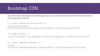
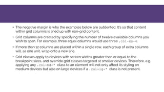
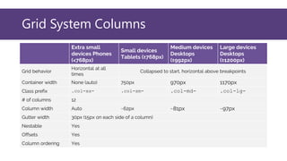
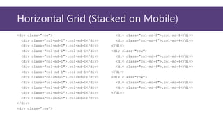
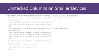
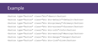
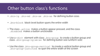
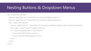
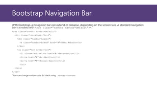

This document provides an overview of Bootstrap, a popular CSS framework. It discusses including Bootstrap via a CDN or by downloading files. It covers Bootstrap containers, grids for layouts using rows and columns, responsive typography styles, and common components like buttons, navigation bars, dropdown menus, and more. Setup and basic usage of these Bootstrap features are demonstrated with code examples.