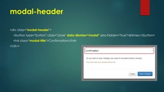
Downloaded 54 times


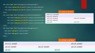
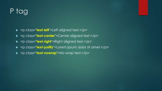
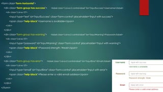
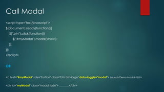
![Bootstrap grid classes
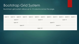
The Bootstrap grid system has four classes:
xs (for phones) [i.e col-xs-12 for full screen width]
sm (for tablets) [i.e col-sm-12 for full screen width]
md (for desktops) [i.e col-md-12 for full screen width]
lg (for larger desktops) [i.e col-lg-12 for full screen width]
The smaller size will affect the big size if no handle for the big size.](https://image.slidesharecdn.com/bootstarp-150618082337-lva1-app6891/85/Bootstarp-3-3-320.jpg)
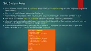
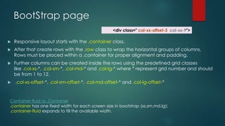
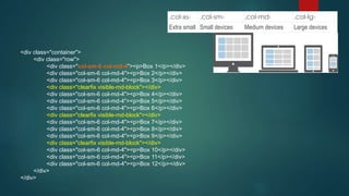
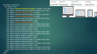


The document discusses Bootstrap's grid system and how to create responsive layouts using Bootstrap. Some key points: - Bootstrap's grid system uses 12 columns that work across different screen sizes (xs, sm, md, lg) - Rows are used to create horizontal groups of columns within a container - Columns are specified by class names like col-xs-6 to span a certain number of columns - Grid classes, containers, rows and columns are used to build responsive layouts that adapt to different devices