Download as PDF, PPTX
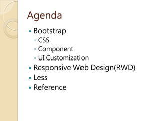


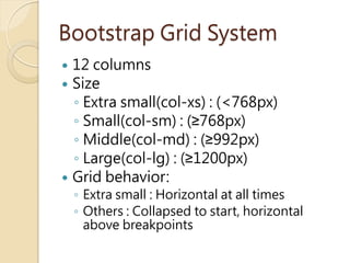


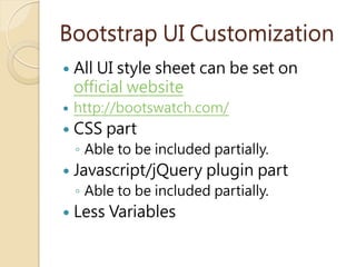

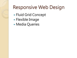


This document summarizes Bootstrap v3, including its use of HTML5, CSS3, the grid system, components, JavaScript integration, responsive design, and Less preprocessing. Key points include Bootstrap's 12 column fluid grid layout, common components like dropdowns and buttons, enabling components via JavaScript or markup, using media queries for responsive designs, and Less features like variables, mixins, and functions.