Download as PDF, PPTX

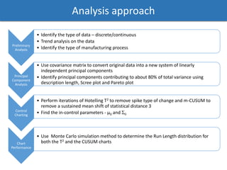
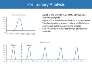
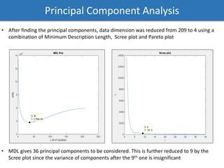
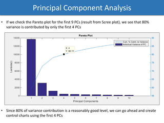
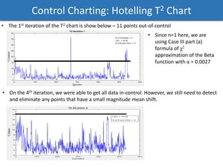

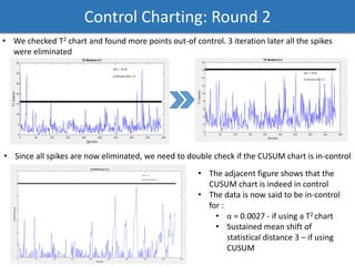
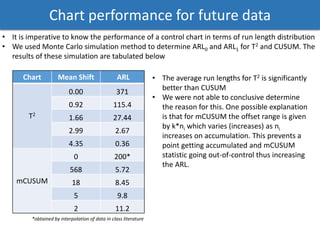
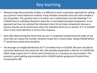

The document discusses a phased analysis of manufacturing process control, combining Hotelling's T2 and CUSUM methods. It details steps including data analysis, principal component analysis, and the development of control charts to detect out-of-control conditions. The findings indicate that Hotelling's T2 charts generally perform better in terms of average run length compared to CUSUM charts, though further iterations may be necessary for accuracy.