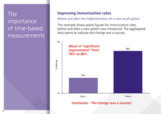
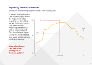
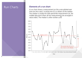
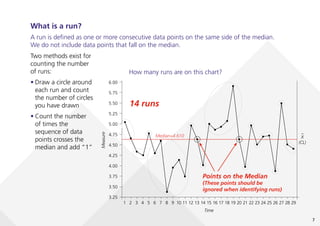
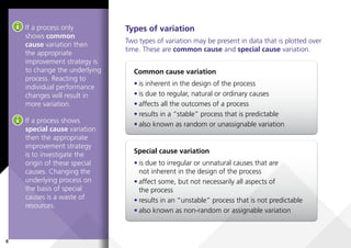
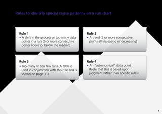
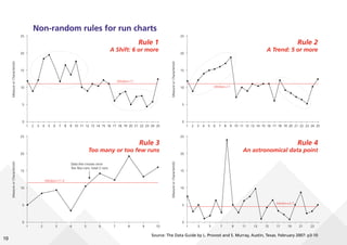
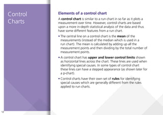
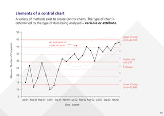
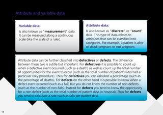
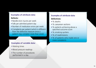
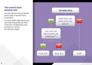
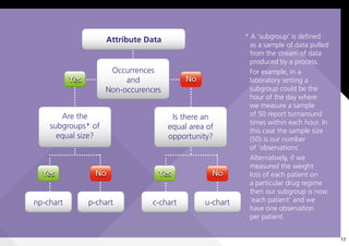
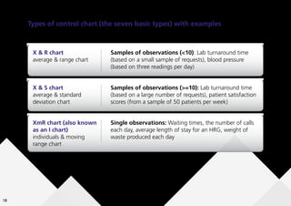
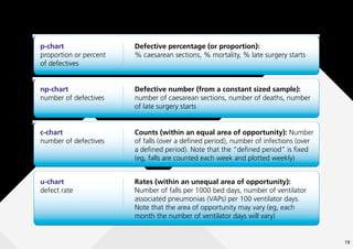
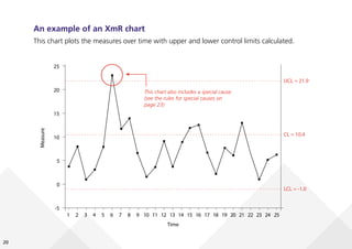
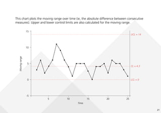
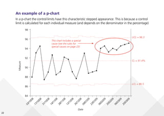
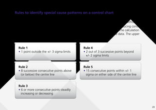
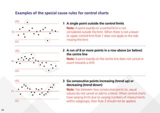
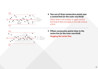
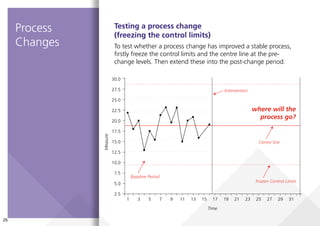
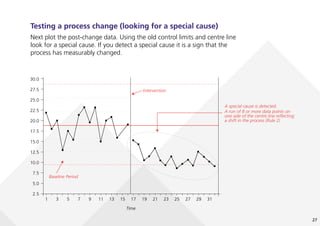
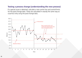
SlideShare a Scribd company logo
1 of 32
Download to read offline
Institute for Innovation
and Improvement
A guide to creating
and interpreting run
and control charts
Turning Data into Information
for Improvement
Using this guide
The NHS Institute has developed this guide as a
reminder to commissioners how to create and
analyse time-series data as part of their
improvement work.
It should help you ask the right questions
and to better assess whether a change
has led to an improvement.
Contents
The importance of time based
measurements..........................................4
Run Charts.
...............................................6
Control Charts........................................12
Process Changes.....................................26
Recommended Reading..........................29
4
75
90
%
take-up
Time 1
79%
86%
Time 2
Improving immunisation rates
Before and after the implementation of a new recall system
This example shows yearly figures for immunisation rates
before and after a new system was introduced. The aggregated
data seems to indicate the change was a success.
Conclusion - The change was a success!
The
importance
of time-based
measurements
Wow! A “significant
improvement” from
79% to 86%
5
Improving immunisation rates
Before and after the implementation of a new recall system
50
100
24 Months
75
%
take-up
79%
X
–
86%
New system implemented here
X
–
Now what do you
conclude about
the impact of
the new system?
However, viewing how the
rates have changed within
the two periods tells a
very different story. Here
we see that immunisation
rates were actually
improving until the new
system was introduced.
They then became worse.
Seeing this more detailed
time based picture prompts
a different response.
6
3.25
6.00
5.75
5.50
5.25
5.00
4.75
4.50
4.25
4.00
3.75
3.50
Measure
X
(CL)
Time
Median=4.610
1 2 3 4 5 6 7 8 9 10 11 12 13 14 15 16 17 18 19 20 21 22 23 24 25 26 27 28 29
~
Elements of a run chart
A run chart shows a measurement on the y-axis plotted over
time (on the x-axis). A centre line (CL) is drawn at the median.
The median is simply the 50th percentile measurement (ie, the
middle data point when all the measurements are arranged in
value order). The median is often written as X.
The centre line (CL) on a
Run Chart is the Median
Run Charts
7
3.25
6.00
5.75
5.50
5.25
5.00
4.75
4.50
4.25
4.00
3.75
3.50
Measure
X
(CL)
Time
Median=4.610
1 2 3 4 5 6 7 8 9 10 11 12 13 14 15 16 17 18 19 20 21 22 23 24 25 26 27 28 29
~
Two methods exist for
counting the number
of runs:
• Draw a circle around
each run and count
the number of circles
you have drawn
• Count the number
of times the
sequence of data
points crosses the
median and add “1”
What is a run?
A run is defined as one or more consecutive data points on the same side of the median.
We do not include data points that fall on the median.
How many runs are on this chart?
14 runs
Points on the Median
(These points should be
ignored when identifying runs)
8
Types of variation
Two types of variation may be present in data that is plotted over
time. These are common cause and special cause variation.
If a process only
shows common
cause variation then
the appropriate
improvement strategy is
to change the underlying
process. Reacting to
individual performance
changes will result in
more variation.
If a process shows
special cause variation
then the appropriate
improvement strategy
is to investigate the
origin of these special
causes. Changing the
underlying process on
the basis of special
causes is a waste of
resources.
Common cause variation
• is inherent in the design of the process
• is due to regular, natural or ordinary causes
• affects all the outcomes of a process
• results in a “stable” process that is predictable
• also known as random or unassignable variation
Special cause variation
• is due to irregular or unnatural causes that are
not inherent in the design of the process
• affect some, but not necessarily all aspects of
the process
• results in an “unstable” process that is not predictable
• also known as non-random or assignable variation
9
Rules to identify special cause patterns on a run chart
These non-random patterns indicate special cause variation on a run chart.
Rule 1
• A shift in the process or too many data
points in a run (6 or more consecutive
points above or below the median)
Rule 2
• A trend (5 or more consecutive
points all increasing or decreasing)
Rule 3
• Too many or too few runs (A table is
used in conjunction with this rule and is
shown on page 11)
Rule 4
• An “astronomical” data point
(Note that this is based upon
judgment rather than specific rules)
10
Non-random rules for run charts
0
25
20
15
10
5
Measure
or
Characteristic
1 2 3 4 5 6 7 8 9 10 11 12 13 14 15 16 17 18 19 20 21 22 23 24 25
Median=11
0
25
20
15
10
5
Measure
or
Characteristic
1 2 3 4 5 6 7 8 9 10 11 12 13 14 15 16 17 18 19 20 21 22 23 24 25
Median=11
0
25
20
15
10
5
Measure
or
Characteristic
1 2 3 4 5 6 7 8 9 10
Median=11.4
Data line crosses once
Too few runs: total 2 runs
0
25
20
15
10
5
Measure
or
Characteristic
1 3 5 7 9 11 13 15 17 19 21 23
Median=4.5
Rule 1
A Shift: 6 or more
Rule 2
A Trend: 5 or more
Rule 3
Too many or too few runs
Rule 4
An astronomical data point
Source: The Data Guide by L. Provost and S. Murray, Austin, Texas. February 2007: p3-10
11
11
Using Rule 3
(too few or too many runs)
Use this table to identify the lower and
upper limit for the number of runs.
First, calculate the number of useful
observations in your data set. This is
done by subtracting the number of data
points on the median from the total
number of data points.
Then, read across to establish the lower
and upper limits.
If the number of runs in your data falls
below the lower limit or above the
upper limit then this is a signal of a
special cause.
On the earlier example of a run chart
on page 7 we had 29 data points with
2 lying on the median. This gives us 27
useful observations. Using this table
for 27 useful observations we expect
between 9 and 19 runs. We in fact
found 14 so we do not have a special
cause according to Rule 3. Source: Quality Improvement: Practical Applications for
Medical Group Practice. D Balestracci and J L Barlow
12
Elements of a control chart
A control chart is similar to a run chart in so far as it plots a
measurement over time. However, control charts are based
upon a more in-depth statistical analysis of the data and thus
have some different features from a run chart.
• The central line on a control chart is the mean of the
measurements (instead of the median which is used in a
run chart). The mean is calculated by adding up all the
measurement points and then dividing by the total number of
measurement points.
• A control chart has upper and lower control limits shown
as horizontal lines across the chart. These lines are used when
identifying special causes. In some types of control chart
these lines can have a stepped appearance (as shown later for
a p-chart).
• Control charts have their own set of rules for identifying
special causes which are generally different from the rules
applied to run charts.
Control
Charts
13
Elements of a control chart
A variety of methods exist to create control charts. The type of chart is
determined by the type of data being analysed – variable or attribute.
5
50
25
30
35
40
45
20
15
10
Measure
-
Number
of
Complaints
Time - Month
Jan 01 Mar 01 May 01 Jul 01 Sep 01 Nov 01 Jan 02 Mar 02 May 02 Jul 02 Sep 02 Nov 02
Upper Control
Limit=44.855
A
A
B
B
C
C
Centre Line
=29.250
X (Mean)
–
Lower Control
Limit=13.645
An indication of
a special cause
14
Attribute and variable data
Variable data:
Is also known as “measurement” data.
It can be measured along a continuous
scale (like the scale of a ruler).
Attribute data:
Is also known as “discrete” or “count”
data. This type of data relates to
attributes that can be classified into
categories. For example, a patient is alive
or dead, pregnant or not pregnant.
Attribute data can be further classified into defectives or defects. The difference
between these two is subtle but important. For defectives it is possible to count up
when a defective event occurred (such as a death) as well as count up the total number
of opportunities for the event to occur (such as the total number of patients who had a
particular risky procedure). Thus for defectives you can calculate a percentage (such as
the percentage of deaths). For defects on the other hand it is possible to know when a
defect event occurred (such as a fall) but you do not know the number of non-defects
(such as the number of non-falls). Instead for defects you tend to know the opportunity
for a non-defect (such as the total number of patient days in hospital). Thus for defects
you tend to calculate a rate (such as falls per patient day).
15
Examples of attribute data
Defectives:
• % deaths
• % caesarean sections
• % patients achieving above a
specified outcome score
• % smoking quitters
• % of readmissions
• % of patients who made one or
more complaints
Examples of attribute data
Defects:
• Needle-stick injuries per week
• Falls per admitted patient day
• Number of medication errors per week
• Complaints per patient (which is different
from the defective measure since a
patient may complain more than once)
Examples of variable data:
• Waiting times
• Blood pressure readings
• The number of procedures
performed in a day
16
Variable Data
More than one
observation per
group?
Yes No
Less than ten
observations per
subgroup*?
X bar & R X bar & S
Yes No
XmR
The control chart
decision tree
Use this decision tree to decide
which type of control chart
to produce.
In many health applications you
will most frequently use XmR
charts (for variable data) and
p-charts or u-charts
(for attribute data) .
17
* A ‘subgroup’ is defined
as a sample of data pulled
from the stream of data
produced by a process.
For example, in a
laboratory setting a
subgroup could be the
hour of the day where
we measure a sample
of 50 report turnaround
times within each hour. In
this case the sample size
(50) is our number
of ‘observations’.
Alternatively, if we
measured the weight
loss of each patient on
a particular drug regime
then our subgroup is now
‘each patient’ and we
have one observation
per patient.
Attribute Data
Occurrences
and
Non-occurences
Yes No
Are the
subgroups* of
equal size?
Is there an
equal area of
opportunity?
c-chart u-chart
Yes No
np-chart p-chart
Yes No
18
Types of control chart (the seven basic types) with examples
X & R chart
average & range chart
Charts for variable data
Samples of observations (<10): Lab turnaround time
(based on a small sample of requests), blood pressure
(based on three readings per day)
X & S chart
average & standard
deviation chart
Samples of observations (>=10): Lab turnaround time
(based on a large number of requests), patient satisfaction
scores (from a sample of 50 patients per week)
XmR chart (also known
as an I chart)
individuals & moving
range chart
Single observations: Waiting times, the number of calls
each day, average length of stay for an HRG, weight of
waste produced each day
19
Charts for attribute data
p-chart
proportion or percent
of defectives
Defective percentage (or proportion):
% caesarean sections, % mortality, % late surgery starts
np-chart
number of defectives
Defective number (from a constant sized sample):
number of caesarean sections, number of deaths, number
of late surgery starts
c-chart
number of defectives
Counts (within an equal area of opportunity): Number
of falls (over a defined period), number of infections (over
a defined period). Note that the “defined period” is fixed
(eg, falls are counted each week and plotted weekly)
u-chart
defect rate
Rates (within an unequal area of opportunity):
Number of falls per 1000 bed days, number of ventilator
associated pneumonias (VAPs) per 100 ventilator days.
Note that the area of opportunity may vary (eg, each
month the number of ventilator days will vary)
20
An example of an XmR chart
This chart plots the measures over time with upper and lower control limits calculated.
-5
25
20
15
10
5
0
Measure
Time
UCL = 21.9
CL = 10.4
LCL = -1.0
1 2 3 4 5 6 7 8 9 10 11 12 13 14 15 16 17 18 19 20 21 22 23 24 25
This chart also includes a special cause
(see the rules for special causes on
page 23)
21
-5
0
15
10
5
Moving
range
Time
UCL = 14
CL = 4.3
LCL = 0
5 10 15 20 25
This chart plots the moving range over time (ie, the absolute difference between consecutive
measures). Upper and lower control limits are also calculated for the moving range.
22
An example of a p-chart
In a p-chart the control limits have this characteristic stepped appearance. This is because a control
limit is calculated for each individual measure (and depends on the denominator in the percentage)
84
90
88
86
98
96
94
92
Measure
Date
UCL = 96.3
CL = 91.4%
LCL = 86.5
0
3
/
1
0
/
0
8
1
7
/
1
0
/
0
8
3
1
/
1
0
/
0
8
1
4
/
1
1
/
0
8
2
8
/
1
1
/
0
8
1
2
/
1
2
/
0
8
2
6
/
1
2
/
0
8
0
9
/
0
1
/
0
9
2
3
/
0
1
/
0
9
0
6
/
0
2
/
0
9
2
0
/
0
2
/
0
9
0
6
/
0
3
/
0
9
2
0
/
0
3
/
0
9
This chart includes a special
cause (see the rules for
special causes on page 23)
23
Rules to identify special cause patterns on a control chart
There are many rules to detect a special cause on a control chart. The following five rules are
recommended for general use and will suit most applications of control charts in healthcare.
The rules introduce the concept of “Sigma”. This is a value calculated when producing control
limits (and is routinely calculated in all software that produces control charts). The calculation
of sigma depends on the chart type but it is based upon the variability in the data. The upper
and lower control limits are set at +/- three sigma.
Rule 1
• 1 point outside the +/- 3 sigma limits
Rule 4
• 2 out of 3 successive points beyond
+/- 2 sigma limits
Rule 2
• 8 successive consecutive points above
(or below) the centre line
Rule 5
• 15 consecutive points within +/- 1
sigma on either side of the centre line
Rule 3
• 6 or more consecutive points steadily
increasing or decreasing
24
Examples of the special cause rules for control charts
UCL
CL
LCL
UCL
CL
LCL
UCL
CL
LCL
1 A single point outside the control limits
Note: A point exactly on a control limit is not
considered outside the limit. When there is not a lower
or upper control limit Rule 1 does not apply to the side
missing the limit.
2 A run of 8 or more points in a row above (or below)
the centre line
Note: A point exactly on the centre line does not cancel or
count towards a shift.
3 Six consecutive points increasing (trend up) or
decreasing (trend down)
Note: Ties between two consecutive points (ie, equal
values) do not cancel or add to a trend. When control charts
have varying limits due to varying numbers of measurments
within subgroups, then Rule 3 should not be applied.
25
UCL
Outer
one-third
of chart
CL
LCL
UCL
Inner
one-third
of chart
CL
LCL
4 Two out of three consecutive points near
a control limit (in the outer one-third)
When there is not a lower or upper control
limit Rule 4 does not apply to the side missing
a limit.
5 Fifteen consecutive points close to the
centre line (in the inner one-third)
Hugging the centre line.
26
2.5
1 3 5 7 9 11 13 15 17 19 21 23 25 27 29 31
20.0
17.5
15.0
12.5
10.0
7.5
5.0
30.0
27.5
25.0
22.5
Measure
Time
Intervention
Baseline Period
Frozen Control Limits
Centre line
Testing a process change
(freezing the control limits)
To test whether a process change has improved a stable process,
firstly freeze the control limits and the centre line at the pre-
change levels. Then extend these into the post-change period.
Process
Changes
where will the
process go?
27
Testing a process change (looking for a special cause)
Next plot the post-change data. Using the old control limits and centre line
look for a special cause. If you detect a special cause it is a sign that the
process has measurably changed.
2.5
1 3 5 7 9 11 13 15 17 19 21 23 25 27 29 31
20.0
17.5
15.0
12.5
10.0
7.5
5.0
30.0
27.5
25.0
22.5
Measure
Time
Intervention
Baseline Period
A special cause is detected.
A run of 8 or more data points on
one side of the centre line reflecting
a shift in the process (Rule 2)
28
2.5
1 3 5 7 9 11 13 15 17 19 21 23 25 27 29 31
20.0
17.5
15.0
12.5
10.0
7.5
5.0
30.0
27.5
25.0
22.5
Measure
Time
UCL = 15.3
A
A
B
B
C
C
CL = 10.7
LCL = 6.1
Intervention
Baseline Period
New control limits and
centre line based upon the
new (changed) process
Testing a process change (understanding the new process)
If a special cause is detected, calculate a new centre line and control limits
for the post-change data. These are calculated in exactly the same way as
usual but only using the post-change data.
29
Recommended Reading
This short guide has been produced by the NHS Institute for Innovation and Improvement to
support teams using run and control charts in service improvement projects.
The content of this guide is based upon the work of Dr Robert Lloyd (Executive Director
Performance Improvement, Institute for Healthcare Improvement). We are indebted to
Dr Lloyd for his support in helping us to promote the science of improvement in the NHS.
To learn more about the science of improvement and the use of run and control charts,
we recommend:
• R C Lloyd, Quality Healthcare: A guide to developing and using indicators, Jones
and Bartlett (2004)
• J C Benneyan, R C Lloyd, P E Plsek, Statistical process control as a tool for research
and healthcare improvement, Quality and Safety in Health Care 2003;12:458–464
• M A Mohammed, P Worthington, W H Woodall, Plotting basic control charts:
tutorial notes for healthcare practitioners, Quality and Safety in Health Care
2008;17:137–145.
• D Balestracci, J L Barlow, Quality Improvement: Practical Applications for Medical
Group Practice, Medical Group Management Association (1996)
30
Notes
31
Further copies of this guide can be ordered from
our online catalogue.
Product code: NHSICommruncont1
NHS Institute for Innovation and Improvement
Coventry House
University of Warwick
Coventry
CV4 7AL
Email: commissioning@institute.nhs.uk
www.institute.nhs.uk/commissioning
© NHS Institute for Innovation and Improvement 2009.
All Rights Reserved

More Related Content

Similar to A-guide-to-creating-and-interpreting-run-and-control-charts

Histogram, Pareto Diagram, Ishikawa Diagram, and Control Chart
Histogram, Pareto Diagram, Ishikawa Diagram, and Control ChartHistogram, Pareto Diagram, Ishikawa Diagram, and Control Chart
Histogram, Pareto Diagram, Ishikawa Diagram, and Control ChartNicola Ergo
 
process monitoring (statistical process control)
process monitoring (statistical process control)process monitoring (statistical process control)
process monitoring (statistical process control)Bindutesh Saner
 
Control charts[1]
Control charts[1]Control charts[1]
Control charts[1]66784532
 
A Practical Guide to Selecting the Right Control Chart eBook
A Practical Guide to Selecting the Right Control Chart eBookA Practical Guide to Selecting the Right Control Chart eBook
A Practical Guide to Selecting the Right Control Chart eBookB2B Marketing Source, LLC
 
Quality management information system
Quality management information systemQuality management information system
Quality management information systemselinasimpson341
 
Statistical quality control presentation
Statistical quality control presentationStatistical quality control presentation
Statistical quality control presentationSuchitra Sahu
 
UNIT III.pptx
UNIT III.pptxUNIT III.pptx
UNIT III.pptxMECHHOD6
 
Quality management methodology
Quality management methodologyQuality management methodology
Quality management methodologyselinasimpson2201
 
Quality management methodologies
Quality management methodologiesQuality management methodologies
Quality management methodologiesselinasimpson331
 
Quality management certificate
Quality management certificateQuality management certificate
Quality management certificateselinasimpson1401
 

Similar to A-guide-to-creating-and-interpreting-run-and-control-charts (20)

7 QC - NEW.ppt
7 QC - NEW.ppt7 QC - NEW.ppt
7 QC - NEW.ppt
 
7 quality management tools
7 quality management tools7 quality management tools
7 quality management tools
 
Histogram, Pareto Diagram, Ishikawa Diagram, and Control Chart
Histogram, Pareto Diagram, Ishikawa Diagram, and Control ChartHistogram, Pareto Diagram, Ishikawa Diagram, and Control Chart
Histogram, Pareto Diagram, Ishikawa Diagram, and Control Chart
 
process monitoring (statistical process control)
process monitoring (statistical process control)process monitoring (statistical process control)
process monitoring (statistical process control)
 
Control charts[1]
Control charts[1]Control charts[1]
Control charts[1]
 
Control Charts[1]
Control Charts[1]Control Charts[1]
Control Charts[1]
 
Control Charts[1]
Control Charts[1]Control Charts[1]
Control Charts[1]
 
A Practical Guide to Selecting the Right Control Chart eBook
A Practical Guide to Selecting the Right Control Chart eBookA Practical Guide to Selecting the Right Control Chart eBook
A Practical Guide to Selecting the Right Control Chart eBook
 
Quality management information system
Quality management information systemQuality management information system
Quality management information system
 
Statistical quality control presentation
Statistical quality control presentationStatistical quality control presentation
Statistical quality control presentation
 
Quality management pmp
Quality management pmpQuality management pmp
Quality management pmp
 
Quality_Tools1.ppt
Quality_Tools1.pptQuality_Tools1.ppt
Quality_Tools1.ppt
 
UNIT III.pptx
UNIT III.pptxUNIT III.pptx
UNIT III.pptx
 
Quality management methodology
Quality management methodologyQuality management methodology
Quality management methodology
 
Control charts
Control chartsControl charts
Control charts
 
Quality management quotes
Quality management quotesQuality management quotes
Quality management quotes
 
Quality data management
Quality data managementQuality data management
Quality data management
 
Quality data management
Quality data managementQuality data management
Quality data management
 
Quality management methodologies
Quality management methodologiesQuality management methodologies
Quality management methodologies
 
Quality management certificate
Quality management certificateQuality management certificate
Quality management certificate
 

Recently uploaded

Week-01-2.ppt BBB human Computer interaction
Week-01-2.ppt BBB human Computer interactionWeek-01-2.ppt BBB human Computer interaction
Week-01-2.ppt BBB human Computer interactionfulawalesam
 
Carero dropshipping via API with DroFx.pptx
Carero dropshipping via API with DroFx.pptxCarero dropshipping via API with DroFx.pptx
Carero dropshipping via API with DroFx.pptxolyaivanovalion
 
BigBuy dropshipping via API with DroFx.pptx
BigBuy dropshipping via API with DroFx.pptxBigBuy dropshipping via API with DroFx.pptx
BigBuy dropshipping via API with DroFx.pptxolyaivanovalion
 
BPAC WITH UFSBI GENERAL PRESENTATION 18_05_2017-1.pptx
BPAC WITH UFSBI GENERAL PRESENTATION 18_05_2017-1.pptxBPAC WITH UFSBI GENERAL PRESENTATION 18_05_2017-1.pptx
BPAC WITH UFSBI GENERAL PRESENTATION 18_05_2017-1.pptxMohammedJunaid861692
 
Call me @ 9892124323 Cheap Rate Call Girls in Vashi with Real Photo 100% Secure
Call me @ 9892124323  Cheap Rate Call Girls in Vashi with Real Photo 100% SecureCall me @ 9892124323  Cheap Rate Call Girls in Vashi with Real Photo 100% Secure
Call me @ 9892124323 Cheap Rate Call Girls in Vashi with Real Photo 100% SecurePooja Nehwal
 
Market Analysis in the 5 Largest Economic Countries in Southeast Asia.pdf
Market Analysis in the 5 Largest Economic Countries in Southeast Asia.pdfMarket Analysis in the 5 Largest Economic Countries in Southeast Asia.pdf
Market Analysis in the 5 Largest Economic Countries in Southeast Asia.pdfRachmat Ramadhan H
 
Invezz.com - Grow your wealth with trading signals
Invezz.com - Grow your wealth with trading signalsInvezz.com - Grow your wealth with trading signals
Invezz.com - Grow your wealth with trading signalsInvezz1
 
VIP Call Girls Service Miyapur Hyderabad Call +91-8250192130
VIP Call Girls Service Miyapur Hyderabad Call +91-8250192130VIP Call Girls Service Miyapur Hyderabad Call +91-8250192130
VIP Call Girls Service Miyapur Hyderabad Call +91-8250192130Suhani Kapoor
 
代办国外大学文凭《原版美国UCLA文凭证书》加州大学洛杉矶分校毕业证制作成绩单修改
代办国外大学文凭《原版美国UCLA文凭证书》加州大学洛杉矶分校毕业证制作成绩单修改代办国外大学文凭《原版美国UCLA文凭证书》加州大学洛杉矶分校毕业证制作成绩单修改
代办国外大学文凭《原版美国UCLA文凭证书》加州大学洛杉矶分校毕业证制作成绩单修改atducpo
 
Industrialised data - the key to AI success.pdf
Industrialised data - the key to AI success.pdfIndustrialised data - the key to AI success.pdf
Industrialised data - the key to AI success.pdfLars Albertsson
 
RA-11058_IRR-COMPRESS Do 198 series of 1998
RA-11058_IRR-COMPRESS Do 198 series of 1998RA-11058_IRR-COMPRESS Do 198 series of 1998
RA-11058_IRR-COMPRESS Do 198 series of 1998YohFuh
 
Data-Analysis for Chicago Crime Data 2023
Data-Analysis for Chicago Crime Data  2023Data-Analysis for Chicago Crime Data  2023
Data-Analysis for Chicago Crime Data 2023ymrp368
 
CebaBaby dropshipping via API with DroFX.pptx
CebaBaby dropshipping via API with DroFX.pptxCebaBaby dropshipping via API with DroFX.pptx
CebaBaby dropshipping via API with DroFX.pptxolyaivanovalion
 
Halmar dropshipping via API with DroFx
Halmar  dropshipping  via API with DroFxHalmar  dropshipping  via API with DroFx
Halmar dropshipping via API with DroFxolyaivanovalion
 
FESE Capital Markets Fact Sheet 2024 Q1.pdf
FESE Capital Markets Fact Sheet 2024 Q1.pdfFESE Capital Markets Fact Sheet 2024 Q1.pdf
FESE Capital Markets Fact Sheet 2024 Q1.pdfMarinCaroMartnezBerg
 
100-Concepts-of-AI by Anupama Kate .pptx
100-Concepts-of-AI by Anupama Kate .pptx100-Concepts-of-AI by Anupama Kate .pptx
100-Concepts-of-AI by Anupama Kate .pptxAnupama Kate
 
Introduction-to-Machine-Learning (1).pptx
Introduction-to-Machine-Learning (1).pptxIntroduction-to-Machine-Learning (1).pptx
Introduction-to-Machine-Learning (1).pptxfirstjob4
 
Brighton SEO | April 2024 | Data Storytelling
Brighton SEO | April 2024 | Data StorytellingBrighton SEO | April 2024 | Data Storytelling
Brighton SEO | April 2024 | Data StorytellingNeil Barnes
 
Mature dropshipping via API with DroFx.pptx
Mature dropshipping via API with DroFx.pptxMature dropshipping via API with DroFx.pptx
Mature dropshipping via API with DroFx.pptxolyaivanovalion
 

Recently uploaded (20)

Week-01-2.ppt BBB human Computer interaction
Week-01-2.ppt BBB human Computer interactionWeek-01-2.ppt BBB human Computer interaction
Week-01-2.ppt BBB human Computer interaction
 
Carero dropshipping via API with DroFx.pptx
Carero dropshipping via API with DroFx.pptxCarero dropshipping via API with DroFx.pptx
Carero dropshipping via API with DroFx.pptx
 
Sampling (random) method and Non random.ppt
Sampling (random) method and Non random.pptSampling (random) method and Non random.ppt
Sampling (random) method and Non random.ppt
 
BigBuy dropshipping via API with DroFx.pptx
BigBuy dropshipping via API with DroFx.pptxBigBuy dropshipping via API with DroFx.pptx
BigBuy dropshipping via API with DroFx.pptx
 
BPAC WITH UFSBI GENERAL PRESENTATION 18_05_2017-1.pptx
BPAC WITH UFSBI GENERAL PRESENTATION 18_05_2017-1.pptxBPAC WITH UFSBI GENERAL PRESENTATION 18_05_2017-1.pptx
BPAC WITH UFSBI GENERAL PRESENTATION 18_05_2017-1.pptx
 
Call me @ 9892124323 Cheap Rate Call Girls in Vashi with Real Photo 100% Secure
Call me @ 9892124323  Cheap Rate Call Girls in Vashi with Real Photo 100% SecureCall me @ 9892124323  Cheap Rate Call Girls in Vashi with Real Photo 100% Secure
Call me @ 9892124323 Cheap Rate Call Girls in Vashi with Real Photo 100% Secure
 
Market Analysis in the 5 Largest Economic Countries in Southeast Asia.pdf
Market Analysis in the 5 Largest Economic Countries in Southeast Asia.pdfMarket Analysis in the 5 Largest Economic Countries in Southeast Asia.pdf
Market Analysis in the 5 Largest Economic Countries in Southeast Asia.pdf
 
Invezz.com - Grow your wealth with trading signals
Invezz.com - Grow your wealth with trading signalsInvezz.com - Grow your wealth with trading signals
Invezz.com - Grow your wealth with trading signals
 
VIP Call Girls Service Miyapur Hyderabad Call +91-8250192130
VIP Call Girls Service Miyapur Hyderabad Call +91-8250192130VIP Call Girls Service Miyapur Hyderabad Call +91-8250192130
VIP Call Girls Service Miyapur Hyderabad Call +91-8250192130
 
代办国外大学文凭《原版美国UCLA文凭证书》加州大学洛杉矶分校毕业证制作成绩单修改
代办国外大学文凭《原版美国UCLA文凭证书》加州大学洛杉矶分校毕业证制作成绩单修改代办国外大学文凭《原版美国UCLA文凭证书》加州大学洛杉矶分校毕业证制作成绩单修改
代办国外大学文凭《原版美国UCLA文凭证书》加州大学洛杉矶分校毕业证制作成绩单修改
 
Industrialised data - the key to AI success.pdf
Industrialised data - the key to AI success.pdfIndustrialised data - the key to AI success.pdf
Industrialised data - the key to AI success.pdf
 
RA-11058_IRR-COMPRESS Do 198 series of 1998
RA-11058_IRR-COMPRESS Do 198 series of 1998RA-11058_IRR-COMPRESS Do 198 series of 1998
RA-11058_IRR-COMPRESS Do 198 series of 1998
 
Data-Analysis for Chicago Crime Data 2023
Data-Analysis for Chicago Crime Data  2023Data-Analysis for Chicago Crime Data  2023
Data-Analysis for Chicago Crime Data 2023
 
CebaBaby dropshipping via API with DroFX.pptx
CebaBaby dropshipping via API with DroFX.pptxCebaBaby dropshipping via API with DroFX.pptx
CebaBaby dropshipping via API with DroFX.pptx
 
Halmar dropshipping via API with DroFx
Halmar  dropshipping  via API with DroFxHalmar  dropshipping  via API with DroFx
Halmar dropshipping via API with DroFx
 
FESE Capital Markets Fact Sheet 2024 Q1.pdf
FESE Capital Markets Fact Sheet 2024 Q1.pdfFESE Capital Markets Fact Sheet 2024 Q1.pdf
FESE Capital Markets Fact Sheet 2024 Q1.pdf
 
100-Concepts-of-AI by Anupama Kate .pptx
100-Concepts-of-AI by Anupama Kate .pptx100-Concepts-of-AI by Anupama Kate .pptx
100-Concepts-of-AI by Anupama Kate .pptx
 
Introduction-to-Machine-Learning (1).pptx
Introduction-to-Machine-Learning (1).pptxIntroduction-to-Machine-Learning (1).pptx
Introduction-to-Machine-Learning (1).pptx
 
Brighton SEO | April 2024 | Data Storytelling
Brighton SEO | April 2024 | Data StorytellingBrighton SEO | April 2024 | Data Storytelling
Brighton SEO | April 2024 | Data Storytelling
 
Mature dropshipping via API with DroFx.pptx
Mature dropshipping via API with DroFx.pptxMature dropshipping via API with DroFx.pptx
Mature dropshipping via API with DroFx.pptx
 

A-guide-to-creating-and-interpreting-run-and-control-charts

  • 1. Institute for Innovation and Improvement A guide to creating and interpreting run and control charts Turning Data into Information for Improvement
  • 2. Using this guide The NHS Institute has developed this guide as a reminder to commissioners how to create and analyse time-series data as part of their improvement work. It should help you ask the right questions and to better assess whether a change has led to an improvement.
  • 3. Contents The importance of time based measurements..........................................4 Run Charts. ...............................................6 Control Charts........................................12 Process Changes.....................................26 Recommended Reading..........................29
  • 4. 4 75 90 % take-up Time 1 79% 86% Time 2 Improving immunisation rates Before and after the implementation of a new recall system This example shows yearly figures for immunisation rates before and after a new system was introduced. The aggregated data seems to indicate the change was a success. Conclusion - The change was a success! The importance of time-based measurements Wow! A “significant improvement” from 79% to 86%
  • 5. 5 Improving immunisation rates Before and after the implementation of a new recall system 50 100 24 Months 75 % take-up 79% X – 86% New system implemented here X – Now what do you conclude about the impact of the new system? However, viewing how the rates have changed within the two periods tells a very different story. Here we see that immunisation rates were actually improving until the new system was introduced. They then became worse. Seeing this more detailed time based picture prompts a different response.
  • 6. 6 3.25 6.00 5.75 5.50 5.25 5.00 4.75 4.50 4.25 4.00 3.75 3.50 Measure X (CL) Time Median=4.610 1 2 3 4 5 6 7 8 9 10 11 12 13 14 15 16 17 18 19 20 21 22 23 24 25 26 27 28 29 ~ Elements of a run chart A run chart shows a measurement on the y-axis plotted over time (on the x-axis). A centre line (CL) is drawn at the median. The median is simply the 50th percentile measurement (ie, the middle data point when all the measurements are arranged in value order). The median is often written as X. The centre line (CL) on a Run Chart is the Median Run Charts
  • 7. 7 3.25 6.00 5.75 5.50 5.25 5.00 4.75 4.50 4.25 4.00 3.75 3.50 Measure X (CL) Time Median=4.610 1 2 3 4 5 6 7 8 9 10 11 12 13 14 15 16 17 18 19 20 21 22 23 24 25 26 27 28 29 ~ Two methods exist for counting the number of runs: • Draw a circle around each run and count the number of circles you have drawn • Count the number of times the sequence of data points crosses the median and add “1” What is a run? A run is defined as one or more consecutive data points on the same side of the median. We do not include data points that fall on the median. How many runs are on this chart? 14 runs Points on the Median (These points should be ignored when identifying runs)
  • 8. 8 Types of variation Two types of variation may be present in data that is plotted over time. These are common cause and special cause variation. If a process only shows common cause variation then the appropriate improvement strategy is to change the underlying process. Reacting to individual performance changes will result in more variation. If a process shows special cause variation then the appropriate improvement strategy is to investigate the origin of these special causes. Changing the underlying process on the basis of special causes is a waste of resources. Common cause variation • is inherent in the design of the process • is due to regular, natural or ordinary causes • affects all the outcomes of a process • results in a “stable” process that is predictable • also known as random or unassignable variation Special cause variation • is due to irregular or unnatural causes that are not inherent in the design of the process • affect some, but not necessarily all aspects of the process • results in an “unstable” process that is not predictable • also known as non-random or assignable variation
  • 9. 9 Rules to identify special cause patterns on a run chart These non-random patterns indicate special cause variation on a run chart. Rule 1 • A shift in the process or too many data points in a run (6 or more consecutive points above or below the median) Rule 2 • A trend (5 or more consecutive points all increasing or decreasing) Rule 3 • Too many or too few runs (A table is used in conjunction with this rule and is shown on page 11) Rule 4 • An “astronomical” data point (Note that this is based upon judgment rather than specific rules)
  • 10. 10 Non-random rules for run charts 0 25 20 15 10 5 Measure or Characteristic 1 2 3 4 5 6 7 8 9 10 11 12 13 14 15 16 17 18 19 20 21 22 23 24 25 Median=11 0 25 20 15 10 5 Measure or Characteristic 1 2 3 4 5 6 7 8 9 10 11 12 13 14 15 16 17 18 19 20 21 22 23 24 25 Median=11 0 25 20 15 10 5 Measure or Characteristic 1 2 3 4 5 6 7 8 9 10 Median=11.4 Data line crosses once Too few runs: total 2 runs 0 25 20 15 10 5 Measure or Characteristic 1 3 5 7 9 11 13 15 17 19 21 23 Median=4.5 Rule 1 A Shift: 6 or more Rule 2 A Trend: 5 or more Rule 3 Too many or too few runs Rule 4 An astronomical data point Source: The Data Guide by L. Provost and S. Murray, Austin, Texas. February 2007: p3-10
  • 11. 11 11 Using Rule 3 (too few or too many runs) Use this table to identify the lower and upper limit for the number of runs. First, calculate the number of useful observations in your data set. This is done by subtracting the number of data points on the median from the total number of data points. Then, read across to establish the lower and upper limits. If the number of runs in your data falls below the lower limit or above the upper limit then this is a signal of a special cause. On the earlier example of a run chart on page 7 we had 29 data points with 2 lying on the median. This gives us 27 useful observations. Using this table for 27 useful observations we expect between 9 and 19 runs. We in fact found 14 so we do not have a special cause according to Rule 3. Source: Quality Improvement: Practical Applications for Medical Group Practice. D Balestracci and J L Barlow
  • 12. 12 Elements of a control chart A control chart is similar to a run chart in so far as it plots a measurement over time. However, control charts are based upon a more in-depth statistical analysis of the data and thus have some different features from a run chart. • The central line on a control chart is the mean of the measurements (instead of the median which is used in a run chart). The mean is calculated by adding up all the measurement points and then dividing by the total number of measurement points. • A control chart has upper and lower control limits shown as horizontal lines across the chart. These lines are used when identifying special causes. In some types of control chart these lines can have a stepped appearance (as shown later for a p-chart). • Control charts have their own set of rules for identifying special causes which are generally different from the rules applied to run charts. Control Charts
  • 13. 13 Elements of a control chart A variety of methods exist to create control charts. The type of chart is determined by the type of data being analysed – variable or attribute. 5 50 25 30 35 40 45 20 15 10 Measure - Number of Complaints Time - Month Jan 01 Mar 01 May 01 Jul 01 Sep 01 Nov 01 Jan 02 Mar 02 May 02 Jul 02 Sep 02 Nov 02 Upper Control Limit=44.855 A A B B C C Centre Line =29.250 X (Mean) – Lower Control Limit=13.645 An indication of a special cause
  • 14. 14 Attribute and variable data Variable data: Is also known as “measurement” data. It can be measured along a continuous scale (like the scale of a ruler). Attribute data: Is also known as “discrete” or “count” data. This type of data relates to attributes that can be classified into categories. For example, a patient is alive or dead, pregnant or not pregnant. Attribute data can be further classified into defectives or defects. The difference between these two is subtle but important. For defectives it is possible to count up when a defective event occurred (such as a death) as well as count up the total number of opportunities for the event to occur (such as the total number of patients who had a particular risky procedure). Thus for defectives you can calculate a percentage (such as the percentage of deaths). For defects on the other hand it is possible to know when a defect event occurred (such as a fall) but you do not know the number of non-defects (such as the number of non-falls). Instead for defects you tend to know the opportunity for a non-defect (such as the total number of patient days in hospital). Thus for defects you tend to calculate a rate (such as falls per patient day).
  • 15. 15 Examples of attribute data Defectives: • % deaths • % caesarean sections • % patients achieving above a specified outcome score • % smoking quitters • % of readmissions • % of patients who made one or more complaints Examples of attribute data Defects: • Needle-stick injuries per week • Falls per admitted patient day • Number of medication errors per week • Complaints per patient (which is different from the defective measure since a patient may complain more than once) Examples of variable data: • Waiting times • Blood pressure readings • The number of procedures performed in a day
  • 16. 16 Variable Data More than one observation per group? Yes No Less than ten observations per subgroup*? X bar & R X bar & S Yes No XmR The control chart decision tree Use this decision tree to decide which type of control chart to produce. In many health applications you will most frequently use XmR charts (for variable data) and p-charts or u-charts (for attribute data) .
  • 17. 17 * A ‘subgroup’ is defined as a sample of data pulled from the stream of data produced by a process. For example, in a laboratory setting a subgroup could be the hour of the day where we measure a sample of 50 report turnaround times within each hour. In this case the sample size (50) is our number of ‘observations’. Alternatively, if we measured the weight loss of each patient on a particular drug regime then our subgroup is now ‘each patient’ and we have one observation per patient. Attribute Data Occurrences and Non-occurences Yes No Are the subgroups* of equal size? Is there an equal area of opportunity? c-chart u-chart Yes No np-chart p-chart Yes No
  • 18. 18 Types of control chart (the seven basic types) with examples X & R chart average & range chart Charts for variable data Samples of observations (<10): Lab turnaround time (based on a small sample of requests), blood pressure (based on three readings per day) X & S chart average & standard deviation chart Samples of observations (>=10): Lab turnaround time (based on a large number of requests), patient satisfaction scores (from a sample of 50 patients per week) XmR chart (also known as an I chart) individuals & moving range chart Single observations: Waiting times, the number of calls each day, average length of stay for an HRG, weight of waste produced each day
  • 19. 19 Charts for attribute data p-chart proportion or percent of defectives Defective percentage (or proportion): % caesarean sections, % mortality, % late surgery starts np-chart number of defectives Defective number (from a constant sized sample): number of caesarean sections, number of deaths, number of late surgery starts c-chart number of defectives Counts (within an equal area of opportunity): Number of falls (over a defined period), number of infections (over a defined period). Note that the “defined period” is fixed (eg, falls are counted each week and plotted weekly) u-chart defect rate Rates (within an unequal area of opportunity): Number of falls per 1000 bed days, number of ventilator associated pneumonias (VAPs) per 100 ventilator days. Note that the area of opportunity may vary (eg, each month the number of ventilator days will vary)
  • 20. 20 An example of an XmR chart This chart plots the measures over time with upper and lower control limits calculated. -5 25 20 15 10 5 0 Measure Time UCL = 21.9 CL = 10.4 LCL = -1.0 1 2 3 4 5 6 7 8 9 10 11 12 13 14 15 16 17 18 19 20 21 22 23 24 25 This chart also includes a special cause (see the rules for special causes on page 23)
  • 21. 21 -5 0 15 10 5 Moving range Time UCL = 14 CL = 4.3 LCL = 0 5 10 15 20 25 This chart plots the moving range over time (ie, the absolute difference between consecutive measures). Upper and lower control limits are also calculated for the moving range.
  • 22. 22 An example of a p-chart In a p-chart the control limits have this characteristic stepped appearance. This is because a control limit is calculated for each individual measure (and depends on the denominator in the percentage) 84 90 88 86 98 96 94 92 Measure Date UCL = 96.3 CL = 91.4% LCL = 86.5 0 3 / 1 0 / 0 8 1 7 / 1 0 / 0 8 3 1 / 1 0 / 0 8 1 4 / 1 1 / 0 8 2 8 / 1 1 / 0 8 1 2 / 1 2 / 0 8 2 6 / 1 2 / 0 8 0 9 / 0 1 / 0 9 2 3 / 0 1 / 0 9 0 6 / 0 2 / 0 9 2 0 / 0 2 / 0 9 0 6 / 0 3 / 0 9 2 0 / 0 3 / 0 9 This chart includes a special cause (see the rules for special causes on page 23)
  • 23. 23 Rules to identify special cause patterns on a control chart There are many rules to detect a special cause on a control chart. The following five rules are recommended for general use and will suit most applications of control charts in healthcare. The rules introduce the concept of “Sigma”. This is a value calculated when producing control limits (and is routinely calculated in all software that produces control charts). The calculation of sigma depends on the chart type but it is based upon the variability in the data. The upper and lower control limits are set at +/- three sigma. Rule 1 • 1 point outside the +/- 3 sigma limits Rule 4 • 2 out of 3 successive points beyond +/- 2 sigma limits Rule 2 • 8 successive consecutive points above (or below) the centre line Rule 5 • 15 consecutive points within +/- 1 sigma on either side of the centre line Rule 3 • 6 or more consecutive points steadily increasing or decreasing
  • 24. 24 Examples of the special cause rules for control charts UCL CL LCL UCL CL LCL UCL CL LCL 1 A single point outside the control limits Note: A point exactly on a control limit is not considered outside the limit. When there is not a lower or upper control limit Rule 1 does not apply to the side missing the limit. 2 A run of 8 or more points in a row above (or below) the centre line Note: A point exactly on the centre line does not cancel or count towards a shift. 3 Six consecutive points increasing (trend up) or decreasing (trend down) Note: Ties between two consecutive points (ie, equal values) do not cancel or add to a trend. When control charts have varying limits due to varying numbers of measurments within subgroups, then Rule 3 should not be applied.
  • 25. 25 UCL Outer one-third of chart CL LCL UCL Inner one-third of chart CL LCL 4 Two out of three consecutive points near a control limit (in the outer one-third) When there is not a lower or upper control limit Rule 4 does not apply to the side missing a limit. 5 Fifteen consecutive points close to the centre line (in the inner one-third) Hugging the centre line.
  • 26. 26 2.5 1 3 5 7 9 11 13 15 17 19 21 23 25 27 29 31 20.0 17.5 15.0 12.5 10.0 7.5 5.0 30.0 27.5 25.0 22.5 Measure Time Intervention Baseline Period Frozen Control Limits Centre line Testing a process change (freezing the control limits) To test whether a process change has improved a stable process, firstly freeze the control limits and the centre line at the pre- change levels. Then extend these into the post-change period. Process Changes where will the process go?
  • 27. 27 Testing a process change (looking for a special cause) Next plot the post-change data. Using the old control limits and centre line look for a special cause. If you detect a special cause it is a sign that the process has measurably changed. 2.5 1 3 5 7 9 11 13 15 17 19 21 23 25 27 29 31 20.0 17.5 15.0 12.5 10.0 7.5 5.0 30.0 27.5 25.0 22.5 Measure Time Intervention Baseline Period A special cause is detected. A run of 8 or more data points on one side of the centre line reflecting a shift in the process (Rule 2)
  • 28. 28 2.5 1 3 5 7 9 11 13 15 17 19 21 23 25 27 29 31 20.0 17.5 15.0 12.5 10.0 7.5 5.0 30.0 27.5 25.0 22.5 Measure Time UCL = 15.3 A A B B C C CL = 10.7 LCL = 6.1 Intervention Baseline Period New control limits and centre line based upon the new (changed) process Testing a process change (understanding the new process) If a special cause is detected, calculate a new centre line and control limits for the post-change data. These are calculated in exactly the same way as usual but only using the post-change data.
  • 29. 29 Recommended Reading This short guide has been produced by the NHS Institute for Innovation and Improvement to support teams using run and control charts in service improvement projects. The content of this guide is based upon the work of Dr Robert Lloyd (Executive Director Performance Improvement, Institute for Healthcare Improvement). We are indebted to Dr Lloyd for his support in helping us to promote the science of improvement in the NHS. To learn more about the science of improvement and the use of run and control charts, we recommend: • R C Lloyd, Quality Healthcare: A guide to developing and using indicators, Jones and Bartlett (2004) • J C Benneyan, R C Lloyd, P E Plsek, Statistical process control as a tool for research and healthcare improvement, Quality and Safety in Health Care 2003;12:458–464 • M A Mohammed, P Worthington, W H Woodall, Plotting basic control charts: tutorial notes for healthcare practitioners, Quality and Safety in Health Care 2008;17:137–145. • D Balestracci, J L Barlow, Quality Improvement: Practical Applications for Medical Group Practice, Medical Group Management Association (1996)
  • 31. 31
  • 32. Further copies of this guide can be ordered from our online catalogue. Product code: NHSICommruncont1 NHS Institute for Innovation and Improvement Coventry House University of Warwick Coventry CV4 7AL Email: commissioning@institute.nhs.uk www.institute.nhs.uk/commissioning © NHS Institute for Innovation and Improvement 2009. All Rights Reserved