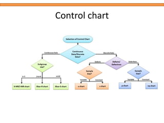
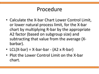
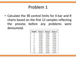
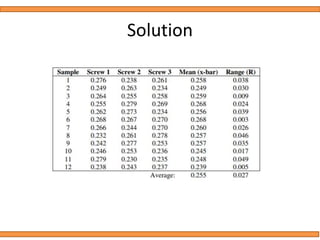
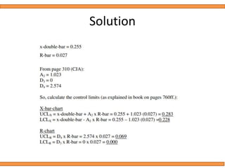
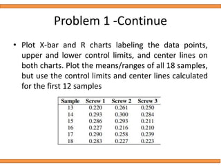
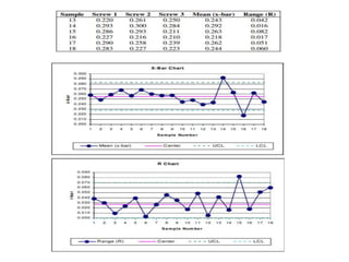
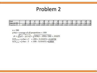
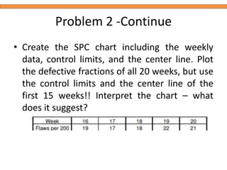
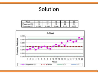
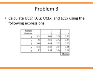
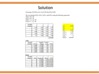
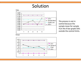
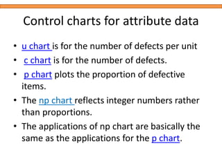
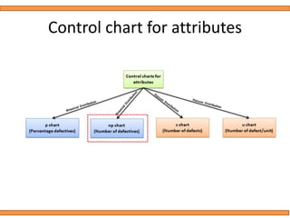
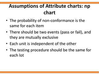
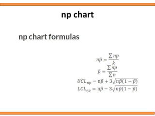
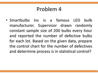
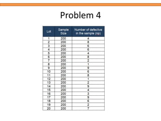
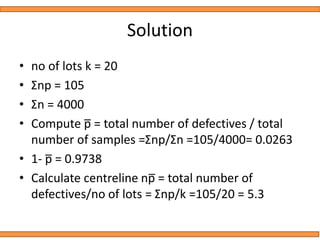
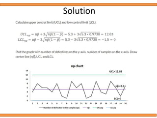
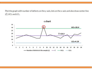
STATISTICAL QUALITY CONTROL
PROBLEMS
• X-bar chart: The mean or average change in
process over time from subgroup values. The
control limits on the X-Bar brings the sample’s
mean and center into consideration.
• R-chart: The range of the process over the
time from subgroups values. This monitors the
spread of the process over the time.
Use X Bar R Control Charts When:
• Even very stable process may have some minor variations,
which will cause the process instability. X bar R chart will
help to identify the process variation over the time
• When the data is assumed to be normally distributed.
• X bar R chart is for subgroup size more than one (for I-MR
chart the subgroup size is one only) and generally it is used
when rationally collect measurements in subgroup size is
between two and 10 observations.
• The X Bar S Control chart are to be consider when the
subgroup size is more than 10.
• When the collected data is in continuous (ie Length,
Weight) etc. and captures in time order
Control chart constants
Control chart
Procedure
• Calculate the average R value, or R-bar, and
plot this value as the centerline on the R
chart.
• Based on the subgroup size, select the
appropriate constant, called D4, and multiply
by R-bar to determine the Upper Control Limit
for the Range Chart. All constants are available
from the reference table.
UCL (R) = R-bar x D4
Procedure
• If the subgroup size is between 7 and 10,
select the appropriate constant, called D3, and
multiply by R-bar to determine the Lower
Control Limit for the Range Chart.
• There is no Lower Control Limit for the Range
Chart if the subgroup size is 6 or less.
• LCL(R) = R-bar x D3
Procedure
• Using the X-bar values for each subgroup,
compute the average of all Xbars, or X-bar-bar
(also called the Grand Average). Plot the X-bar-
bar value as the centerline on the X Chart
• Calculate the X-bar Chart Upper Control Limit, or
upper natural process limit, by multiplying R-bar
by the appropriate A2 factor (based on subgroup
size) and adding that value to the average (X-bar-
bar).
• UCL (X-bar) = X-bar-bar + (A2 x R-bar)
Procedure
• Calculate the X-bar Chart Lower Control Limit,
or lower natural process limit, for the X-bar
chart by multiplying R-bar by the appropriate
A2 factor (based on subgroup size) and
subtracting that value from the average (X-
barbar).
• LCL(X-bar) = X-bar-bar - (A2 x R-bar)
• Plot the Lower Control Limit on the X-bar
chart.
Problem 1
• Calculate the 3ϭ control limits for X-bar and R
charts based on the first 12 samples reflecting
the process before any problems were
denounced.
Solution
Solution
Problem 1 -Continue
• Plot X-bar and R charts labeling the data points,
upper and lower control limits, and center lines on
both charts. Plot the means/ranges of all 18 samples,
but use the control limits and center lines calculated
for the first 12 samples
Problem 1 -Continue
• Do you feel that the screw production process
is in control? Is there something suspicious?
The graphs confirm that the customers
complaints are justified – it really seems as if the
variation in the screw diameters has increased
significantly. The R-chart suggests significant
differences even within single samples! Clearly
some corrective measures have to be taken to
bring this process back under control!
Problem 2
• Calculate the 3ϭ control limits for the
supplier’s manufacturing process based on the
first 15 weeks (i.e. weeks 1-15, when the
quality of the alloy did not seem to be an
issue).
Problem 2
Problem 2 -Continue
• Create the SPC chart including the weekly
data, control limits, and the center line. Plot
the defective fractions of all 20 weeks, but use
the control limits and the center line of the
first 15 weeks!! Interpret the chart – what
does it suggest?
Solution
Inference from chart
• Clearly there is an upward tendency in the fraction of
defective packages of alloy. Even though the problem was
not noticed before week 15, it seems as if this process
started already in week 9.
• The magnitude of the fluctuations is not as alarming as is
the steady upward tendency. Even though only the very last
weeks reveal defective fractions outside the control limits,
the graph gives the impression that the fractions will keep
on increasing in future.
• Whatever the reasons for this increase might be, it leads to
severe quality problems of Screwed’s final products and
cannot be accepted. Definitely this problem should be
looked into more carefully …
Problem 3
• Calculate UCLr, LCLr, UCLx, and LCLx using the
following expressions:
Solution
Solution
The process is not in
control because the
sample mean for sample
4 (in the X-bar graph) falls
outside the control limits.
• np chart is one of the quality control charts is
used to assess trends and patterns in counts
of binary events (e.g., pass, fail) over time.
• np chart requires that the sample size of the
each subgroup be the same and compute
control limits based on the binomial
distribution.
Control charts for attribute data
• u chart is for the number of defects per unit
• c chart is for the number of defects.
• p chart plots the proportion of defective
items.
• The np chart reflects integer numbers rather
than proportions.
• The applications of np chart are basically the
same as the applications for the p chart.
Control chart for attributes
Assumptions of Attribute charts: np
chart
• The probability of non-conformance is the
same for each item
• There should be two events (pass or fail), and
they are mutually exclusive
• Each unit is independent of the other
• The testing procedure should be the same for
each lot
np chart
Problem 4
• Smartbulbs Inc is a famous LED bulb
manufacturer. Supervisor drawn randomly
constant sample size of 200 bulbs every hour
and reported the number of defective bulbs
for each lot. Based on the given data, prepare
the control chart for the number of defectives
and determine process is in statistical control?
Problem 4
Solution
• no of lots k = 20
• Σnp = 105
• Σn = 4000
• Compute p̅ = total number of defectives / total
number of samples =Σnp/Σn =105/4000= 0.0263
• 1- p̅ = 0.9738
• Calculate centreline np̅ = total number of
defectives/no of lots = Σnp/k =105/20 = 5.3
Solution
C Chart
• c chart is also known as the control chart for defects
(counting of the number of defects). It is generally used
to monitor the number of defects in constant size
units.
• There may be a single type of defect or several
different types, but the c chart tracks the total number
of defects in each unit and it assumes the underlying
data approximate the Poisson distribution.
• The unit may be a single item or a specified section of
items—for example, scratches on plated metal,
number of insufficient soldering in a printed circuit
board.
C Chart
C Chart
How do you Create a C Chart
• Determine the subgroup size. The subgroup size must be
large enough for the c chart; otherwise, control limits may
not be accurate when estimated from the data.
• Count the number of defects in each sample
• Compute centreline c̅ = total number of defects / number
of samples =Σc/k
• Calculate upper control limit (UCL) and low control limit
(LCL). If LCL is negative, then consider it as 0.
• Plot the graph with number of defects on the y-axis, lots on
the x-axis: Draw centerline, UCL and LCL. Use these limits to
monitor the number of defects going forward.
• Finally, interpret the data to determine whether the
process is in control.
Problem
• Mobile charger supplier drawn randomly
constant sample size of 500 chargers every
day for quality control test. Defects in each
charger are recorded during testing. Based on
the given data, draw the appropriate control
chart and comment on the state of control.
Quality control tool afor  process  capabilities

Quality control tool afor process capabilities

  • 1.
  • 2.
    • X-bar chart:The mean or average change in process over time from subgroup values. The control limits on the X-Bar brings the sample’s mean and center into consideration. • R-chart: The range of the process over the time from subgroups values. This monitors the spread of the process over the time.
  • 3.
    Use X BarR Control Charts When: • Even very stable process may have some minor variations, which will cause the process instability. X bar R chart will help to identify the process variation over the time • When the data is assumed to be normally distributed. • X bar R chart is for subgroup size more than one (for I-MR chart the subgroup size is one only) and generally it is used when rationally collect measurements in subgroup size is between two and 10 observations. • The X Bar S Control chart are to be consider when the subgroup size is more than 10. • When the collected data is in continuous (ie Length, Weight) etc. and captures in time order
  • 4.
  • 5.
  • 6.
    Procedure • Calculate theaverage R value, or R-bar, and plot this value as the centerline on the R chart. • Based on the subgroup size, select the appropriate constant, called D4, and multiply by R-bar to determine the Upper Control Limit for the Range Chart. All constants are available from the reference table. UCL (R) = R-bar x D4
  • 7.
    Procedure • If thesubgroup size is between 7 and 10, select the appropriate constant, called D3, and multiply by R-bar to determine the Lower Control Limit for the Range Chart. • There is no Lower Control Limit for the Range Chart if the subgroup size is 6 or less. • LCL(R) = R-bar x D3
  • 8.
    Procedure • Using theX-bar values for each subgroup, compute the average of all Xbars, or X-bar-bar (also called the Grand Average). Plot the X-bar- bar value as the centerline on the X Chart • Calculate the X-bar Chart Upper Control Limit, or upper natural process limit, by multiplying R-bar by the appropriate A2 factor (based on subgroup size) and adding that value to the average (X-bar- bar). • UCL (X-bar) = X-bar-bar + (A2 x R-bar)
  • 9.
    Procedure • Calculate theX-bar Chart Lower Control Limit, or lower natural process limit, for the X-bar chart by multiplying R-bar by the appropriate A2 factor (based on subgroup size) and subtracting that value from the average (X- barbar). • LCL(X-bar) = X-bar-bar - (A2 x R-bar) • Plot the Lower Control Limit on the X-bar chart.
  • 10.
    Problem 1 • Calculatethe 3ϭ control limits for X-bar and R charts based on the first 12 samples reflecting the process before any problems were denounced.
  • 11.
  • 12.
  • 13.
    Problem 1 -Continue •Plot X-bar and R charts labeling the data points, upper and lower control limits, and center lines on both charts. Plot the means/ranges of all 18 samples, but use the control limits and center lines calculated for the first 12 samples
  • 15.
    Problem 1 -Continue •Do you feel that the screw production process is in control? Is there something suspicious? The graphs confirm that the customers complaints are justified – it really seems as if the variation in the screw diameters has increased significantly. The R-chart suggests significant differences even within single samples! Clearly some corrective measures have to be taken to bring this process back under control!
  • 16.
    Problem 2 • Calculatethe 3ϭ control limits for the supplier’s manufacturing process based on the first 15 weeks (i.e. weeks 1-15, when the quality of the alloy did not seem to be an issue).
  • 17.
  • 18.
    Problem 2 -Continue •Create the SPC chart including the weekly data, control limits, and the center line. Plot the defective fractions of all 20 weeks, but use the control limits and the center line of the first 15 weeks!! Interpret the chart – what does it suggest?
  • 19.
  • 20.
    Inference from chart •Clearly there is an upward tendency in the fraction of defective packages of alloy. Even though the problem was not noticed before week 15, it seems as if this process started already in week 9. • The magnitude of the fluctuations is not as alarming as is the steady upward tendency. Even though only the very last weeks reveal defective fractions outside the control limits, the graph gives the impression that the fractions will keep on increasing in future. • Whatever the reasons for this increase might be, it leads to severe quality problems of Screwed’s final products and cannot be accepted. Definitely this problem should be looked into more carefully …
  • 21.
    Problem 3 • CalculateUCLr, LCLr, UCLx, and LCLx using the following expressions:
  • 22.
  • 23.
    Solution The process isnot in control because the sample mean for sample 4 (in the X-bar graph) falls outside the control limits.
  • 24.
    • np chartis one of the quality control charts is used to assess trends and patterns in counts of binary events (e.g., pass, fail) over time. • np chart requires that the sample size of the each subgroup be the same and compute control limits based on the binomial distribution.
  • 25.
    Control charts forattribute data • u chart is for the number of defects per unit • c chart is for the number of defects. • p chart plots the proportion of defective items. • The np chart reflects integer numbers rather than proportions. • The applications of np chart are basically the same as the applications for the p chart.
  • 26.
  • 27.
    Assumptions of Attributecharts: np chart • The probability of non-conformance is the same for each item • There should be two events (pass or fail), and they are mutually exclusive • Each unit is independent of the other • The testing procedure should be the same for each lot
  • 29.
  • 30.
    Problem 4 • SmartbulbsInc is a famous LED bulb manufacturer. Supervisor drawn randomly constant sample size of 200 bulbs every hour and reported the number of defective bulbs for each lot. Based on the given data, prepare the control chart for the number of defectives and determine process is in statistical control?
  • 31.
  • 32.
    Solution • no oflots k = 20 • Σnp = 105 • Σn = 4000 • Compute p̅ = total number of defectives / total number of samples =Σnp/Σn =105/4000= 0.0263 • 1- p̅ = 0.9738 • Calculate centreline np̅ = total number of defectives/no of lots = Σnp/k =105/20 = 5.3
  • 33.
  • 34.
    C Chart • cchart is also known as the control chart for defects (counting of the number of defects). It is generally used to monitor the number of defects in constant size units. • There may be a single type of defect or several different types, but the c chart tracks the total number of defects in each unit and it assumes the underlying data approximate the Poisson distribution. • The unit may be a single item or a specified section of items—for example, scratches on plated metal, number of insufficient soldering in a printed circuit board.
  • 35.
  • 36.
  • 37.
    How do youCreate a C Chart • Determine the subgroup size. The subgroup size must be large enough for the c chart; otherwise, control limits may not be accurate when estimated from the data. • Count the number of defects in each sample • Compute centreline c̅ = total number of defects / number of samples =Σc/k • Calculate upper control limit (UCL) and low control limit (LCL). If LCL is negative, then consider it as 0. • Plot the graph with number of defects on the y-axis, lots on the x-axis: Draw centerline, UCL and LCL. Use these limits to monitor the number of defects going forward. • Finally, interpret the data to determine whether the process is in control.
  • 38.
    Problem • Mobile chargersupplier drawn randomly constant sample size of 500 chargers every day for quality control test. Defects in each charger are recorded during testing. Based on the given data, draw the appropriate control chart and comment on the state of control.