2. STEP ONE: PHOTOGRAPHS
Original
Tonemapped
Out of 47 photographs to choose from I’ve selected two
that would mostly fit my magazine idea and were slightly
scary to look at. I told the model to look serious as it
matches with the model of the magazine I was inspired
from which is the Empire magazine specifically from
August 2008 (Harry Potter themed). Since I wanted the
image to look scary, I needed to add more blue tones and
make the overall background darker. Therefore, I have
used a programme called Photomatix which is specifically
designed for HDR. It is a programme that specialises in
this section more than Photoshop. I’ve opened
Photomatix through a programme called Adobe
Photoshop Bridge which allowed me to efficiently locate,
organize, browse, preview, and batch process my context
files. By right-clicking the wanted photograph, I could
open it in various other programmes. Once I opened
Photomatix, I used specific filters called ‘Tonemapping’ in
order to make the background darker, without making the
image overly exposed and not lose it’s quality, this
technique saved me a lot of time.
3. STEP TWO: DIFFERENT CHOSEN PHOTOGRAPH
Original
Tonemapped & Photo-shopped
However, the first image that I’ve chosen to process wasn’t exactly
what I wanted. Therefore, I went back to my photographs and found
another image that matches more with my original idea. I like this
photograph a lot more because the
posture is more confident and her
Eyes look significantly more fierce.
I’ve done the same process using
Photomatix to ‘Tonemap’ this image making the
background a lot darker. Then, I proceeded to open
the saved (Tonemapped) photograph as a JPG and
opened it in Photoshop. In Photoshop, I’ve
darkened the background further using a blend
mode layer set on ‘Multiply’. On her face, I
smoothened some harsh shadows made by the
studio light using a blending brush and made her
eye colour a lot stronger using an ‘Overlay’ layer
and a soft brush. Finally, I’ve used an adjustment
setting called ‘Colour Balance’ to make the image
more blue and purple by adjusting the colour
sliders.
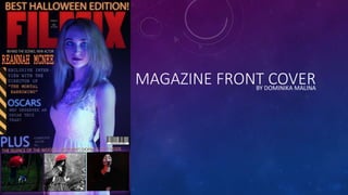
4. STEP THREE: TITLE & FEATURES
Then, I’ve placed a big and bold magazine title
behind the model by erasing some parts of the
layer making the image a lot more noticeable as if
the model is standing in front of the text. The
yellow bar on the right side was inspired by the
same ‘Empire’ magazine I’ve stated previously.
The yellow bar brings attention to the ‘Features’.
Many film magazines have sub-images of other
films to show that they are also reviewed within
the magazine. I wanted to replicate that in order
to make my magazine look busier, therefore I used
some personal photography. At first the low
quality photograph didn’t look professional so I’ve
removed it and found some high quality
photographs I’ve taken that match the mood of
the magazine. Overall, this magazine has a Title,
Headline, Features, Main Image, Sub-Images,
Barcode, Issue Number, Date and a Tagline.