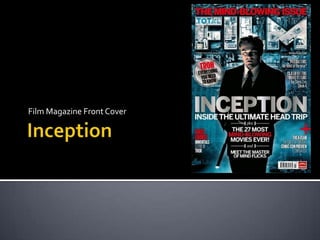
2. The layout of the magazine cover is good as it allows you to see the
balance of both text and the central image.
Cover lines on the right hand side is right hand aligned and the cover
lines on the left hand side is left hand aligned. This is to make sure that
there isn’t too much text layering over the top of the central image. It
also helps to cover up areas on the sides which would have looked a bit
empty.
The image is placed in the centre to attract attention.
The title of the film “Inception” is placed just below the mid point of the
magazine. As it overlaps the central image we assume the text and
image are linked.
The barcode and the publishing logo “Future” is placed in the
bottom right hand corner. This is because it isn’t important
information so it doesn’t need to stand out.
Buzz words are placed below “Inception” in the centre. The buzz
words are aligned to the outline of the central image in the
background. Therefore, the background for the buzz words is
the mans trousers.
3. The Masthead “Total Film” is written in a big font size and in capital letters to
make sure the brand title of the film magazine stands out so regular readers
can spot the magazine easily. All the lettering is the same size.
It is placed almost at the top of the cover and stretches from one side to the
other which makes it stand out.
The masthead “Total Film” is simple and easy to remember. It makes it clear
to readers what the magazine is about.
The colour of the masthead is similar to the background and other text
allowing the different components of the cover to visually work together. The
masthead uses the same colours as the background but slightly brighter to
allow it to stand out and have a slight 3D effect.
To make sure the masthead doesn’t dominate the cover, the central
image party overlaps it. This helps to draw attention to the image.
The word “Total” is written in the top line of the letter “F” but in a
different colour to the word “Film”. This allows a slightly long
masthead to not take up too much space on the page.
4. The price is placed next to the season it was released and the issue
number. The magazine price is £3.99. This is written in a small font
as it isn’t something that will help to sell the magazine. It is just
there to inform readers how much the magazine will cost.
Under the letter “F” the text says “Summer 2010 Issue 169”. This
informs readers what season the magazine relates to and which
issue the magazine is. This means regular readers will be able to
keep track of issues they have or ones they have missed. The font
size is fairly small as it isn’t something that will necessarily help to
sell the magazine. It is just information which some readers may
find useful.
The barcode is placed in the bottom right hand corner. It
is placed out of the way as it isn’t something which would
help to sell the magazine. Therefore, it doesn’t need to
attract viewers eyes. It is next to the logo of the company
that published the magazine “Future”.
5. There are four main colours which are used on the magazine cover
which are blue, silver/ white, black and red. Blue, white and black
work well together but the colour red is used to make certain text
stand out.
Blue and white are quite cold colours and they create a misty effect in
the bottom part of the background. This creates the feeling of
uncertainty in the film that is featuring on the front of the magazine:
“Inception”.
The silver colour which is used for “Inception” is also used for some of
the anchorage text on the right hand side and the fill colour of the
circle on the left hand side. Using the same colour for different areas
of the cover helps to bring it all together.
Colours can hint at some elements viewers can expect to see
in films. The central images main colour is black. As black is a
dark colour, it could imply that this person could have a dark
secret or is hiding something. Therefore, people may be
attracted to the magazine if they’re interested in dark or
mysterious films.
6. The fonts used are simple and therefore makes texts easy to read.
There are two main font types. One of the fonts is bold as the
lettering is quite thick (the words “Inception” and “The Mind
Blowing Issue” are examples of this font type). These words stand
out more compared to other words on the cover.
The other font type doesn’t stand out as much as the lettering is
thinner and the size tends to be smaller compared to the other
font (the words “Let Me In” and “Toy Story 3 vs Shrek 4”).
The words which are written in the font that stands out
the most are written in that font as they are the words
that would help to sell the magazine that most. The words
written in the smaller font is just additional information
which would still help to sell the magazine but might not
catches readers eyes as much.
7. The central image is simple. It’s Leonardo DiCaprio as Cobb from Inception.
It is a medium/ long shot as the whole of his legs are not in the shot.
The photograph was taken at a slightly low angle which makes it seem like he
is looking at something on the level we are viewing him from. It also suggests
his status in the film is quite high.
He is wearing a black suit. Black is a dark colour which implies the film could
have a dark and mysterious side to it. Light falls on one side of his face which
allows us to see his facial expression. He is serious which implies the film has
a serious side to it.
It takes up quite a lot of space. His head overlaps the title of the magazine
and he is placed in the centre of the cover which draws attention to
him.
As Leonardo DiCaprio is on the front cover and he is quite a famous
actor (been in films such as Titanic and Shutter Island) having his
image on the cover would attract some people towards the
magazine. Fans of his might be drawn towards the magazine to find
out more.
8. The anchorage text is “Inception” and “Inside The
Ultimate Head Trip”.
Anchorage text creates meaning for the central
image. We assume that the character on the
magazine cover is someone who features in the
film Inception. This is because the film title is
layering over the top of the central image.
The text provides little information about the film
which leaves people who view the front
cover wanting to find out more. Therefore, they
would be drawn into wanting to buy the
magazine to get more information.