
Recommended
Recommended
More Related Content
What's hot
What's hot (20)
Similar to Codes and conventions of a double page spread
Similar to Codes and conventions of a double page spread (20)
Recently uploaded
Recently uploaded (20)
Codes and conventions of a double page spread
- 1. CODES AND CONVENTIONS OF A DOUBLE PAGE SPREAD.
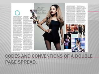
- 2. MAIN IMAGE. The main image usually takes up a large space in the article. The artist in the image usually uses direct address to entice the reader and make them want to read the article. The image is usually used to represent who/what the artist wants to be portrayed as.
- 3. IMAGE MISE-EN-SCENE The main image usually represents the artist. The way the artist is standing, how their hair is styled, their outfit, their make-up, their facial expression and their use of direct address or not all represent the artist in a way they choose to be represented. This way may also match the article and what it is about.
- 4. SUBSIDIARY IMAGES. Subsidiary images are smaller images used in the article, they are usually images of what the artist has talked about in the article. They entice the reader because if they see an interesting image they will want to read the article. They are used as a representation of the artist.
- 5. CAPTIONS. Captions are used next to or underneath the images to give the reader more information on what the pictures are. They can sometimes be a quote from the article.
- 6. DROP CAP. A drop cap is the big capital letter at the start of the article. It is usually a different colour and different font from the rest of the text in the article. It can be up to 10 lines deep. It adds style to the magazine and creates a brand.
- 7. The page number is usually in 11pt writing and is sometimes bold. It is used so the reader can find articles they are looking for. The mast head is the same as it is throughout the magazine. It is used to create a band for the magazine and make it recognisable. However, normally in other magazines it is a lot bigger. The date is used so regular readers can see what issue it is and how often new issues come out.
- 8. COLOUR SCHEME The colour scheme is usually 3-4 colours and very simple. It usually matches the main image and can often be a representation of the artist. The main colours uses here are black, white, grey and blue.
- 9. TYPOGRAPHY. The typography for the bulk body of the text is usually 11pt in size and a very simple font. This is so it is easy for readers to read.
- 10. FIRST LINE OF ARTICLE IN BOLD OR CAPS. The first line of the article can either be in bold or capital letters. In my example it is in capital letters. This is used to start he article off and make it entice the reader.
- 11. COLUMNS An article is usually set between 2 – 4 columns. This makes it look neat which will ultimately make the reader more likely to read the article. It is also done to fit the article onto the double page. My example has 4 articles.
- 12. DROP QUOTES. Some magazine quotes may include drop quotes, which are selected quotes from the article that are used o entice the reader and make them want to read the article to find out what the quote is
- 13. CODES AND CONVENTIONS THAT DID NOT FEATURE IN MY EXAMPLE. Headline Bold questions Article summary By-lines Website
- 14. HEADLINE Most articles have a headline across the top which is a few words long and draws the audience in. BOLD QUESTIONS Some articles may have the questions they have asked the artist in bold to make them stand out from the rest of the text
- 15. ARTICLE SUMMARY Some magazines may have an article summary before the article which sums up what it is going to be about. This entices the reader and can also help them decide if they feel the article is worth reading or not. BY-LINES Some articles also feature by-lines which tell you the name of the writer and the name of the photographer.
- 16. WEBSITE Some articles may also feature a website for the magazine. This may be used to give further article information or competition information. It may also be used for subscription information.