
Recommended
Recommended
More Related Content
What's hot
What's hot (20)
Viewers also liked
Viewers also liked (11)
Similar to Double Page Spread Analysis
Similar to Double Page Spread Analysis (20)
More from maddybrown
Recently uploaded
Recently uploaded (20)
Double Page Spread Analysis
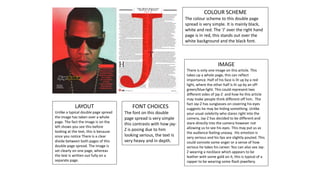
- 1. COLOUR SCHEME The colour scheme to this double page spread is very simple. It is mainly black, white and red. The ‘J’ over the right hand page is in red, this stands out over the white background and the black font. IMAGE There is only one image on this article. This takes up a whole page, this can reflect importance. Half of his face is lit up by a red light, where the other half is lit up by an off- green/blue light. This could represent two different sides of jay-Z and how he this article may make people think different off him. The fact Jay-Z has sunglasses on covering his eyes suggests he may be hiding something. Unlike your usual celebrity who stares right into the camera, Jay-Z has decided to be different and stare directly into the camera however not allowing us to see his eyes. This may put us as the audience feeling uneasy. His emotion is very serious and his lips are slightly pouted. This could connote some anger or a sense of how serious he takes his career. You can also see Jay- Z wearing a necklace which appears to be leather with some gold on it, this is typical of a rapper to be wearing some flash jewellery. FONT CHOICES The font on this double page spread is very simple this contrasts with how jay- Z is posing due to him looking serious, the text Is very heavy and in depth. LAYOUT Unlike a typical double page spread the image has taken over a whole page. The fact the image is on the left shows you see this before looking at the text, this is because once you notice There is a clear divide between both pages of this double page spread. The image is set clearly on one page, whereas the text is written out fully on a separate page.
- 2. COLOUR SCHEME The colour scheme on this double page spread is very dull. There is a major use of black and a dull cream/grey colour as the background. The pages however both have a similar overall tone to them, this brings both pages together. IMAGE The main image takes up a whole page of the double page spread. It is an extreme close up and you can clearly see his expression/ emotion. You can see the artist is staring directly into the camera this could show a sense of having no fear. You can see the artist is wearing a chequered shirt unbuttoned, we can also see his necklace which looks like leather. This shows a typical indie look. His hairstyle is quite messy/shaggy like, this represents his personality and individuality FONT CHOICES The headline is large and takes up a lot of the space on the article. The use of different sized words draws our attention to certain words which the writer wants us to read. LAYOUT The layout on this double page spread is also a typical double page spread. The image is on the left hand side taking up a whole page, this could represent importance. The title takes up half of the right hand side page with a large amount of text underneath, this is unusual and shows there must be an element of importance to the title.
- 3. COLOUR SCHEME The colour scheme on this double page spread is white, black and red. The background is an off-grey colour this isn’t pure white so connotes something more grunge like. The fact Lily Allen has a red and black shirt on her makes her stand out against the background showing she is the main image. IMAGE The main image on this double page spread shows Lily Allen towards the right of the page leaning forwards with her hands on her hips. This gives us the feeling that she is relaxed In her environment and that she is comfortable within herself. You can see her tattoos in this image, this shows her individuality and her way of expressing herself, along with this you can see her using her hairstyle to express herself as it is individual and unique. Her makeup on her face is quite simplistic however she has dark eyes which stand out and tells us she isn’t afraid to show her personality through her looks. She is also wearing a relaxed shirt to show she doesn’t feel the need to dress to impress people. Overall looking at how lily Allen has presented herself through this image we can see she is unique and has an individual grunge style identity. FONT CHOICES The font used on this double page spread for the main title is white on a black blocked background. This makes the title stand out more so it is more noticeable. This contrasts with the title as it says about Lily Allen being an ‘attention seeker’ yet this title attracts/seeks attention. The fact the title uses different sized letters shows a variety in the magazine and this could reflect the variety in Lily Allens music or the diversity in her personality. LAYOUT The layout is a very typical layout for a double page spread. This is obvious as Lily Allen is the main image on the right hand page. The title is very big and clear to see, this draws attention in and allows the reader to see clearly a slight insight to the article and what it is about . There is also an introductory line which tells us what the article is going to be about. These features are all key to a double page spread.
- 4. COLOUR SCHEME The colour scheme is mainly different shades of pinks with black font. The colour pink connotes feminism which is what Nicki stands for. Her outfit is zebra print this tells us she is different and unique. IMAGE The main image is just off the centre of the double page spread, with text surrounding It . Nicki is posing for the photo as this isn’t a relaxed stance, this shows the interview may be more formal. Nicki has her arm rested on the title and her own name. The fact she is leaning on it may represent ownership. The image has been placed where it is so it stands out from the rest of the text and shows her individuality. Nicki Minaj’s makeup is very full on, this is usually how we see Nicki Minaj. The fact she has bright pink lipstick on also shows the fact she is girly and contrasts with the pink font and background. LAYOUT The layout of the double page spread is very typical due to the fact it has text all over the page surrounding the image. The Title is bigger than the rest of the text especially ‘Nicki Minaj’s name this is so you can clearly see who the article is about. The image is just off the centre of the page, it is therefore still clear to see. The two pages connect into one as there is no initial divide we can clearly see. FONT CHOICES The font ‘the gospel according to’ is similar to the writing that is used in the bible, this is also represented when using the word ‘Gospel’. ‘Nicki Minaj’ is written in capitals and bold block writing. This is so it is easy to see and clearly stands out as the whole article is about Nicki.