1. This magazine is highly priced at
£3.90 due to it being a monthly
issue. This would mean the
magazine has more content.
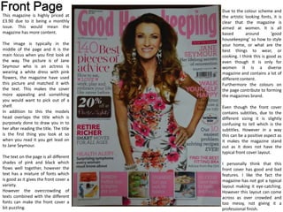
The image is typically in the
middle of the page and it is the
main focus when you first look at
the way. The picture is of Jane
Seymour who is an actress is
wearing a white dress with pink
flowers, the magazine have used
this picture and matched it with
the text. This makes the cover
more appealing and something
you would want to pick out of a
shelf.
In addition to this the models
head overlaps the title which is
purposely done to draw you in to
her after reading the title. The title
is the first thing you look at so
when you read it you get lead on
to Jane Seymour.
The text on the page is all different
shades of pink and black which
flows well together, however the
text has a mixture of fonts which
is good as it gives the front cover a
variety.
However the overcrowding of
texts combined with the different
fonts can make the front cover a
bit puzzling.
Due to the colour scheme and
the artistic looking fonts, it is
clear that the magazine is
aimed at women. It is all
based around ‘good
housekeeping’ so how to style
your home, or what are the
best things to wear, or
cooking. I think this is good as
even though it is only for
women it is a diverse
magazine and contains a lot of
different content.
Furthermore the colours on
the page contribute to forming
the magazines brand.
Even though the front cover
contains subtitles, due to the
different sizing it is slightly
confusing to tell which is the
subtitles. However in a way
this can be a positive aspect as
it makes the magazine stand
out as it does not have the
typical front cover layout.
I personally think that this
front cover has good and bad
features. I like the fact the
magazine has not got a typical
layout making it eye-catching.
However this layout can come
across as over crowded and
too messy, not giving it a
professional finish.
2. The contents is spread over two pages
and has a clear layout. This makes it easy
for the customer to find what they are
looking for. Like the other magazines I
have reviewed the page has a mixture of
pictures and text. Giving it a good
variation.
The font on the contents page is more
consistent and helps the magazine have a
formal approach. There are both subtitles
which are able to separate the page
numbers into sections, for example ‘good
food’.
One of the successful features
of the contents page is how
the pictures are numbers, and
explained in a clear format.
This is shown on the picture
on the right. By doing this the
magazine is really simple and
easy to navigate your way
around.
The title dominates the page as it is both bigger and bolder
drawing all attention to it. The red text for the title contributes
towards this. The magazine make it clear what issue it is with
the next big text on the page saying ‘March 2013’. I think this is
a good idea as it is easy to find and it is a valuable piece of
information.
The only thing I would change about this contents page is
making sure the text is spread out to ensure it isn't too
crowded.
3. I think this double page spread
flows really well and the magazine
has purposely matched the
colours within the pictures with
some of the text. The picture
covers most of the two pages and
the writing naturally goes around
it, this means that the page is
inviting and makes you want to
read on.
The title on the page is again
bigger to hold the dominance,
with the word ‘reinvention’ even
bigger than the rest of the title.
This is done as it is the main word
that links with the rest of the
content which makes it clear what
the article is about. The ‘Jane on..’
are in the baby blue colour so it
matches with the sofa in the
picture, creating that link, but also
making them split up the text so it
isn't in huge chunks. Making it
easier to read.
The double page spread is of Jane Seymour as shown on the front cover, this again helps the magazine flow and shows that it is well thought
out. Key quotes on the page is enlarged to make it stand out: “When you feel comfortable in your skin, you exude confidence”. The magazine
has done this to emphasize what the article is about resulting in the reader wanted to read more into it.
I think that this double page spread is really effective and is the best out of the three I have reviewed and analysed. This is because it has been
well thought out and the colours in the picture are matched in the text. I want to use these ideas of matching the picture with the rest of the
page to ensure my double page spread looks professional.