Sealdah % High Class Call Girls Kolkata - 450+ Call Girl Cash Payment 8005736...
Audience feedback
1. Angela Pignatiello
1
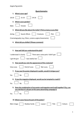
Questionnaire
1. What is your age?
18-20 21-23 24-26
2. What is your gender?
Male Female
3. What did you like about the trailer? (Tick as many as you like)
Acting Sound effects Creatures Plot
Cinematography (e.g. filters, camera angles/movements)
4. What did you dislike? (Please comment)
_____________________________________________________________
5. How well did you understand the plot?
I understood it clearly There were some parts I didn’t get
I got the gist I was totally lost
6. How would you rate the appearance of the creatures?
Very scary Kind of scary Not scary
7. If you saw the poster displayed in public, would it intrigue you?
Yes No
8. If you the magazine displayed, would you be tempted to read it?
Yes No
9. Does the combination of my poster and magazine work well together? (E.g. can
you tell that it’s all part of the same advertising campaign?)
Yes No
10. What is your favourite part of the poster?
Main image Shadow hands Layout Title Colours
2. Angela Pignatiello
2
11. Which part of the magazine catches you eye the most?
Masthead Title Main image Colours
Free posters Articles
12. What improvements would you make to the poster? (Please comment)
_______________________________________________________________________
13. What improvements would you make to the magazine?
3. Angela Pignatiello
3
Results
Q1.
Age 18 - 20 21 - 23 24 - 25
Result 5 3 2
Q2.
Male Female
6 4
Q3.
Acting Sound effects Creatures Plot Cinematography
8 8 9 9 10
Q4.
The lighting could be better in some scenes
Some of the creatures didn’t move
Q5.
Clearly understood Mostly understood Got the gist Didn’t understand
6 3 1 0
Q6.
Very scary Kind of scary Not scary
5 5 0
Q7.
Yes No
9 1
Q8.
Yes No
8 2
Q9.
Yes No
7 3
Q10.
Main image Shadow hands Layout Title Colours
8 0 1 0 1
Q11.
Masthead Title Main image Colours Free posters Articles
2 0 6 1 1 0
4. Angela Pignatiello
4
Q12.
The blue hoodie should be black
The shadow hands should be more obvious
The photo-shopping around the person and the pill could be better
Q13.
There’s a lot of colours. There should just be on element which stands out the most
(not the title as well as all the red bits etc…)
Could fill up some of the gaps (like near the bottom)