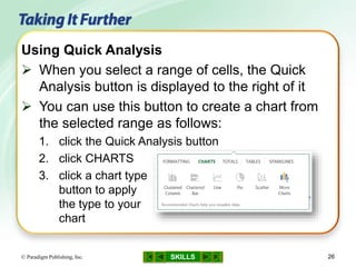
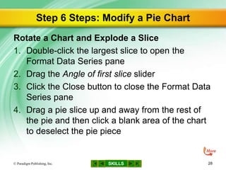
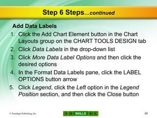
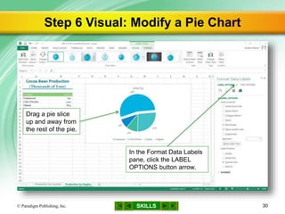
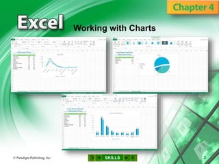
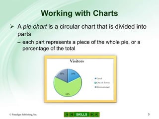
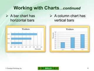
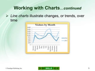
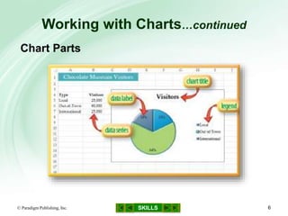
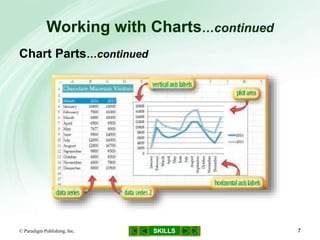
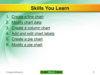
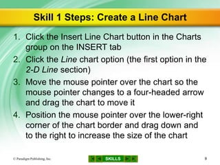
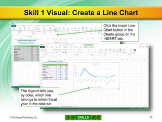
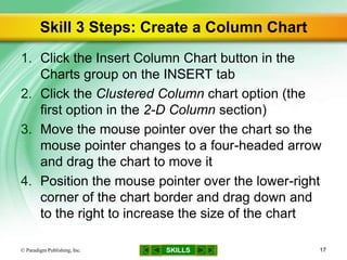
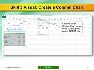
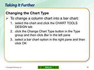
MODULE 6
SKILLS
Microsoft Excel 2013
Creating an Excel Workbook
Working with Formulas and
Functions
Formatting Cells
Working with Charts
© Paradigm Publishing, Inc. 1
SKILLS© Paradigm Publishing, Inc. 2
Working with Charts
SKILLS
Working with Charts
© Paradigm Publishing, Inc. 3
 A pie chart is a circular chart that is divided into
parts
– each part represents a piece of the whole pie, or a
percentage of the total
SKILLS
Working with Charts…continued
© Paradigm Publishing, Inc. 4
 A bar chart has
horizontal bars
 A column chart has
vertical bars
SKILLS
Working with Charts…continued
© Paradigm Publishing, Inc. 5
 Line charts illustrate changes, or trends, over
time
SKILLS
Working with Charts…continued
© Paradigm Publishing, Inc. 6
Chart Parts
SKILLS
Working with Charts…continued
© Paradigm Publishing, Inc. 7
Chart Parts…continued
SKILLS
Skills You Learn
1. Create a line chart
2. Modify chart data
3. Create a column chart
4. Add and edit chart labels
5. Create a pie chart
6. Modify a pie chart
© Paradigm Publishing, Inc. 8
SKILLS
Skill 1 Steps: Create a Line Chart
1. Click the Insert Line Chart button in the Charts
group on the INSERT tab
2. Click the Line chart option (the first option in the
2-D Line section)
3. Move the mouse pointer over the chart so the
mouse pointer changes to a four-headed arrow
and drag the chart to move it
4. Position the mouse pointer over the lower-right
corner of the chart border and drag down and
to the right to increase the size of the chart
© Paradigm Publishing, Inc. 9
SKILLS
Skill 1 Visual: Create a Line Chart
© Paradigm Publishing, Inc. 10
Click the Insert Line
Chart button in the
Charts group on the
INSERT tab.
The legend tells you,
by color, which line
belongs to which fiscal
year in the data set.
SKILLS© Paradigm Publishing, Inc. 11
Moving the Chart Location
 By default, a chart is placed in the existing
worksheet
 To move the chart to a new worksheet:
1. select the chart to make the CHART TOOLS
DESIGN tab active
2. click the Move Chart button in the Location group
and then select the New sheet option in the Move
Chart dialog box
3. click OK to move the chart to a new worksheet
named Chart1
CHECKPOINT QUESTION
SKILLS© Paradigm Publishing, Inc. 12
Which chart type would best compare the
attendance at an annual meeting for the past
four years?
a. column
b. line
c. pie
d. bar
1

SKILLS
Skill 2 Steps: Modify Chart Data
1. Drag the lower-right selection handle for the
blue selection box up to change the range
2. Notice that the chart updates automatically
3. Right-click a row heading
4. Click Insert to insert a new row
5. Type the data for that category of the chart,
pressing the Right Arrow key after each entry
6. Notice that the chart updates automatically
© Paradigm Publishing, Inc. 13
SKILLS
Skill 2 Visual: Modify Chart Data
© Paradigm Publishing, Inc. 14
Drag the lower-right
selection handle for
the blue selection box
up until you have
changed the range.
SKILLS© Paradigm Publishing, Inc. 15
Editing Chart Data
 To edit the data and labels in a chart:
1. select the chart
2. click the Select Data button in the Data group on the
CHART TOOLS DESIGN tab to open a dialog box
that shows the current axis labels and legend entries
3. click the Edit button
4. select the correct cells in the worksheet to change
the labels or the information in the legend
CHECKPOINT QUESTION
SKILLS© Paradigm Publishing, Inc. 16
When data is modified, the chart
automatically updates because it is
to the worksheet data.
a. merged
b. pasted
c. copied
d. linked
2

SKILLS
Skill 3 Steps: Create a Column Chart
1. Click the Insert Column Chart button in the
Charts group on the INSERT tab
2. Click the Clustered Column chart option (the
first option in the 2-D Column section)
3. Move the mouse pointer over the chart so the
mouse pointer changes to a four-headed arrow
and drag the chart to move it
4. Position the mouse pointer over the lower-right
corner of the chart border and drag down and
to the right to increase the size of the chart
© Paradigm Publishing, Inc. 17
SKILLS
Skill 3 Visual: Create a Column Chart
© Paradigm Publishing, Inc. 18
Click the Insert
Column Chart button
in the Charts group
on the INSERT tab.
SKILLS© Paradigm Publishing, Inc. 19
Changing the Chart Type
 To change a column chart into a bar chart:
1. select the chart and click the CHART TOOLS
DESIGN tab
2. click the Change Chart Type button in the Type
group and then click Bar in the left pane
3. select a bar chart option in the right pane and then
click OK
CHECKPOINT QUESTION
SKILLS© Paradigm Publishing, Inc. 20
Which chart type would best show the
average monthly rainfall for a year?
a. bar
b. column
c. line
d. pie
3

SKILLS
Skill 4 Steps: Add and Edit Chart Labels
1. Click the Chart Title placeholder
2. Triple-click the Chart Title placeholder text
3. Type the desired title of the chart
4. Click the Add Chart Element button in the Chart
Layouts group on the CHART TOOLS DESIGN
tab
5. Click Data Labels in the drop-down list
6. Click an option
© Paradigm Publishing, Inc. 21
SKILLS
Skill 4 Visual: Add and Edit Chart Labels
© Paradigm Publishing, Inc. 22
Click the Add Chart
Element button in the
Chart Layouts group
on the CHART
TOOLS DESIGN tab,
click an option such
as Data Labels, and
then click an option.
CHECKPOINT QUESTION
SKILLS© Paradigm Publishing, Inc. 23
A descriptive heading for a chart is a chart
a. layout.
b. label.
c. legend.
d. title.
4

SKILLS
Skill 5 Steps: Create a Pie Chart
1. In the Charts group on the INSERT tab, click
the Insert Pie or Doughnut Chart button
2. Click the Pie chart option (the first option in the
2-D Pie section)
3. Move the mouse pointer over the chart so the
mouse pointer changes to a four-headed arrow
and drag the chart to move it
4. Position the mouse pointer over the lower-right
corner of the chart border and drag down and
to the right to increase the size of the chart
© Paradigm Publishing, Inc. 24
SKILLS
Skill 5 Visual: Create a Pie Chart
© Paradigm Publishing, Inc. 25
Click the Insert Pie or
Doughnut Chart button
in the Charts group on
the INSERT tab.
SKILLS© Paradigm Publishing, Inc. 26
Using Quick Analysis
 When you select a range of cells, the Quick
Analysis button is displayed to the right of it
 You can use this button to create a chart from
the selected range as follows:
1. click the Quick Analysis button
2. click CHARTS
3. click a chart type
button to apply
the type to your
chart
CHECKPOINT QUESTION
SKILLS© Paradigm Publishing, Inc. 27
Which chart type would best show how much
of a company’s total salary budget was spent
on each department in the company?
a. pie
b. column
c. line
d. bar
5

SKILLS
Step 6 Steps: Modify a Pie Chart
Rotate a Chart and Explode a Slice
1. Double-click the largest slice to open the
Format Data Series pane
2. Drag the Angle of first slice slider
3. Click the Close button to close the Format Data
Series pane
4. Drag a pie slice up and away from the rest of
the pie and then click a blank area of the chart
to deselect the pie piece
© Paradigm Publishing, Inc. 28
SKILLS
Step 6 Steps…continued
Add Data Labels
1. Click the Add Chart Element button in the Chart
Layouts group on the CHART TOOLS DESIGN tab
2. Click Data Labels in the drop-down list
3. Click More Data Label Options and then click the
desired options
4. In the Format Data Labels pane, click the LABEL
OPTIONS button arrow
5. Click Legend, click the Left option in the Legend
Position section, and then click the Close button
© Paradigm Publishing, Inc. 29
SKILLS
Step 6 Visual: Modify a Pie Chart
© Paradigm Publishing, Inc. 30
In the Format Data Labels
pane, click the LABEL
OPTIONS button arrow.
Drag a pie slice
up and away from
the rest of the pie.
SKILLS© Paradigm Publishing, Inc. 31
Changing Pie Chart Themes and Styles
 If you apply a different theme to the file, using
the Theme button on the PAGE LAYOUT tab,
the colors in the chart update automatically
 Another way to modify the chart colors is to
apply a chart style as follows:
– click a thumbnail from the gallery in the Chart Styles
group on the CHART TOOLS DESIGN tab
or
– click the Style and Color button next to the selected
chart, click Style, and then click a different chart style
SKILLS© Paradigm Publishing, Inc. 32
Changing the Chart Legend
 The chart legend tells you which piece of data
each colored slice or line represents
 By default, Excel places the legend at the right
side of the chart
 To change the position of the legend:
1. click the Add Chart Element button in the CHART
TOOLS DESIGN tab
2. click Legend in the drop-down list
3. click the desired position in the list of options
OR
click None to remove the legend
SKILLS© Paradigm Publishing, Inc. 33
Using Quick Layout
 You can quickly change the overall layout of a
chart by following these steps:
1. click the Quick Layout button in the Chart Layouts
group on the FORMAT TOOLS DESIGN tab to
display a gallery of chart layouts
2. click an option from the gallery
CHECKPOINT QUESTION
SKILLS© Paradigm Publishing, Inc. 34
To explode a pie slice,
a. select it and then drag it away from the
other slices.
b. double-click it.
c. rotate it 220 degrees.
d. add data labels.
6

SKILLS
Tasks Summary: 1 of 2
© Paradigm Publishing, Inc. 35
SKILLS
Tasks Summary: 2 of 2
© Paradigm Publishing, Inc. 36

Gl13 m6-c4-presentation

  • 1.
    MODULE 6 SKILLS Microsoft Excel2013 Creating an Excel Workbook Working with Formulas and Functions Formatting Cells Working with Charts © Paradigm Publishing, Inc. 1
  • 2.
    SKILLS© Paradigm Publishing,Inc. 2 Working with Charts
  • 3.
    SKILLS Working with Charts ©Paradigm Publishing, Inc. 3  A pie chart is a circular chart that is divided into parts – each part represents a piece of the whole pie, or a percentage of the total
  • 4.
    SKILLS Working with Charts…continued ©Paradigm Publishing, Inc. 4  A bar chart has horizontal bars  A column chart has vertical bars
  • 5.
    SKILLS Working with Charts…continued ©Paradigm Publishing, Inc. 5  Line charts illustrate changes, or trends, over time
  • 6.
    SKILLS Working with Charts…continued ©Paradigm Publishing, Inc. 6 Chart Parts
  • 7.
    SKILLS Working with Charts…continued ©Paradigm Publishing, Inc. 7 Chart Parts…continued
  • 8.
    SKILLS Skills You Learn 1.Create a line chart 2. Modify chart data 3. Create a column chart 4. Add and edit chart labels 5. Create a pie chart 6. Modify a pie chart © Paradigm Publishing, Inc. 8
  • 9.
    SKILLS Skill 1 Steps:Create a Line Chart 1. Click the Insert Line Chart button in the Charts group on the INSERT tab 2. Click the Line chart option (the first option in the 2-D Line section) 3. Move the mouse pointer over the chart so the mouse pointer changes to a four-headed arrow and drag the chart to move it 4. Position the mouse pointer over the lower-right corner of the chart border and drag down and to the right to increase the size of the chart © Paradigm Publishing, Inc. 9
  • 10.
    SKILLS Skill 1 Visual:Create a Line Chart © Paradigm Publishing, Inc. 10 Click the Insert Line Chart button in the Charts group on the INSERT tab. The legend tells you, by color, which line belongs to which fiscal year in the data set.
  • 11.
    SKILLS© Paradigm Publishing,Inc. 11 Moving the Chart Location  By default, a chart is placed in the existing worksheet  To move the chart to a new worksheet: 1. select the chart to make the CHART TOOLS DESIGN tab active 2. click the Move Chart button in the Location group and then select the New sheet option in the Move Chart dialog box 3. click OK to move the chart to a new worksheet named Chart1
  • 12.
    CHECKPOINT QUESTION SKILLS© ParadigmPublishing, Inc. 12 Which chart type would best compare the attendance at an annual meeting for the past four years? a. column b. line c. pie d. bar 1 
  • 13.
    SKILLS Skill 2 Steps:Modify Chart Data 1. Drag the lower-right selection handle for the blue selection box up to change the range 2. Notice that the chart updates automatically 3. Right-click a row heading 4. Click Insert to insert a new row 5. Type the data for that category of the chart, pressing the Right Arrow key after each entry 6. Notice that the chart updates automatically © Paradigm Publishing, Inc. 13
  • 14.
    SKILLS Skill 2 Visual:Modify Chart Data © Paradigm Publishing, Inc. 14 Drag the lower-right selection handle for the blue selection box up until you have changed the range.
  • 15.
    SKILLS© Paradigm Publishing,Inc. 15 Editing Chart Data  To edit the data and labels in a chart: 1. select the chart 2. click the Select Data button in the Data group on the CHART TOOLS DESIGN tab to open a dialog box that shows the current axis labels and legend entries 3. click the Edit button 4. select the correct cells in the worksheet to change the labels or the information in the legend
  • 16.
    CHECKPOINT QUESTION SKILLS© ParadigmPublishing, Inc. 16 When data is modified, the chart automatically updates because it is to the worksheet data. a. merged b. pasted c. copied d. linked 2 
  • 17.
    SKILLS Skill 3 Steps:Create a Column Chart 1. Click the Insert Column Chart button in the Charts group on the INSERT tab 2. Click the Clustered Column chart option (the first option in the 2-D Column section) 3. Move the mouse pointer over the chart so the mouse pointer changes to a four-headed arrow and drag the chart to move it 4. Position the mouse pointer over the lower-right corner of the chart border and drag down and to the right to increase the size of the chart © Paradigm Publishing, Inc. 17
  • 18.
    SKILLS Skill 3 Visual:Create a Column Chart © Paradigm Publishing, Inc. 18 Click the Insert Column Chart button in the Charts group on the INSERT tab.
  • 19.
    SKILLS© Paradigm Publishing,Inc. 19 Changing the Chart Type  To change a column chart into a bar chart: 1. select the chart and click the CHART TOOLS DESIGN tab 2. click the Change Chart Type button in the Type group and then click Bar in the left pane 3. select a bar chart option in the right pane and then click OK
  • 20.
    CHECKPOINT QUESTION SKILLS© ParadigmPublishing, Inc. 20 Which chart type would best show the average monthly rainfall for a year? a. bar b. column c. line d. pie 3 
  • 21.
    SKILLS Skill 4 Steps:Add and Edit Chart Labels 1. Click the Chart Title placeholder 2. Triple-click the Chart Title placeholder text 3. Type the desired title of the chart 4. Click the Add Chart Element button in the Chart Layouts group on the CHART TOOLS DESIGN tab 5. Click Data Labels in the drop-down list 6. Click an option © Paradigm Publishing, Inc. 21
  • 22.
    SKILLS Skill 4 Visual:Add and Edit Chart Labels © Paradigm Publishing, Inc. 22 Click the Add Chart Element button in the Chart Layouts group on the CHART TOOLS DESIGN tab, click an option such as Data Labels, and then click an option.
  • 23.
    CHECKPOINT QUESTION SKILLS© ParadigmPublishing, Inc. 23 A descriptive heading for a chart is a chart a. layout. b. label. c. legend. d. title. 4 
  • 24.
    SKILLS Skill 5 Steps:Create a Pie Chart 1. In the Charts group on the INSERT tab, click the Insert Pie or Doughnut Chart button 2. Click the Pie chart option (the first option in the 2-D Pie section) 3. Move the mouse pointer over the chart so the mouse pointer changes to a four-headed arrow and drag the chart to move it 4. Position the mouse pointer over the lower-right corner of the chart border and drag down and to the right to increase the size of the chart © Paradigm Publishing, Inc. 24
  • 25.
    SKILLS Skill 5 Visual:Create a Pie Chart © Paradigm Publishing, Inc. 25 Click the Insert Pie or Doughnut Chart button in the Charts group on the INSERT tab.
  • 26.
    SKILLS© Paradigm Publishing,Inc. 26 Using Quick Analysis  When you select a range of cells, the Quick Analysis button is displayed to the right of it  You can use this button to create a chart from the selected range as follows: 1. click the Quick Analysis button 2. click CHARTS 3. click a chart type button to apply the type to your chart
  • 27.
    CHECKPOINT QUESTION SKILLS© ParadigmPublishing, Inc. 27 Which chart type would best show how much of a company’s total salary budget was spent on each department in the company? a. pie b. column c. line d. bar 5 
  • 28.
    SKILLS Step 6 Steps:Modify a Pie Chart Rotate a Chart and Explode a Slice 1. Double-click the largest slice to open the Format Data Series pane 2. Drag the Angle of first slice slider 3. Click the Close button to close the Format Data Series pane 4. Drag a pie slice up and away from the rest of the pie and then click a blank area of the chart to deselect the pie piece © Paradigm Publishing, Inc. 28
  • 29.
    SKILLS Step 6 Steps…continued AddData Labels 1. Click the Add Chart Element button in the Chart Layouts group on the CHART TOOLS DESIGN tab 2. Click Data Labels in the drop-down list 3. Click More Data Label Options and then click the desired options 4. In the Format Data Labels pane, click the LABEL OPTIONS button arrow 5. Click Legend, click the Left option in the Legend Position section, and then click the Close button © Paradigm Publishing, Inc. 29
  • 30.
    SKILLS Step 6 Visual:Modify a Pie Chart © Paradigm Publishing, Inc. 30 In the Format Data Labels pane, click the LABEL OPTIONS button arrow. Drag a pie slice up and away from the rest of the pie.
  • 31.
    SKILLS© Paradigm Publishing,Inc. 31 Changing Pie Chart Themes and Styles  If you apply a different theme to the file, using the Theme button on the PAGE LAYOUT tab, the colors in the chart update automatically  Another way to modify the chart colors is to apply a chart style as follows: – click a thumbnail from the gallery in the Chart Styles group on the CHART TOOLS DESIGN tab or – click the Style and Color button next to the selected chart, click Style, and then click a different chart style
  • 32.
    SKILLS© Paradigm Publishing,Inc. 32 Changing the Chart Legend  The chart legend tells you which piece of data each colored slice or line represents  By default, Excel places the legend at the right side of the chart  To change the position of the legend: 1. click the Add Chart Element button in the CHART TOOLS DESIGN tab 2. click Legend in the drop-down list 3. click the desired position in the list of options OR click None to remove the legend
  • 33.
    SKILLS© Paradigm Publishing,Inc. 33 Using Quick Layout  You can quickly change the overall layout of a chart by following these steps: 1. click the Quick Layout button in the Chart Layouts group on the FORMAT TOOLS DESIGN tab to display a gallery of chart layouts 2. click an option from the gallery
  • 34.
    CHECKPOINT QUESTION SKILLS© ParadigmPublishing, Inc. 34 To explode a pie slice, a. select it and then drag it away from the other slices. b. double-click it. c. rotate it 220 degrees. d. add data labels. 6 
  • 35.
    SKILLS Tasks Summary: 1of 2 © Paradigm Publishing, Inc. 35
  • 36.
    SKILLS Tasks Summary: 2of 2 © Paradigm Publishing, Inc. 36

Editor's Notes

  • #2 In Module 6, you learn about Microsoft Excel 2013. Chapter 1 covers creating an Excel workbook including entering data and navigating. Chapter 2 deals with performing calculations. In Chapter 3, you use formatting tools to add visual appeal. In Chapter 4, you learn about working with charts and graphs.
  • #3 The Chocolate Museum has a number of exhibits, including one that shows how much cocoa is produced in various countries. You prepare a pie chart and a column chart to illustrate these production levels by country. You apply a theme, add a style, and change the formatting to enhance the appearance of the charts. You also add descriptive titles so that the reader can easily understand the data represented in the charts.
  • #4 The example of a pie chart in this slide, Visitors, illustrates that out of all the visitors to The Chocolate Museum, 18% are from the local area, 64% are out-of-town visitors, and 18% are international visitors.
  • #5 You can use a bar chart or a column chart to compare differences between values. The examples of a bar chart (left) and a column chart (right) in this slide compare the total number of Chocolate Museum visitors by calendar year.
  • #6 The example of a line chart in this slide, Visitors by Month, shows how the number of monthly visitors to The Chocolate Museum varied through the years 2014 and 2015.
  • #7 This chapter helps you understand the parts of a chart, including the parts labeled in the examples in this slide and the next slide.
  • #8 This chapter helps you understand the parts of a chart, including the parts labeled in the examples in this slide and the previous slide.
  • #9 If you have a lot of numbers in a worksheet, a chart can simplify your understanding of the data by showing it in a visual arrangement. When you represent the data in a chart, you can easily show patterns or trends in the data. You can create a variety of chart types in Excel, including pie, bar, and line charts. Navigation Tip: In Slide Show view, click an underlined skill on this slide to navigate directly to the related slide. At any time in Slide Show view, you may navigate to the beginning of this presentation by clicking the left-most button at the bottom center of the slide. To navigate to the previous slide in this presentation, click the second button from the left. Click the SKILLS button to return to this slide. Click the button to the right of the SKILLS button to navigate to the next slide in this presentation, and click the right-most button to navigate to the end of this presentation.
  • #10 In this skill, you create a line chart. The line chart uses two series of data from the worksheet. One data series charts the cocoa bean production for several cocoa-producing countries for the fiscal year 2011/12 and the other data series charts that production for the fiscal year 2012/13. Once you create the line chart, you move and size the chart. If you are not sure which type of chart to use, click the Recommended Charts button in the Charts group to see if Excel can help. Hover the mouse pointer over a chart option to display the name of the chart. While you drag, the two-headed diagonal arrow displays as a cross. When you release the mouse pointer, the cross turns back into the two-headed diagonal arrow.
  • #11 In the line chart, the names of the countries that produce the cocoa are listed along the horizontal axis, and the cocoa bean production amounts are listed along the vertical axis. In a line chart, the chart legend tells you which line belongs to which category of data.
  • #12 This option automatically adjusts the size of the chart to fill the worksheet page.
  • #13 Navigation Tip: In Slide Show view, read the Checkpoint question and determine which answer is the correct answer. Click anywhere on the slide, and the correct answer will display in green with a green check mark beside it.
  • #14 When you select a chart, colored boxes appear around the data that you used to create the chart. Different colored boxes appear around the different parts of the chart. For example, the data series used to create the chart has a blue box around it. If you change a number in the data series or add another row to the data series, the chart automatically updates because it is linked to the worksheet data. In this skill, you practice editing chart data by removing a row from the chart data and then inserting a row with new data. Another Way: Click the Chart Filters button and then click to clear the a check box. Another Way: Press the Tab key rather than the Right Arrow key.
  • #15 The illustration in this illustration displays the blue selection box for the chart data range. The chart updates automatically, and the data is no longer included on the chart.
  • #16 Sometimes when you create a chart, the data and labels do not appear just the way you would like. You can also edit chart data by clicking the Chart Filters button and then checking or unchecking data you do not want displayed. You might want to save a separate copy of the file you used in Skill 2 and experiment with these editing tools.
  • #17 Navigation Tip: In Slide Show view, read the Checkpoint question and determine which answer is the correct answer. Click anywhere on the slide, and the correct answer will display in green with a green check mark beside it.
  • #18 In this skill, you create a column chart. Column charts compare differences between values over time.
  • #19 The illustration in this slide shows the options available in the Insert Column Chart button drop-down list. The column chart you create shows how the cocoa production in each country increased or decreased between the 2011/12 and the 2012/13 fiscal years.
  • #20 Bar charts, like column charts, can clearly show differences in charted values.
  • #21 Navigation Tip: In Slide Show view, read the Checkpoint question and determine which answer is the correct answer. Click anywhere on the slide, and the correct answer will display in green with a green check mark beside it.
  • #22 You can add and edit labels on a chart to make its elements easier to understand. When you create a chart, Excel adds some labels automatically, based on the data you selected to create the chart. You can edit these labels and add other labels using options on the CHART TOOLS DESIGN tab. For example, you can add individual data labels to show the quantity that a single column or pie slice represents. You can also edit the chart title and add x- and y-axis labels. You may want to use axis titles to describe what the numbers and labels along each axis represent. To add titles to the vertical or horizontal axis, click the Chart Elements button (looks like a plus sign), click Axis Titles, and then click the right-pointing arrow to see your options. You can place data labels in various places, such as the outside end of the data point, inside end of the data point, or centered on the data point. For some chart types, you can also select a Best Fit option that places the data labels where Excel determines they fit best in the chart.
  • #23 The illustration in this slide displays options available in the Add Chart Element button drop-down list. To hide a chart element, such as a chart title or legend, click the Chart Elements button next to the chart and then click to clear the element check box. Also use the Chart Elements button to add, delete, or change chart elements.
  • #24 Navigation Tip: In Slide Show view, read the Checkpoint question and determine which answer is the correct answer. Click anywhere on the slide, and the correct answer will display in green with a green check mark beside it.
  • #25 In this skill, you create a pie chart. A pie chart is a circular chart that is divided into parts. Each part represents a percentage of the total quantity. The pie chart you create represents the total amount of cocoa production for four countries. The pie is divided into four parts, one for each country’s cocoa production. The size of each piece represents how much of the total cocoa production comes from that country. A pie chart can contain only one data series.
  • #26 The illustration in this slide displays the options available in the Insert Pie or Doughnut Chart button drop-down list.
  • #27 After clicking CHARTS, hover over a chart type button to see how the selected data will appear in the chart.
  • #28 Navigation Tip: In Slide Show view, read the Checkpoint question and determine which answer is the correct answer. Click anywhere on the slide, and the correct answer will display in green with a green check mark beside it.
  • #29 You can rotate a pie chart and explode a slice away from the rest of the pie chart. Another Way: Type a value such as 220 in the Angle of first slice text box and press Enter.
  • #30 You can add data labels to a chart. By default, these will display as numbers without any special formatting, such as 1011. However, the data labels in pie charts typically display as a percentage, such as 80%. In this skill, you learn to display data labels as percentages.
  • #31 An exploded slice, as illustrated in this slide, sits outside the circle of the pie, to call attention to the content or data it represents.
  • #32 When you create a chart, the theme applied to the workbook file determines the chart colors. Chart styles change the chart color, and they may also change the chart background color and apply other effects.
  • #33 When the slices in a pie chart or the lines in a line chart have different colors, how do you know what the colors represent? You look at the chart legend. You can click More Legend Options to open the Format Legend pane with more options. You can choose None to remove the legend if you think the reader can easily understand the chart without it.
  • #34 For example, if you want the legend under the title and percentage data labels on a pie chart, click Layout 2.
  • #35 Navigation Tip: In Slide Show view, read the Checkpoint question and determine which answer is the correct answer. Click anywhere on the slide, and the correct answer will display in green with a green check mark beside it.
  • #36 The table in this slide, which continues on the next slide, lists the tasks covered in this chapter.
  • #37 The table in this slide, which continues from the previous slide, lists the tasks covered in this chapter.