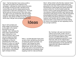
Generating and developing ideas
By Lusi Ndoja
Idea 1: My first idea that I have come up with is
very basic and similar to the original Irn-bru
campaigns. I will keep the colour scheme the same
the (orange and blue) but also I will still use the
humour they use with the original adverts as the
product like to make their campaign funny. The fonts
will be bold and chunky and as Irn-Bru have used.
This again is the very simple idea. Also the images
that will b used will be image more towards young
people as they will be ore likely to buy the product
and tis way it will get more young buying the drink.

Idea 3:I will use black and
white images (monochrome)
as this again is the original
technique Irn-bru use
originally . Also I will keep the
same colour scheme for this
again making them more
vibrant and funky. Also I could
use just a black and white
image and Photoshop the
photograph so they are
advertising the Irn-Bru and
leaving it in colour so it stands
out from the black and white
image, this will draw attention
to the product. The slogan will
be the colours of the product
again (orange and blue) .

Ideas

Idea 2: will be similar to the first idea, however I have
come up with having a Scottish based theme and
going back to the roots of the product as its Scottish
and wanting to make people more aware where the
product comes from. As the Scottish public like
humour I came up with having stereotypical Scottish
man playing a traditional Scottish sport wearing a kilt
and having a joke giving it humour. Also the log will be
photoshopped and will be replaced by the product
(Irn-bru) liking it the theme and where it comes from
making it very Scottish with the orange and blue
colours but akin it more vibrant and current making
the colours more brighter ad neon appealing more to
then younger audience.

Idea 4: my forth idea that I have come
up with is that I will still have the theme
of making the advert humoristic but
however I will change the colour
scheme of the product giving it a
different look, as the colour scheme
Irn-Bru has used is more aimed for the
male audience and not looking unisex
targeting it both for male and female.

My final idea I will used more feminine
colours such as pink, purple, red ect. I
have decided to do this as I want to give
the can a complete different colour
scheme and appearance giving it a more
fresh look. Also as the original colour
scheme looks more masculine I thought it
would appropriate to try the opposite and
experiment with different effects and
different audiences.
(orange and blue)
as this is the
original colours that
Pink, Purple
Irn-Bru have used
and red
to present their
product, this will
make the campaign
look more
Colour scheme
professional.

By researching
some of the
Neon colours,
existing Irn-Bru
making the
campaigns the
campaign bright,
layout is very
bold and eye
basic and
catching
simple.
As the product
Layout
is aimed at a
young audience
I have
Dark colours e.g. black
discovered
previously that
having more
Funky bold
image than text
fonts will be
will get the
used for the
audience to be
Fonts
campaign also
more hooked
I will be
and more
choosing a
willing to buy
font that will
Images
Bradley Hand ITC
the product.
be bold and
Photography:
Goudy Old
clear.
Taking you own images
Style
and also (booking out a
Broadway Stock images from
Also looking on Da
camera)
the internet
Font will help me
find even more
funky fonts that are
These are some of the
Black and white
more comedy that
fonts that will be
image (monochrome)
will fit into the
appealing and also
is popular with the
theme of my
some what appropriate
Irn-Bru as most of the
campaign idea.
for the target audience
images they have
as they are more

Mind Map

Generating and developing ideas

  • 1.
    Generating and developingideas By Lusi Ndoja
  • 2.
    Idea 1: Myfirst idea that I have come up with is very basic and similar to the original Irn-bru campaigns. I will keep the colour scheme the same the (orange and blue) but also I will still use the humour they use with the original adverts as the product like to make their campaign funny. The fonts will be bold and chunky and as Irn-Bru have used. This again is the very simple idea. Also the images that will b used will be image more towards young people as they will be ore likely to buy the product and tis way it will get more young buying the drink. Idea 3:I will use black and white images (monochrome) as this again is the original technique Irn-bru use originally . Also I will keep the same colour scheme for this again making them more vibrant and funky. Also I could use just a black and white image and Photoshop the photograph so they are advertising the Irn-Bru and leaving it in colour so it stands out from the black and white image, this will draw attention to the product. The slogan will be the colours of the product again (orange and blue) . Ideas Idea 2: will be similar to the first idea, however I have come up with having a Scottish based theme and going back to the roots of the product as its Scottish and wanting to make people more aware where the product comes from. As the Scottish public like humour I came up with having stereotypical Scottish man playing a traditional Scottish sport wearing a kilt and having a joke giving it humour. Also the log will be photoshopped and will be replaced by the product (Irn-bru) liking it the theme and where it comes from making it very Scottish with the orange and blue colours but akin it more vibrant and current making the colours more brighter ad neon appealing more to then younger audience. Idea 4: my forth idea that I have come up with is that I will still have the theme of making the advert humoristic but however I will change the colour scheme of the product giving it a different look, as the colour scheme Irn-Bru has used is more aimed for the male audience and not looking unisex targeting it both for male and female. My final idea I will used more feminine colours such as pink, purple, red ect. I have decided to do this as I want to give the can a complete different colour scheme and appearance giving it a more fresh look. Also as the original colour scheme looks more masculine I thought it would appropriate to try the opposite and experiment with different effects and different audiences.
  • 3.
    (orange and blue) asthis is the original colours that Pink, Purple Irn-Bru have used and red to present their product, this will make the campaign look more Colour scheme professional. By researching some of the Neon colours, existing Irn-Bru making the campaigns the campaign bright, layout is very bold and eye basic and catching simple. As the product Layout is aimed at a young audience I have Dark colours e.g. black discovered previously that having more Funky bold image than text fonts will be will get the used for the audience to be Fonts campaign also more hooked I will be and more choosing a willing to buy font that will Images Bradley Hand ITC the product. be bold and Photography: Goudy Old clear. Taking you own images Style and also (booking out a Broadway Stock images from Also looking on Da camera) the internet Font will help me find even more funky fonts that are These are some of the Black and white more comedy that fonts that will be image (monochrome) will fit into the appealing and also is popular with the theme of my some what appropriate Irn-Bru as most of the campaign idea. for the target audience images they have as they are more Mind Map