Download as ODP, PPTX
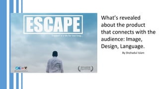

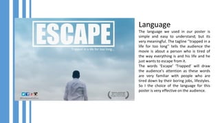


The document discusses how image, language, and design were used in a movie poster to effectively connect with the target audience. The image shows a sense of loneliness, emptiness, and freedom represented by an open sky and a man. The simple but meaningful tagline "trapped in a life for too long" draws attention by using familiar words like "trapped" that resonate with people tired of boring jobs and lifestyles. The design uses calm and hopeful colors of white and blue, with a square shape around the movie title suggesting being circled and trapped, relatable to the audience.


