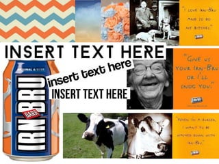
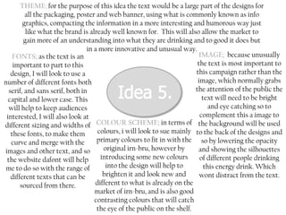
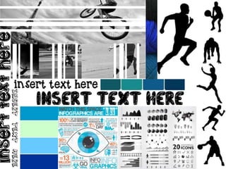
This document discusses four potential design concepts for Irn-Bru packaging and advertising. Each concept focuses on different elements like fonts, images, color schemes, and themes. The first emphasizes contrasting soft and bold fonts with gendered color schemes. The second prioritizes legibility with sans serif fonts and calming colors. The third features monochrome colors with highlighted product images. The fourth centers on infographics and uses varied fonts and sizing to showcase nutritional information humorously.


![5G Explained! A High Level Overview [Introduction]](https://cdn.slidesharecdn.com/ss_thumbnails/5gexplainedahighleveloverview-260119165306-cc137a3e-thumbnail.jpg?width=640&height=640&fit=bounds)


