
Recommended
More Related Content
Viewers also liked
Viewers also liked (15)
Similar to Irnbruboards
Similar to Irnbruboards (20)
More from Callumknight
Irnbruboards
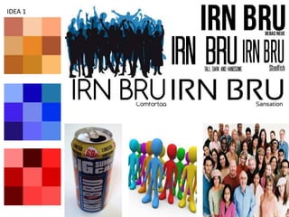
- 1. IDEA 1
- 2. Idea 1 Observation From the mood board for my first idea you can see that the main colours that I will be working with will be the main colours of irn bru ( Blue and oranges ) with possible slight hints of red. This will be used as brand recognition as everyone knows that the traditional colour scheme of blue and orange belongs to Irn Bru. The images that I have used are of different types of crowds. This is so that I can have a variety of different ideas to work with for the final idea. The can of irn bru 32 that is shown is also to represent the can that will be used however I will use my own photography of a can to ensure that I have it in the correct position. The idea that I am working with is that a large group of people are all going to be looking towards a can of irn bru 32. I’m not entirely sure how to execute this idea which is why I left so many different types of crowd there, im not sure whether to colour the people like the irn bru colours, have them as silhouettes or have them as an actual crowd. I chose this font as I feel it is very similar to the current irn bru product and if I wanted to mimic that original design then this would definitely be the best idea. This font was my second choice and would be something that I would try and use if I were to try a more simplistic and modern approach. The font is a lot thinner and has rounded edges as opposed to the Block lettering. This font would be my last choice however I left it in there as I feel that if I were to go for a sort of futuristic style then this would be the one. The spacing inside the letters is very unique.
- 3. IDEA 5
- 4. The colour schemes for this idea are based again around the same colours that irn bru are best known for, Orange and Blue however this time I have opted to try and utilise the colour silver which is from the Diet IRN BRU series of drink. I opted for lighter blues and brighter oranges. The cans are already very standout however I feel that if I use brighter applications of the colours I could possibly make the can more eye-catching . The idea is that the can would have a different design to normal and would be zipping up its new design almost as if it were a new piece of clothing. That is the reasoning behind my images of the zip and of the waterproof drink covers. That is the kind of idea that I am going for. The first font that I chose was Babycakes. I wanted something that was relatively similar to the original Irn Bru font but this added a variation as it was a lot rounded and looks very similar to bubble writings.