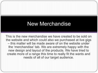
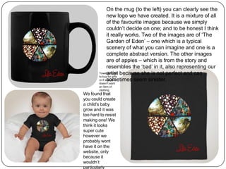
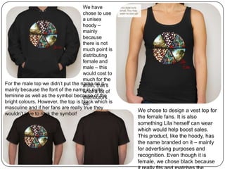
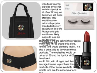
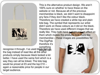
Organizational Structure Running A Successful Business
New Merchandise
1. This is the new merchandise we have created to be sold on
the website and which could also we purchased at live gigs
– this matter will be made aware of on the website under
the ‘merchandise’ tab. We are extremely happy with the
new design and layout of the products. We have tried to
create more of a range this time to really fit the wants and
needs of all of our target audience.
New Merchandise
2. On the mug (to the left) you can clearly see the
new logo we have created. It is a mixture of all
of the favourite images because we simply
couldn’t decide on one; and to be honest I think
it really works. Two of the images are of ‘The
Garden of Eden’ – one which is a typical
scenery of what you can imagine and one is a
complete abstract version. The other images
are of apples – which is from the story and
resembles the ‘bad’ in it, also representing our
artist because she is not perfect and can
sometimes seem sinister.
We found that
you could create
a child's baby
grow and it was
too hard to resist
making one! We
think it looks
super cute
however we
probably wont
have it on the
website, only
because it
wouldn’t
particularly
Towel possibly
to buy for gifts
or if someone
doesn't want
an item of
clothing.
3. We have
chose to use
a unisex
hoody –
mainly
because
there is not
much point is
distributing
female and
male – this
would cost to
much for the
artist, that’s
what a lot of
distributors
do.
For the male top we didn’t put the name on it –
mainly because the font of the name is quite
feminine as well as the symbol because of the
bright colours. However, the top is black which is
masculine and if her fans are really true they
wouldn’t love to rock the symbol!
We chose to design a vest top for
the female fans. It is also
something Lila herself can wear
which would help boost sales.
This product, like the hoody, has
the name branded on it – mainly
for advertising purposes and
recognition. Even though it is
female, we chose black because
4. Claudia is wearing
big false eyelashes
and dark lipstick in
all of our filming, we
think if we sell these
products, they
would become
extremely popular.
Claudia looks very
beautiful in all of the
footage and girls
would most likely
inspire to look like
her, therefore
purchasing the
products.
Therefore if we are selling the products
which help her to create this looks,
female fans would probably invest. It is
also a great way to advertise these
products. The eyelashes would be
priced at £5 and the lipstick at £3
therefore it
would fit in with all ages and their
average income to purchase these
products. Other items available for the
female fans are the underwear and
5. This is the alternative product design. We aren’t
100% sure on whether to have these on the
website or not. Because all of the previous
merchandise is black, we didn’t want to disappoint
any fans if they don’t like the colour black.
Therefore we have created a white top and plain
tote bag. The symbol that represents our artist
didn’t work on these colours as it did on the black.
Therefore we have used different images that we
really like. They both have a slight pop art effect on
them which makes the products look more like
merchandise – these images are possibilities for
The DigiPak
therefore it’s
something
people canrecognise it through. I’ve used black font on
the bag instead of read like all the other
products simply because black looked a lot
better. I have used the same font which is a
way they can all be linked. The tote bag
would be priced at £5 and the top £10 –
again a reasonable price for people in our
target audience.