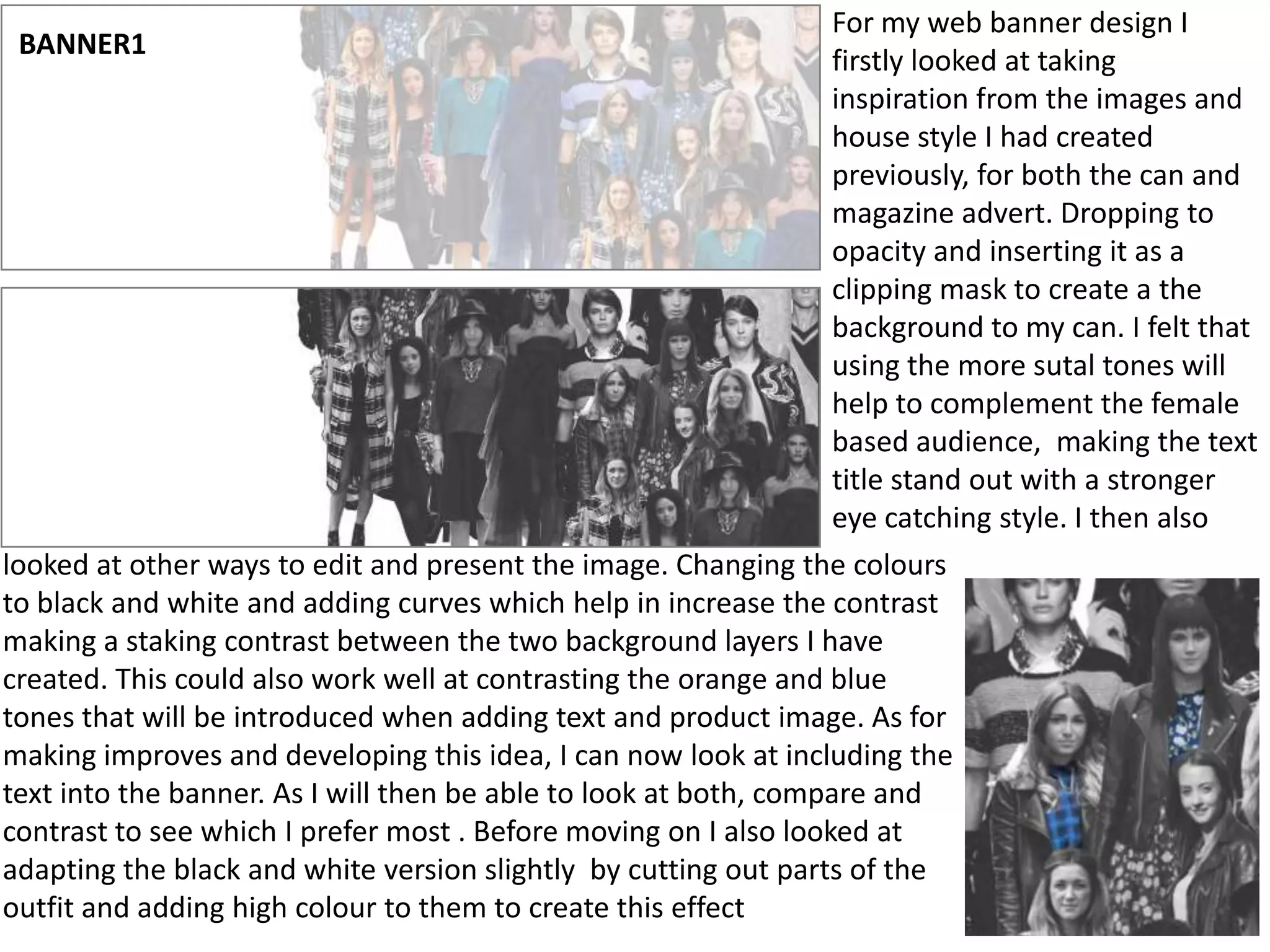
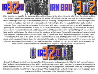
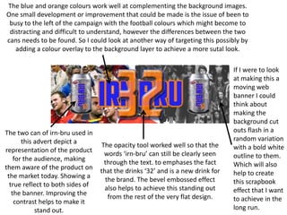
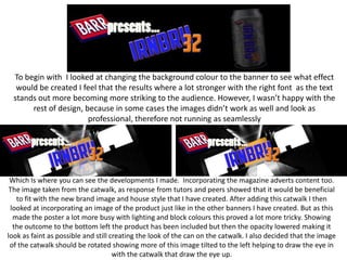
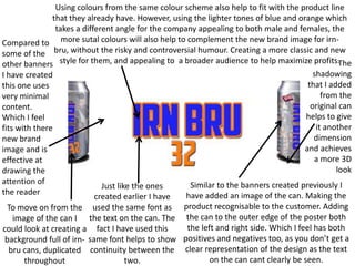
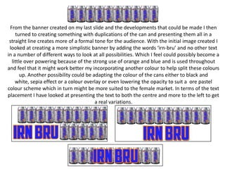
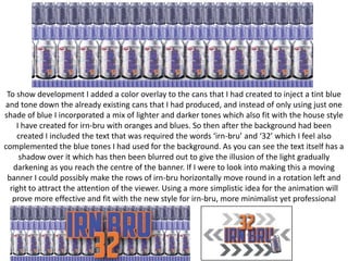
For my web banner design I
firstly looked at taking
inspiration from the images and
house style I had created
previously, for both the can and
magazine advert. Dropping to
opacity and inserting it as a
clipping mask to create a the
background to my can. I felt that
using the more sutal tones will
help to complement the female
based audience, making the text
title stand out with a stronger
eye catching style. I then also
looked at other ways to edit and present the image. Changing the colours
to black and white and adding curves which help in increase the contrast
making a staking contrast between the two background layers I have
created. This could also work well at contrasting the orange and blue
tones that will be introduced when adding text and product image. As for
making improves and developing this idea, I can now look at including the
text into the banner. As I will then be able to look at both, compare and
contrast to see which I prefer most . Before moving on I also looked at
adapting the black and white version slightly by cutting out parts of the
outfit and adding high colour to them to create this effect
BANNER1
After finalising my ideas for the background layers I then looked at the other elements, taken from the adverts and the
can designs I looked at incorporating a similar style. Adding a 3D effect to the text matching blocky and chunky font
choice. Creating a house style that runs between products achieving a more professional finish. Also working with the
modern and updated style that will be achieved while re branding irn-bru. The layout of the text is also another
important factor experimenting and showing development with levels, rotations and sizes to see which works best at
grabbing the attention of the reader reaching out to the audience without been to busy and overcrowded. As of the
banner above you can see the results and the stages in which I have developed my work at. the top left banner shows
has a specific split between the colour text and the black and white images. The use of the opacity tool has also helped
to achieve this look overlapping both the ‘irn-bru’ and ’32’ which I feel works well but when put into practise it could
become difficult to read as the words ‘irn-brn’ become difficult to read. The top right banner also shows this strong
divide which proves striking and draws the attention of the reader in. By placing the numbers ‘32’ in-between the can
of irn-bru also draws your attention to the block orange colour that leads out the can, and feel it would work well for
other versions that I wish to create for the football players to targeting mainly a male audience.

Overall I feel happiest with this design out of the 3 I have created and developed. As I like the stark contrast between
black and white and the orange and blue, which complement each other well. I have also incorporated an image of the
can so that the audience are aware of the product making it more recognizable on the shelf. I also feel that they layout
to this banner is a lot more formal in style, with everything placed straight and with margin between. This design is also
very symmetrical in style with everything focused to the centre.
The blue and orange colours work well at complementing the background images.
One small development or improvement that could be made is the issue of been to
busy to the left of the campaign with the football colours which might become to
distracting and difficult to understand, however the differences between the two
cans needs to be found. So I could look at another way of targeting this possibly by
adding a colour overlay to the background layer to achieve a more sutal look.

The two can of irn-bru used in
this advert depict a
representation of the product
for the audience, making
them aware of the product on
the market today. Showing a
true reflect to both sides of
the banner. Improving the
contrast helps to make it
stand out.

The opacity tool worked well so that the
words ‘irn-bru’ can still be clearly seen
through the text. to emphases the fact
that the drinks ‘32’ and is a new drink for
the brand. The bevel embossed effect
also helps to achieve this standing out
from the rest of the very flat design.

If I were to look
at making this a
moving web
banner I could
think about
making the
background cut
outs flash in a
random variation
with a bold white
outline to them.
Which will also
help to create
this scrapbook
effect that I want
to achieve in the
long run.
To begin with I looked at changing the background colour to the banner to see what effect
would be created I feel that the results where a lot stronger with the right font as the text
stands out more becoming more striking to the audience. However, I wasn’t happy with the
rest of design, because in some cases the images didn’t work as well and look as
professional, therefore not running as seamlessly

Which Is where you can see the developments I made. Incorporating the magazine adverts content too.
The image taken from the catwalk, as response from tutors and peers showed that it would be beneficial
to fit with the new brand image and house style that I have created. After adding this catwalk I then
looked at incorporating an image of the product just like in the other banners I have created. But as this
made the poster a lot more busy with lighting and block colours this proved a lot more tricky. Showing
the outcome to the bottom left the product has been included but then the opacity lowered making it
look as faint as possible and still creating the look of the can on the catwalk. I also decided that the image
of the catwalk should be rotated showing more of this image tilted to the left helping to draw the eye in
with the catwalk that draw the eye up.
Using colours from the same colour scheme also help to fit with the product line
that they already have. However, using the lighter tones of blue and orange which
takes a different angle for the company appealing to both male and females, the
Compared to more sutal colours will also help to complement the new brand image for irnsome of the bru, without the risky and controversial humour. Creating a more classic and new
The
other banners style for them, and appealing to a broader audience to help maximize profits.
shadowing
I have created
that I added
this one uses
from the
very minimal
original can
content.
helps to give
Which I feel
it another
fits with there
dimension
new brand
and achieves
image and is
a more 3D
effective at
look
drawing the
attention of
Similar to the banners created previously I
Just like the ones
the reader
have added an image of the can. Making the
created earlier I have
To move on from the used the same font as product recognisable to the customer. Adding
image of the can I the text on the can. The the can to the outer edge of the poster both
the left and right side. Which I feel has both
could look at creating a fact I have used this
background full of irn- same font helps to show positives and negatives too, as you don’t get a
bru cans, duplicated continuity between the clear representation of the design as the text
on the can cant clearly be seen.
two.
throughout
From the banner created on my last slide and the developments that could be made I then
turned to creating something with duplications of the can and presenting them all in a
straight line creates more of a formal tone for the audience. With the initial image created I
looked at creating a more simplistic banner by adding the words ‘irn-bru’ and no other text
in a number of different ways to look at all possibilities. Which I feel could possibly become a
little over powering because of the strong use of orange and blue and is used throughout
and feel that it might work better my incorporating another colour to help split these colours
up. Another possibility could be adapting the colour of the cans either to black and
white, sepia effect or a colour overlay or even lowering the opacity to suit a ore pastel
colour scheme which in turn might be more suited to the female market. In terms of the text
placement I have looked at presenting the text to both the centre and more to the left to get
a real variations.
To show development I added a color overlay to the cans that I had created to inject a tint blue
and tone down the already existing cans that I had produced, and instead of only using just one
shade of blue I incorporated a mix of lighter and darker tones which also fit with the house style
I have created for irn-bru with oranges and blues. So then after the background had been
created I included the text that was required the words ‘irn-bru’ and ‘32’ which I feel also
complemented the blue tones I had used for the background. As you can see the text itself has a
shadow over it which has then been blurred out to give the illusion of the light gradually
darkening as you reach the centre of the banner. If I were to look into making this a moving
banner I could possibly make the rows of irn-bru horizontally move round in a rotation left and
right to attract the attention of the viewer. Using a more simplistic idea for the animation will
prove more effective and fit with the new style for irn-bru, more minimalist yet professional

Task7- Production Development (webbanner)

  • 1.
    For my webbanner design I firstly looked at taking inspiration from the images and house style I had created previously, for both the can and magazine advert. Dropping to opacity and inserting it as a clipping mask to create a the background to my can. I felt that using the more sutal tones will help to complement the female based audience, making the text title stand out with a stronger eye catching style. I then also looked at other ways to edit and present the image. Changing the colours to black and white and adding curves which help in increase the contrast making a staking contrast between the two background layers I have created. This could also work well at contrasting the orange and blue tones that will be introduced when adding text and product image. As for making improves and developing this idea, I can now look at including the text into the banner. As I will then be able to look at both, compare and contrast to see which I prefer most . Before moving on I also looked at adapting the black and white version slightly by cutting out parts of the outfit and adding high colour to them to create this effect BANNER1
  • 2.
    After finalising myideas for the background layers I then looked at the other elements, taken from the adverts and the can designs I looked at incorporating a similar style. Adding a 3D effect to the text matching blocky and chunky font choice. Creating a house style that runs between products achieving a more professional finish. Also working with the modern and updated style that will be achieved while re branding irn-bru. The layout of the text is also another important factor experimenting and showing development with levels, rotations and sizes to see which works best at grabbing the attention of the reader reaching out to the audience without been to busy and overcrowded. As of the banner above you can see the results and the stages in which I have developed my work at. the top left banner shows has a specific split between the colour text and the black and white images. The use of the opacity tool has also helped to achieve this look overlapping both the ‘irn-bru’ and ’32’ which I feel works well but when put into practise it could become difficult to read as the words ‘irn-brn’ become difficult to read. The top right banner also shows this strong divide which proves striking and draws the attention of the reader in. By placing the numbers ‘32’ in-between the can of irn-bru also draws your attention to the block orange colour that leads out the can, and feel it would work well for other versions that I wish to create for the football players to targeting mainly a male audience. Overall I feel happiest with this design out of the 3 I have created and developed. As I like the stark contrast between black and white and the orange and blue, which complement each other well. I have also incorporated an image of the can so that the audience are aware of the product making it more recognizable on the shelf. I also feel that they layout to this banner is a lot more formal in style, with everything placed straight and with margin between. This design is also very symmetrical in style with everything focused to the centre.
  • 3.
    The blue andorange colours work well at complementing the background images. One small development or improvement that could be made is the issue of been to busy to the left of the campaign with the football colours which might become to distracting and difficult to understand, however the differences between the two cans needs to be found. So I could look at another way of targeting this possibly by adding a colour overlay to the background layer to achieve a more sutal look. The two can of irn-bru used in this advert depict a representation of the product for the audience, making them aware of the product on the market today. Showing a true reflect to both sides of the banner. Improving the contrast helps to make it stand out. The opacity tool worked well so that the words ‘irn-bru’ can still be clearly seen through the text. to emphases the fact that the drinks ‘32’ and is a new drink for the brand. The bevel embossed effect also helps to achieve this standing out from the rest of the very flat design. If I were to look at making this a moving web banner I could think about making the background cut outs flash in a random variation with a bold white outline to them. Which will also help to create this scrapbook effect that I want to achieve in the long run.
  • 4.
    To begin withI looked at changing the background colour to the banner to see what effect would be created I feel that the results where a lot stronger with the right font as the text stands out more becoming more striking to the audience. However, I wasn’t happy with the rest of design, because in some cases the images didn’t work as well and look as professional, therefore not running as seamlessly Which Is where you can see the developments I made. Incorporating the magazine adverts content too. The image taken from the catwalk, as response from tutors and peers showed that it would be beneficial to fit with the new brand image and house style that I have created. After adding this catwalk I then looked at incorporating an image of the product just like in the other banners I have created. But as this made the poster a lot more busy with lighting and block colours this proved a lot more tricky. Showing the outcome to the bottom left the product has been included but then the opacity lowered making it look as faint as possible and still creating the look of the can on the catwalk. I also decided that the image of the catwalk should be rotated showing more of this image tilted to the left helping to draw the eye in with the catwalk that draw the eye up.
  • 5.
    Using colours fromthe same colour scheme also help to fit with the product line that they already have. However, using the lighter tones of blue and orange which takes a different angle for the company appealing to both male and females, the Compared to more sutal colours will also help to complement the new brand image for irnsome of the bru, without the risky and controversial humour. Creating a more classic and new The other banners style for them, and appealing to a broader audience to help maximize profits. shadowing I have created that I added this one uses from the very minimal original can content. helps to give Which I feel it another fits with there dimension new brand and achieves image and is a more 3D effective at look drawing the attention of Similar to the banners created previously I Just like the ones the reader have added an image of the can. Making the created earlier I have To move on from the used the same font as product recognisable to the customer. Adding image of the can I the text on the can. The the can to the outer edge of the poster both the left and right side. Which I feel has both could look at creating a fact I have used this background full of irn- same font helps to show positives and negatives too, as you don’t get a bru cans, duplicated continuity between the clear representation of the design as the text on the can cant clearly be seen. two. throughout
  • 6.
    From the bannercreated on my last slide and the developments that could be made I then turned to creating something with duplications of the can and presenting them all in a straight line creates more of a formal tone for the audience. With the initial image created I looked at creating a more simplistic banner by adding the words ‘irn-bru’ and no other text in a number of different ways to look at all possibilities. Which I feel could possibly become a little over powering because of the strong use of orange and blue and is used throughout and feel that it might work better my incorporating another colour to help split these colours up. Another possibility could be adapting the colour of the cans either to black and white, sepia effect or a colour overlay or even lowering the opacity to suit a ore pastel colour scheme which in turn might be more suited to the female market. In terms of the text placement I have looked at presenting the text to both the centre and more to the left to get a real variations.
  • 7.
    To show developmentI added a color overlay to the cans that I had created to inject a tint blue and tone down the already existing cans that I had produced, and instead of only using just one shade of blue I incorporated a mix of lighter and darker tones which also fit with the house style I have created for irn-bru with oranges and blues. So then after the background had been created I included the text that was required the words ‘irn-bru’ and ‘32’ which I feel also complemented the blue tones I had used for the background. As you can see the text itself has a shadow over it which has then been blurred out to give the illusion of the light gradually darkening as you reach the centre of the banner. If I were to look into making this a moving banner I could possibly make the rows of irn-bru horizontally move round in a rotation left and right to attract the attention of the viewer. Using a more simplistic idea for the animation will prove more effective and fit with the new style for irn-bru, more minimalist yet professional