APM Welcome, APM North West Network Conference, Synergies Across Sectors
Feedback for digipak
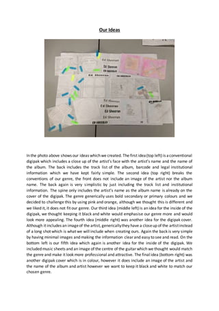
1. Our Ideas
In the photo above shows our ideas which we created. The first idea(top left) is aconventional
digipak which includes a close up of the artist’s face with the artist’s name and the name of
the album. The back includes the track list of the album, barcode and legal institutional
information which we have kept fairly simple. The second idea (top right) breaks the
conventions of our genre, the front does not include an image of the artist nor the album
name. The back again is very simplistic by just including the track list and institutional
information. The spine only includes the artist’s name as the album name is already on the
cover of the digipak. The genre generically uses bold secondary or primary colours and we
decided to challenge this by using pink and orange, although we thought this is different and
we liked it, it does not fit our genre. Our third idea (middle left) is an idea for the inside of the
digipak, we thought keeping it black and white would emphasise our genre more and would
look more appealing. The fourth idea (middle right) was another idea for the digipak cover.
Although it includes an imageof the artist, genericallythey have a closeup of the artistinstead
of a long shot which is what we will include when creating ours. Again the back is very simple
by having minimal images and making the information clear and easy to see and read. On the
bottom left is our fifth idea which again is another idea for the inside of the digipak. We
included music sheets and an image of the centre of the guitar which we thought would match
the genre and make it look more professional and attractive. The final idea (bottom right) was
another digipak cover which is in colour, however it does include an image of the artist and
the name of the album and artist however we want to keep it black and white to match our
chosen genre.
2. Feedback
Using the same image above, the coloured arrows show what people preferred and what
would look good. They liked the back panel of the first idea and also the front panel as they
thought it was very effective although, with the artist leaning against the wall, we were told
that something on the walls to make it more interesting would be better. We were also told
that the third idea inside panel was liked due to the instrument against a stool, we were told
it looks different and attractive and would match our genre. Furthermore, the fifth idea was
liked by a few people as well due to the music sheets and we were told it would look very
pleasing and again, match our chosen genre.
With all the feedback taken into consideration, we decided that we are going to use the first
idea, front and back panel in black and white as we thought this would look more attractive
and match the genre more. We are also going to be using the fifth idea for the inside panel as
we really like the idea of the music sheets and the image of the guitar strings. Altogether we
thought this would look very sophisticated and appealing to the audience, although it isn’t
bold colours and striking, the name of the album and artist will be bold and easy to see as we
thought bold colours wouldn’t be very conventional to the style of music.