Model Call Girl in Tilak Nagar Delhi reach out to us at 🔝9953056974🔝
Digipak mate
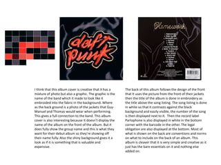
1. I think that this album cover is creative that it has a
mixture of photo but also a graphic. The graphic is the
name of the band which it made to look like it
embroided into the fabric in the background. Where
as the back ground is a photo of the jackets that Guy-
Manuel and Thomas would wear when performing.
This gives a full connection to the band. This album
cover is also interesting because it doesn’t display the
name of the album on the front of the album. But it
does fully show the group name and this is what they
want for their debut album so they’re showing off
their name fully. Also the shiny background gives it a
look as if it is something that is valuable and
expensive.
The back of this album follows the design of the front
that it uses the picture from the front of their jackets
then the title of the album is done in embroidery as
the title above the song listing. The song listing is done
in white so that it contrasts against the black
background and easily visible, the number of the song
is then displayed next to it. Then the record label
Parlophone is also displayed in white in the bottom
corner with the barcode in the other. The legal
obligation are also displayed at the bottom. Most of
what is shown on the back are conventions and norms
on what to include on the back of an album. This
album is cleaver that it is very simple and creative as it
just has the bare essentials on it and nothing else
added on.
2. This is the Daft Punk, Homework CD. It is very different compared to the cover
and back as it isn’t as simplified. It has the band logo with the title of the
album along with all the songs on the album and the time in which they’re on
for. Also they have the record label, legal notes and other information on the
disc. This makes it different to other CDs also because they’re usually bland
and just have a graphic on the front.
3. This album cover of the arctic monkeys is a
combination of picture and graphic that it has the
picture of the houses but then it has a graphic of the
band name and album name then also that windows
have a multitude of different colours in a pattern.
The colourful windows contrast against the black
surrounding which makes it stand out compared to
other albums that usually go for full colours or all
dark where as this has a combination. The cover is
also mainly dominated by the picture/graphic with
the name of the band/album being in a small corner
and in barely readable font which imitates graffiti.
The back of the album is completely different to the
front cover that it has no graphic on or picture.
Instead it is just a coloured background and the track
listing at the bottom. At the bottom along with the
track listing is the barcode, legal listings and the
record label. This album backing is different to other
albums due to it being so bare and having close to
nothing on the back of the album. Also that the
songs are just listed without any numbering or timing
of the songs.
4. This is the inside cover of the album Favourite Worst Nightmare. It includes the CD
which is again very minimal of just having a graphic on it and nothing else. Furthermore
one side includes a booklet with lyrics in of everyone song that is on the album. Each
side of this inside cover has pictures/graphics of what the inside of the houses may look
like with the walls having paintings and drawings on. The main section of the CD case is
made of plastic to hold the CD and make it secure whereas the rest is card making it
look more original and also different to usual CD cases that are plastic and look boring.
Whereas this being made from card it makes it stand out from the crowd and also make
the band look more original rather than following the crowd.
5. This song is easily identifiable as being a graphic as it is
too complex to be able to be a photograph. The cover is
very simple with it just being the graphic and then it has
the band name in one corner and the album name in the
other. This makes it very simplistic and which in turn
makes it very artistic and modern looking due to its design
that doesn’t follow the usual conventions of album covers.
The graphic is definitely the part that this cover focuses
most on with the writing being smaller than it usually
would be. The colours also make this album stand out as
it is very colourful and would attract many people to it
because it so different to normal styles.
The back of the album is similar to the front that it
uses the background from the front but has changed
the colour of the whole thing to yellow changing the
design completely. The back of the album follows
conventions this time by having the album name and
then having the track listing and the legal info as well
as the label and barcode. The back of the album is
designed well that it uses colours from the front of
the cover for the back by using the yellow for the
background and then the pink and blue for the band
name and album name. Also it keeps everything to
the left hand side of the page that makes it look
simple and clean which makes it better to look at and
more pleasing to the eye.
6. This is the CD for the Caribou album Our Love. It is very minimalistic
with it just being pink and only containing a copyright symbol on it . The
CD sleeve which has the cover on it has multiple pictures and
information about the band on the inside which makes it so that buyer
of the CD can find out more information about Caribou and become
more invested in the band if they’re interested in them. Furthermore,
the sleeve keeps the same design/pattern from the front cover to the
inside which continues this good looking design