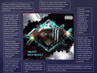
1. Main conventions of a CD front cover
are seen: an eye catching image, colour,
name of the artist and name of the actual
CD album
The artist logo is the
largest image on the
cover, making it the
most eye-catching
part. The futuristic
style and structure
of the logo acts as a
unique selling point
and one of the
reasons fans would
be more inclined to
buy this CD.
Genre believed to be
the future of music.
Imagery: Suggests
future of music and
the evolution of
techno music
Parental
Advisory Sticker:
Industry
regulates itself.
This gives a
warning to
whoever buys
this CD that
there may be
language and
content that
could cause
offence.
Usually at the
bottom right hand
corner on the front
of a CD cover, the
parental advisory
sticker can be seen
at the top of the CD
drawing attention to
it more quickly. This
adds to the look of
chaos that the front
cover is trying to
promote.
The use of screws and metallic font
with no curves but corners gives a clue
as to the nature of the metal based
instruments used in the music.
CD cover is chaotic yet industrial encouraging the audience to
leave their safe zone, let loose and eventually go wild as they
listen to the music within.
Shattered edges
suggest breaking out
of something which
fans can interpret as
breaking from the
school norm of music
and listening to the
‘future’ that is
DUBSTEP.
Font is not neatly done
adding to the chaotic feel
the audience is expected
to feel as they look at the
over.
2. Conventions of the back of a CD cover
include: track names, amount of tracks on
the CD, running order of tracks, image,
colour and production details.
The use of colour is quite complex: Blood Red,
Neon Blue, Black and White. This suggests that
it isn't a pop album; the colours stand out
making the words bold whilst still adding the
feeling of futuristic/ electronic elements due to
the use of neon colours.
The use of polished, glossy
yet metallic designs fits
with the futuristic idea that
the artist is trying to put
across.
The production details: in small print as this is not important to the
fans. It contains the necessary details and legal information such as
copyright, production team, record label etc.
Image of the artist during a performance. The image is
modified to look as if he is melded with machines
adding to the theme of futuristic steampunk and
overall chaos.
The font style is colourised with artists featured in tracks
printed in red. This provides the fans with quick and easy
viewpoints to find out information about the song due to
its bold colour scheme which makes it stand out.
3. Rewards the fans with bonus tracks that have been
extended making them more inclined to pay for the
Digipak rather than illegally downloading it.
The name of the artist is imprinted on
the back of the CD trays. This
juxtaposes the simple image of the
artist in the panel next to it. Whilst we
see the use of metal and neon
characters in the artist name, the
audience receives the opposite in the
next panel as the surroundings are
glossed, clear and simple though still
conveying the futuristic theme that has
been emphasised throughout the
whole design of the digipak.
Leaves the theme of steam punk, chaos and clutter. Giving us a shot of the artist
relaxed whilst smoking a cigarette; perhaps on of the reason the parental
advisory sticker is plastered at the front to prevent the promotion of smoking to
younger audiences.
4. Main conventions of a CD front cover are seen: an eye
catching image, colour, the name of the artist and the
actual name of the albumn.
The image is the largest, most eye catching part. The star
is the unique selling point and one of the reasons fans will
buy this CD.
Though simple the CD
cover is eye catching.
The use of the colour
white causes the cover
to stand out on the
shelf catching the
attention of fans as
they walk past. Whilst
the use of smooth calm
colours are used in the
painting of the artist of
the CD cover. This on
top of the white
background resembles
that of a piece of art
that could be found
within a gallery.
The use of the colour
white suggests the type
of music genre within
the album
Front cover is a painting of the artist in the studio recording. The
audience can see from the ‘painting’ that the artist is calm and relaxes as
he sings, suggesting the type of music within will be slow and
emotional. This in all fits with genre of R&B that artist is known for.
Complete opposite to the
design of Digipaks that
could be found in other
genres such as Rock or
Dubstep. This shows the
overall difference in
Digipak designs being
based on the genre in
which the music falls
under.
A lack of a parental
advisory sticker.
Usually acting as a
warning to whoever
buys the CD that there
may be language and
content that could
cause offense, means
that this song is
appropriate to all ages.
This is a trait that can
be seen in quite a few
R&B and Pop album
covers causing them to
differ from genres such
as Rap and Dubstep.
5. CD cover is simple just like the album cover itself. The CD
simply lists the name artist and album itself over a white
background.
The use of colour is both basic and complex as it uses a
variety of different shades from the three primary
colours of black, white and brown present on the
cover. This simplicity suggests that it is not a pop
album.
The font style is
in simple block
capitals just
like on the front
cover adding to
the theme of
simplicity that
the album
portrays.
The spine has the name of the album and the artist’s
name allowing for the audience to easily distinguish the
album from others when its on a shelf.
The production details: in small print as this is not
important to the fans. It contains the necessary details
and legal information such as copyright, production
team, record label etc.
Conventions of
the back of a
CD cover
include: track
names, amount
of tracks on the
CD, running
order of tracks,
image, colour
and production
details.
The list of only 5 songs present on the back of the CD cover
further adds to the sense of simplicity portrayed in the
design and art style. This small number of tracks adds to the
overall selling point of the CD as it stands out against other
albums ,whilst implying that more time has been spent
creating this song as the artist put his heart and soul into
each track.
6. The artist is looking up into the light that bathes his topless body with a grey
glow as if looking at the light of salvation. This further adds to the flattery of the
audience as the image is positioned in a fashion where it seems that the artist is
looking up at the fan as they pick up the case from the shelf.
Name of the album
is the most eye
catching symbol as it
is drawn over the
image of the artist as
if crossing them off a
hit list.
Parental Advisory Sticker: Industry regulates itself. This gives a warning to whoever buys this CD
that there may be language and content that could cause offence. Always seen in the bottom right
hand corner on the front of a CD cover.
Lack of any
information on the
front cover. Unusual
for most CD covers
acting as a Unique
Selling point along
with the singer. It
throws away the
normal main
conventions of a CD
front cover but
instead only
showing an eye
catching image and
overall colour.
The lack of artist name
shows how well
known the artist is and
flatters the audience
making them feel
special as only ‘true’
fans would be able to
realise who the artist
is at a glimpse. Further
showing the artists
overall popularity and
fame as he can defy
the main conventions
of a CD front cover
and still generate large
number of sales.
The use of the colour
black as a border
juxtaposes the usual
stereotype of clues to
the rock genre as
most CD front covers
with large quantities
of the black are
linked to rock and
metal genres.
7. Track listings of the
songs in their run
order.
Photos of artist all in black and
white, making the artist look
simple/seductive whilst continuing
to run with the digi-paks colour
theme.
The font style is colourised with artists featured in
tracks printed in white. This provides the fans with
quick and easy viewpoints to find out information
about the song due to its bold colour scheme which
makes it stand out on the black canvas.
A photo is
presented
next to each
track
grouped in
three. This
use of images
creates a
sense of the
fans being
within an art
gallery. In
doing this it
makes the
audience feel
special as
they receive
abstract
images of the
artist that
couldn’t not
be found
easily along
with the
digipak itself.
Each image is unique with
different camera angles as well as
positioning. This adds a sense of
both mystery and seduction to the
artist whilst giving the audience a
n idea of the type of music within.
The production details: in small print as this is not important to the fans. It contains the
necessary details and legal information such as copyright, production team, record label etc.