Digipack Analysis
INDIE ROCK
(BUT MORE SPECIFICALLY SUNDARA KARMA)
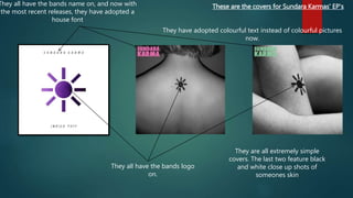
These are the covers for Sundara Karmas' EP's
They all have the bands logo
on.
They all have the bands name on, and now with
the most recent releases, they have adopted a
house font
They are all extremely simple
covers. The last two feature black
and white close up shots of
someones skin
They have adopted colourful text instead of colourful pictures
now.
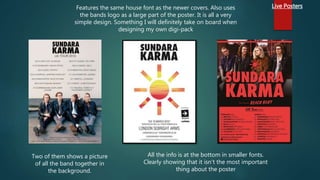
Live PostersFeatures the same house font as the newer covers. Also uses
the bands logo as a large part of the poster. It is all a very
simple design. Something I will definitely take on board when
designing my own digi-pack
All the info is at the bottom in smaller fonts.
Clearly showing that it isn't the most important
thing about the poster
Two of them shows a picture
of all the band together in
the background.
Summary of Sundara Karma's
Digipacks
 So this showed me that Sundara Karma use a simple bold font, which is
usually colourful. They also have started featuring black and white artwork
in the album covers. Their posters take an equally simple approach, with
mainly just name, logo and then the information and maybe a photo of the
band in the background.
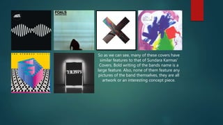
Other Band examples
HERE ARE SOME MORE WELL KNOWN BANDS ALBUM COVERS, AS WELL AS
SOME ALBUM ADVERTS FROM INDIE BANDS.
So as we can see, many of these covers have
similar features to that of Sundara Karmas'
Covers. Bold writing of the bands name is a
large feature. Also, none of them feature any
pictures of the band themselves, they are all
artwork or an interesting concept piece.
Album Advert Analysis
-Album title is massive and bold,
showing you that this is the main
part of the advert. And so you
won't forget the name and you will
go out and buy it.
-There is a clear date for when it is
being released, again, this is just a
way of conveying all the important
information that the consumer will
need to know.
-They all seem to feature star
reviews from various music and
entertainment sources, as well as
a cool quote.
-Shows available outlets from
where to purchase from, whilst
play.com is probably out of date
now, I could use digital outlets
instead such as amazon, itunes
and google play for my own
advert.
-There is the record labels logo,
these are also on all of the adverts
that I have found. This is because
the labels want advertisement as
well, showing what they're involved
with. This is a feature I will definitely
include on my advert.
-There is small print at the bottom
of the page with band contact and
social media details
-Like the previous advert, all of the
information is in a bold font. This
time with band logo and the album
cover itself being the most notable
thing on here. This is done to
hopefully make the image stick in
your mind so that you will buy it if
you see it.
-The record labels logo is at the
bottom of this one, it is noticeably
smaller than everything else, but is
definitely a main part of these
posters.
-This poster is exceptionally sparse,
which I think looks really cool, it
displays the basic info about the
album and nothing else. The
minimalist approach is very un-
intruding and looks very sleek.
-The album name, and date are all
in smaller font, suggesting that they
are really just riding on the fact that
it's the Arctic Monkeys. That alone
will sell this album,
-The main part of this advert is the
album cover, the top three quarters
of the whole poster is the actual
album cover. Again, like with all the
other adverts, this is so you can try
and get it in your head and might
be more inclined to buy it if you
see it.
-At the bottom of the page, in
the biggest font is the date the
album is coming out, as this is
very important information as it
will inform people as to when
they can hand over their hard
earned cash.
-Slightly below the date, it shows
popular singles that are on this
album. This is a good idea as it
gives people a good idea of
what they're getting into before
they buy it. It also brings in more
people who might have heard
those songs on the radio, but
hadn't really known who the
band where.
-Again, like the other posters, at
the very bottom in small font, and
with small pictures, it shows the
record label. As well as the bands
website and a record companys
website. This is good as it will lead
customers to go and get more
information about the band and
asociated bodies.

Digipack analysis1

  • 1.
    Digipack Analysis INDIE ROCK (BUTMORE SPECIFICALLY SUNDARA KARMA)
  • 2.
    These are thecovers for Sundara Karmas' EP's They all have the bands logo on. They all have the bands name on, and now with the most recent releases, they have adopted a house font They are all extremely simple covers. The last two feature black and white close up shots of someones skin They have adopted colourful text instead of colourful pictures now.
  • 3.
    Live PostersFeatures thesame house font as the newer covers. Also uses the bands logo as a large part of the poster. It is all a very simple design. Something I will definitely take on board when designing my own digi-pack All the info is at the bottom in smaller fonts. Clearly showing that it isn't the most important thing about the poster Two of them shows a picture of all the band together in the background.
  • 4.
    Summary of SundaraKarma's Digipacks  So this showed me that Sundara Karma use a simple bold font, which is usually colourful. They also have started featuring black and white artwork in the album covers. Their posters take an equally simple approach, with mainly just name, logo and then the information and maybe a photo of the band in the background.
  • 5.
    Other Band examples HEREARE SOME MORE WELL KNOWN BANDS ALBUM COVERS, AS WELL AS SOME ALBUM ADVERTS FROM INDIE BANDS.
  • 6.
    So as wecan see, many of these covers have similar features to that of Sundara Karmas' Covers. Bold writing of the bands name is a large feature. Also, none of them feature any pictures of the band themselves, they are all artwork or an interesting concept piece.
  • 7.
    Album Advert Analysis -Albumtitle is massive and bold, showing you that this is the main part of the advert. And so you won't forget the name and you will go out and buy it. -There is a clear date for when it is being released, again, this is just a way of conveying all the important information that the consumer will need to know. -They all seem to feature star reviews from various music and entertainment sources, as well as a cool quote. -Shows available outlets from where to purchase from, whilst play.com is probably out of date now, I could use digital outlets instead such as amazon, itunes and google play for my own advert. -There is the record labels logo, these are also on all of the adverts that I have found. This is because the labels want advertisement as well, showing what they're involved with. This is a feature I will definitely include on my advert. -There is small print at the bottom of the page with band contact and social media details
  • 8.
    -Like the previousadvert, all of the information is in a bold font. This time with band logo and the album cover itself being the most notable thing on here. This is done to hopefully make the image stick in your mind so that you will buy it if you see it. -The record labels logo is at the bottom of this one, it is noticeably smaller than everything else, but is definitely a main part of these posters. -This poster is exceptionally sparse, which I think looks really cool, it displays the basic info about the album and nothing else. The minimalist approach is very un- intruding and looks very sleek. -The album name, and date are all in smaller font, suggesting that they are really just riding on the fact that it's the Arctic Monkeys. That alone will sell this album,
  • 9.
    -The main partof this advert is the album cover, the top three quarters of the whole poster is the actual album cover. Again, like with all the other adverts, this is so you can try and get it in your head and might be more inclined to buy it if you see it. -At the bottom of the page, in the biggest font is the date the album is coming out, as this is very important information as it will inform people as to when they can hand over their hard earned cash. -Slightly below the date, it shows popular singles that are on this album. This is a good idea as it gives people a good idea of what they're getting into before they buy it. It also brings in more people who might have heard those songs on the radio, but hadn't really known who the band where. -Again, like the other posters, at the very bottom in small font, and with small pictures, it shows the record label. As well as the bands website and a record companys website. This is good as it will lead customers to go and get more information about the band and asociated bodies.