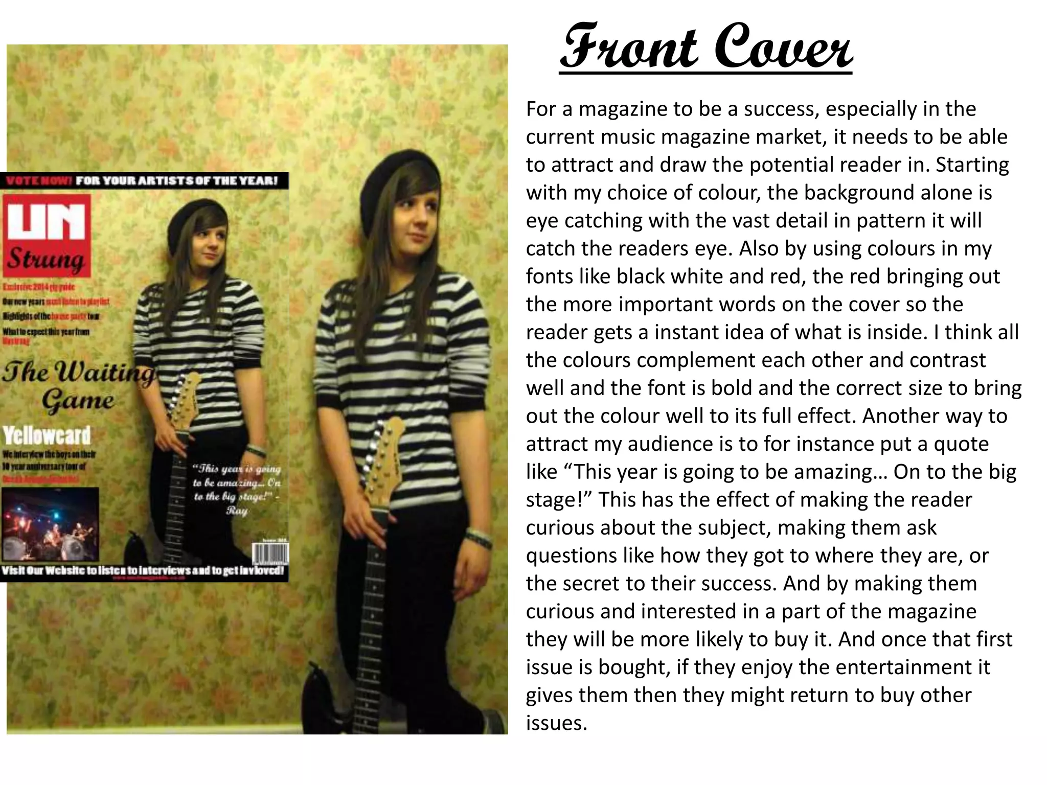
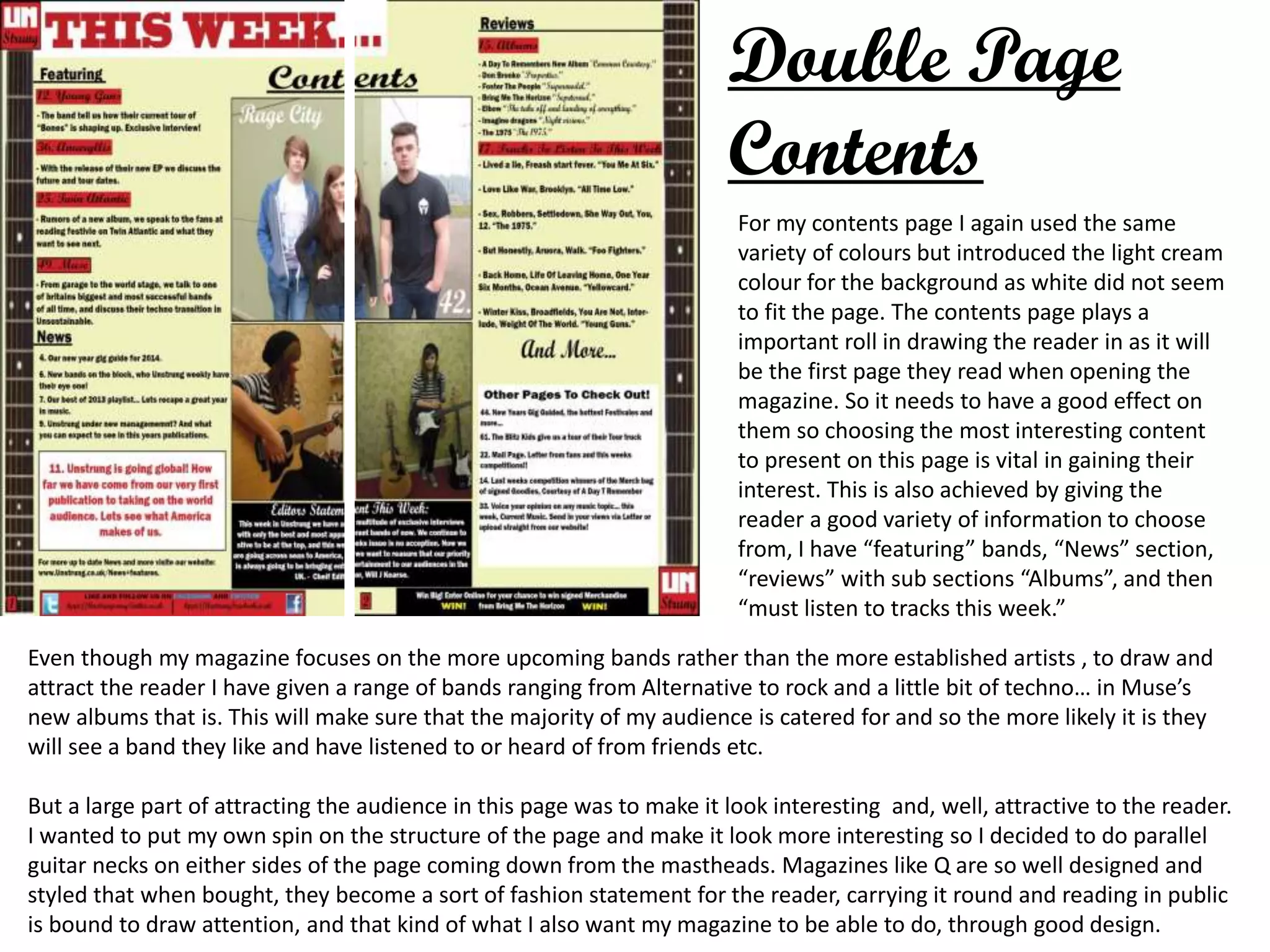
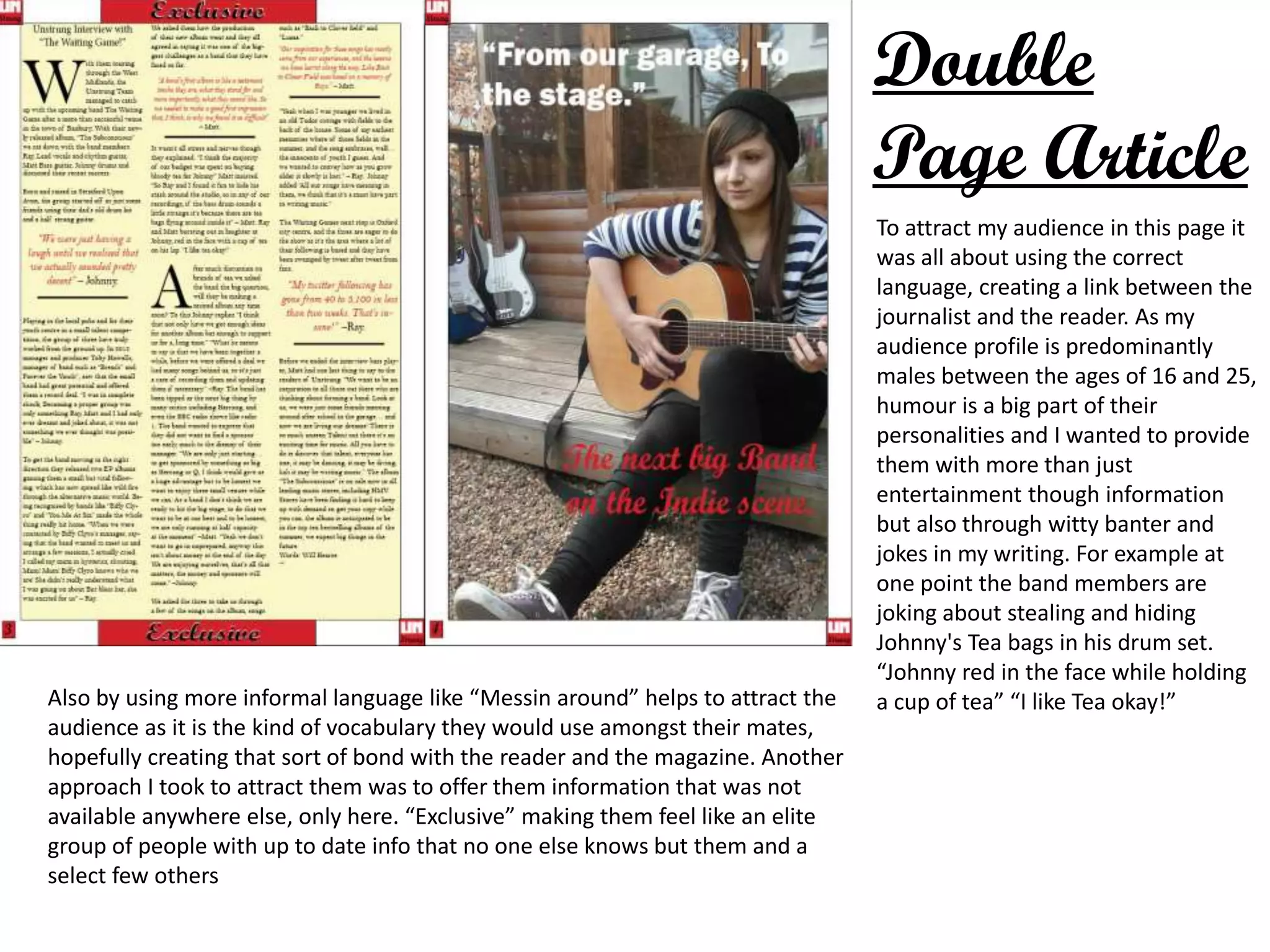
Evaluation Question 5
How did you attract/address
your audience?
For a magazine to be a success, especially in the
current music magazine market, it needs to be able
to attract and draw the potential reader in. Starting
with my choice of colour, the background alone is
eye catching with the vast detail in pattern it will
catch the readers eye. Also by using colours in my
fonts like black white and red, the red bringing out
the more important words on the cover so the
reader gets a instant idea of what is inside. I think all
the colours complement each other and contrast
well and the font is bold and the correct size to bring
out the colour well to its full effect. Another way to
attract my audience is to for instance put a quote
like “This year is going to be amazing… On to the big
stage!” This has the effect of making the reader
curious about the subject, making them ask
questions like how they got to where they are, or
the secret to their success. And by making them
curious and interested in a part of the magazine
they will be more likely to buy it. And once that first
issue is bought, if they enjoy the entertainment it
gives them then they might return to buy other
issues.
Front Cover
Double Page
Contents
For my contents page I again used the same
variety of colours but introduced the light cream
colour for the background as white did not seem
to fit the page. The contents page plays a
important roll in drawing the reader in as it will
be the first page they read when opening the
magazine. So it needs to have a good effect on
them so choosing the most interesting content
to present on this page is vital in gaining their
interest. This is also achieved by giving the
reader a good variety of information to choose
from, I have “featuring” bands, “News” section,
“reviews” with sub sections “Albums”, and then
“must listen to tracks this week.”
Even though my magazine focuses on the more upcoming bands rather than the more established artists , to draw and
attract the reader I have given a range of bands ranging from Alternative to rock and a little bit of techno… in Muse’s
new albums that is. This will make sure that the majority of my audience is catered for and so the more likely it is they
will see a band they like and have listened to or heard of from friends etc.
But a large part of attracting the audience in this page was to make it look interesting and, well, attractive to the reader.
I wanted to put my own spin on the structure of the page and make it look more interesting so I decided to do parallel
guitar necks on either sides of the page coming down from the mastheads. Magazines like Q are so well designed and
styled that when bought, they become a sort of fashion statement for the reader, carrying it round and reading in public
is bound to draw attention, and that kind of what I also want my magazine to be able to do, through good design.
Double
Page Article
To attract my audience in this page it
was all about using the correct
language, creating a link between the
journalist and the reader. As my
audience profile is predominantly
males between the ages of 16 and 25,
humour is a big part of their
personalities and I wanted to provide
them with more than just
entertainment though information
but also through witty banter and
jokes in my writing. For example at
one point the band members are
joking about stealing and hiding
Johnny's Tea bags in his drum set.
“Johnny red in the face while holding
a cup of tea” “I like Tea okay!”Also by using more informal language like “Messin around” helps to attract the
audience as it is the kind of vocabulary they would use amongst their mates,
hopefully creating that sort of bond with the reader and the magazine. Another
approach I took to attract them was to offer them information that was not
available anywhere else, only here. “Exclusive” making them feel like an elite
group of people with up to date info that no one else knows but them and a
select few others

Evaluation question 5

  • 1.
    Evaluation Question 5 Howdid you attract/address your audience?
  • 2.
    For a magazineto be a success, especially in the current music magazine market, it needs to be able to attract and draw the potential reader in. Starting with my choice of colour, the background alone is eye catching with the vast detail in pattern it will catch the readers eye. Also by using colours in my fonts like black white and red, the red bringing out the more important words on the cover so the reader gets a instant idea of what is inside. I think all the colours complement each other and contrast well and the font is bold and the correct size to bring out the colour well to its full effect. Another way to attract my audience is to for instance put a quote like “This year is going to be amazing… On to the big stage!” This has the effect of making the reader curious about the subject, making them ask questions like how they got to where they are, or the secret to their success. And by making them curious and interested in a part of the magazine they will be more likely to buy it. And once that first issue is bought, if they enjoy the entertainment it gives them then they might return to buy other issues. Front Cover
  • 3.
    Double Page Contents For mycontents page I again used the same variety of colours but introduced the light cream colour for the background as white did not seem to fit the page. The contents page plays a important roll in drawing the reader in as it will be the first page they read when opening the magazine. So it needs to have a good effect on them so choosing the most interesting content to present on this page is vital in gaining their interest. This is also achieved by giving the reader a good variety of information to choose from, I have “featuring” bands, “News” section, “reviews” with sub sections “Albums”, and then “must listen to tracks this week.” Even though my magazine focuses on the more upcoming bands rather than the more established artists , to draw and attract the reader I have given a range of bands ranging from Alternative to rock and a little bit of techno… in Muse’s new albums that is. This will make sure that the majority of my audience is catered for and so the more likely it is they will see a band they like and have listened to or heard of from friends etc. But a large part of attracting the audience in this page was to make it look interesting and, well, attractive to the reader. I wanted to put my own spin on the structure of the page and make it look more interesting so I decided to do parallel guitar necks on either sides of the page coming down from the mastheads. Magazines like Q are so well designed and styled that when bought, they become a sort of fashion statement for the reader, carrying it round and reading in public is bound to draw attention, and that kind of what I also want my magazine to be able to do, through good design.
  • 4.
    Double Page Article To attractmy audience in this page it was all about using the correct language, creating a link between the journalist and the reader. As my audience profile is predominantly males between the ages of 16 and 25, humour is a big part of their personalities and I wanted to provide them with more than just entertainment though information but also through witty banter and jokes in my writing. For example at one point the band members are joking about stealing and hiding Johnny's Tea bags in his drum set. “Johnny red in the face while holding a cup of tea” “I like Tea okay!”Also by using more informal language like “Messin around” helps to attract the audience as it is the kind of vocabulary they would use amongst their mates, hopefully creating that sort of bond with the reader and the magazine. Another approach I took to attract them was to offer them information that was not available anywhere else, only here. “Exclusive” making them feel like an elite group of people with up to date info that no one else knows but them and a select few others