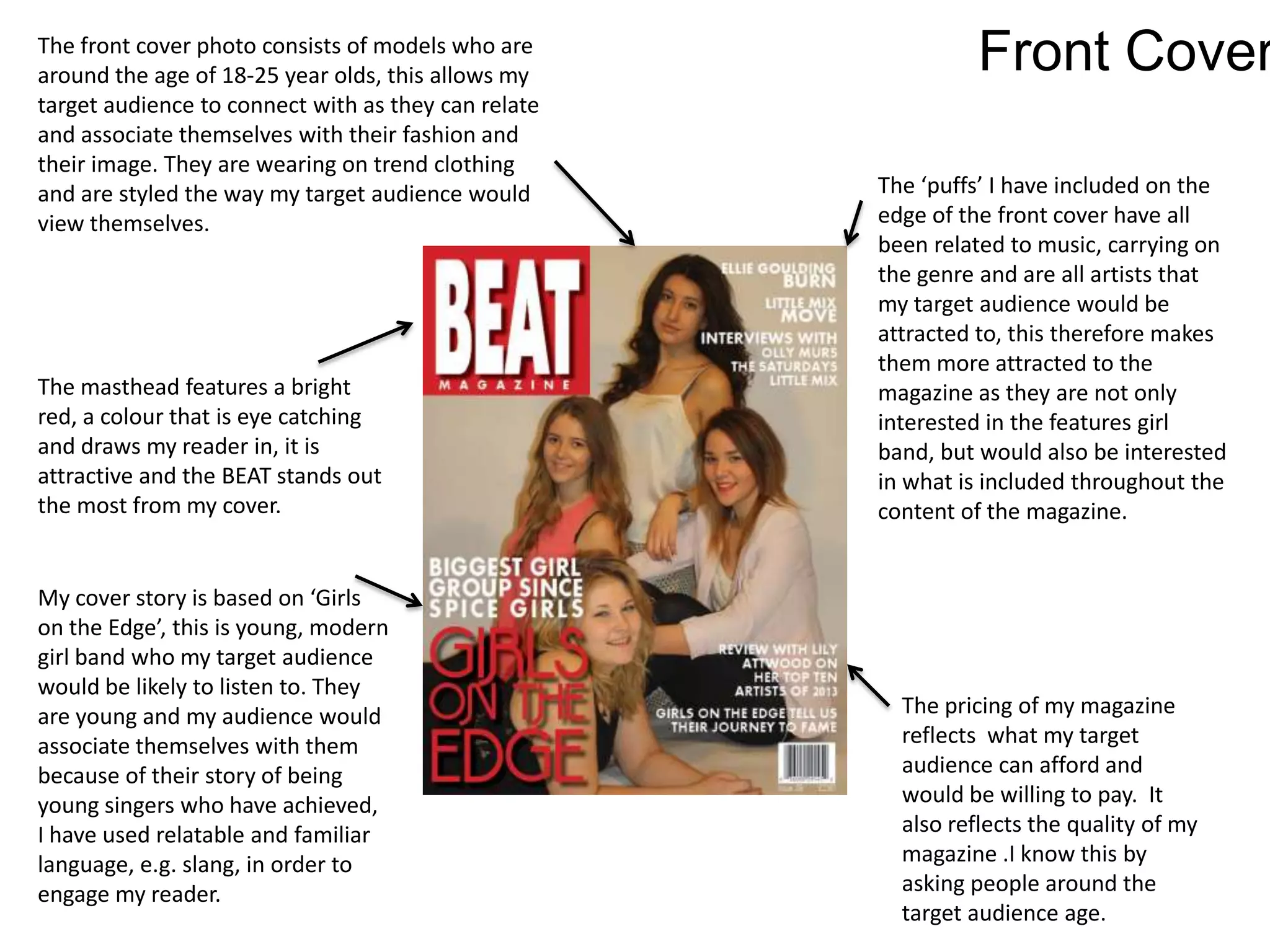
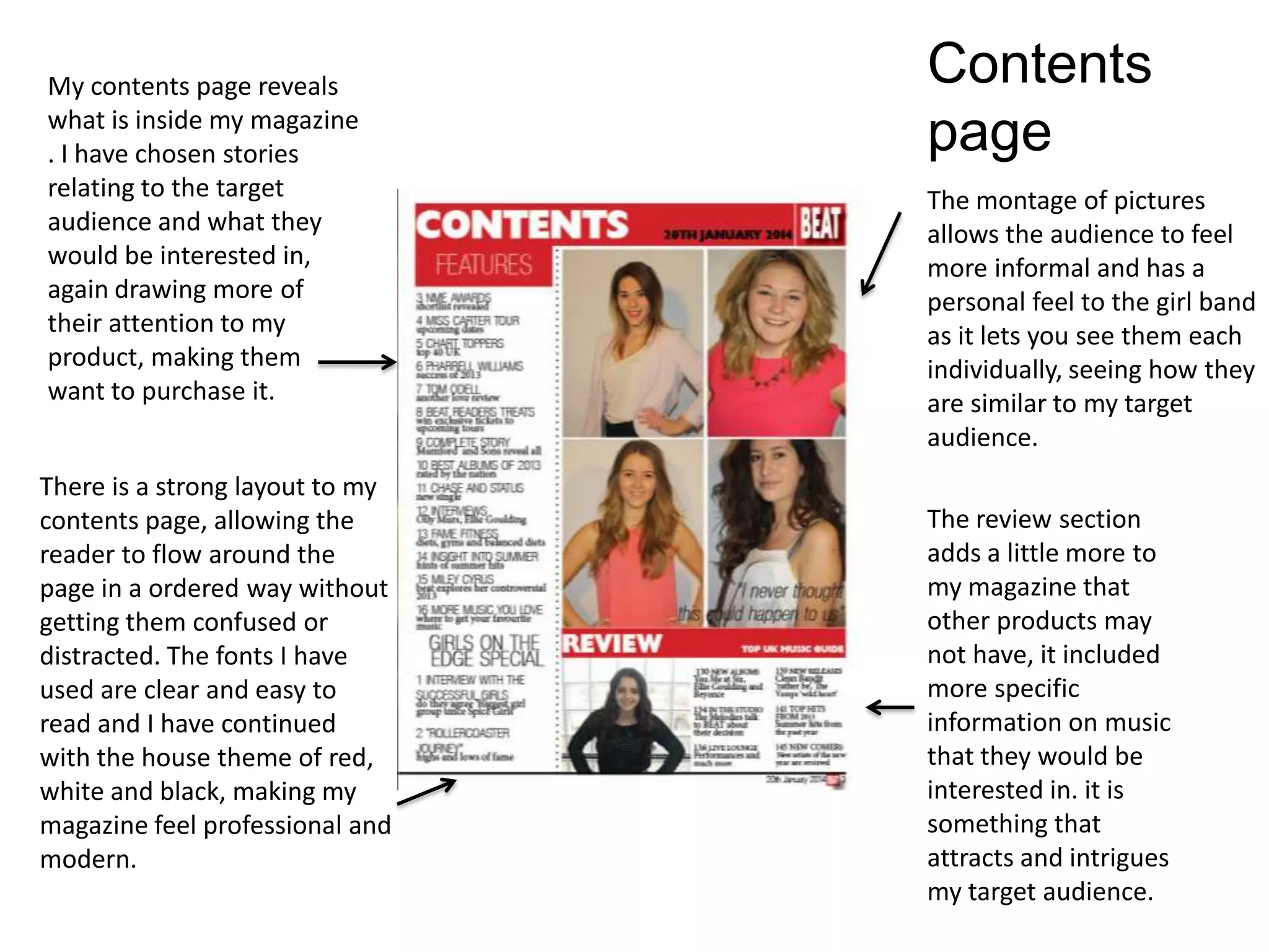
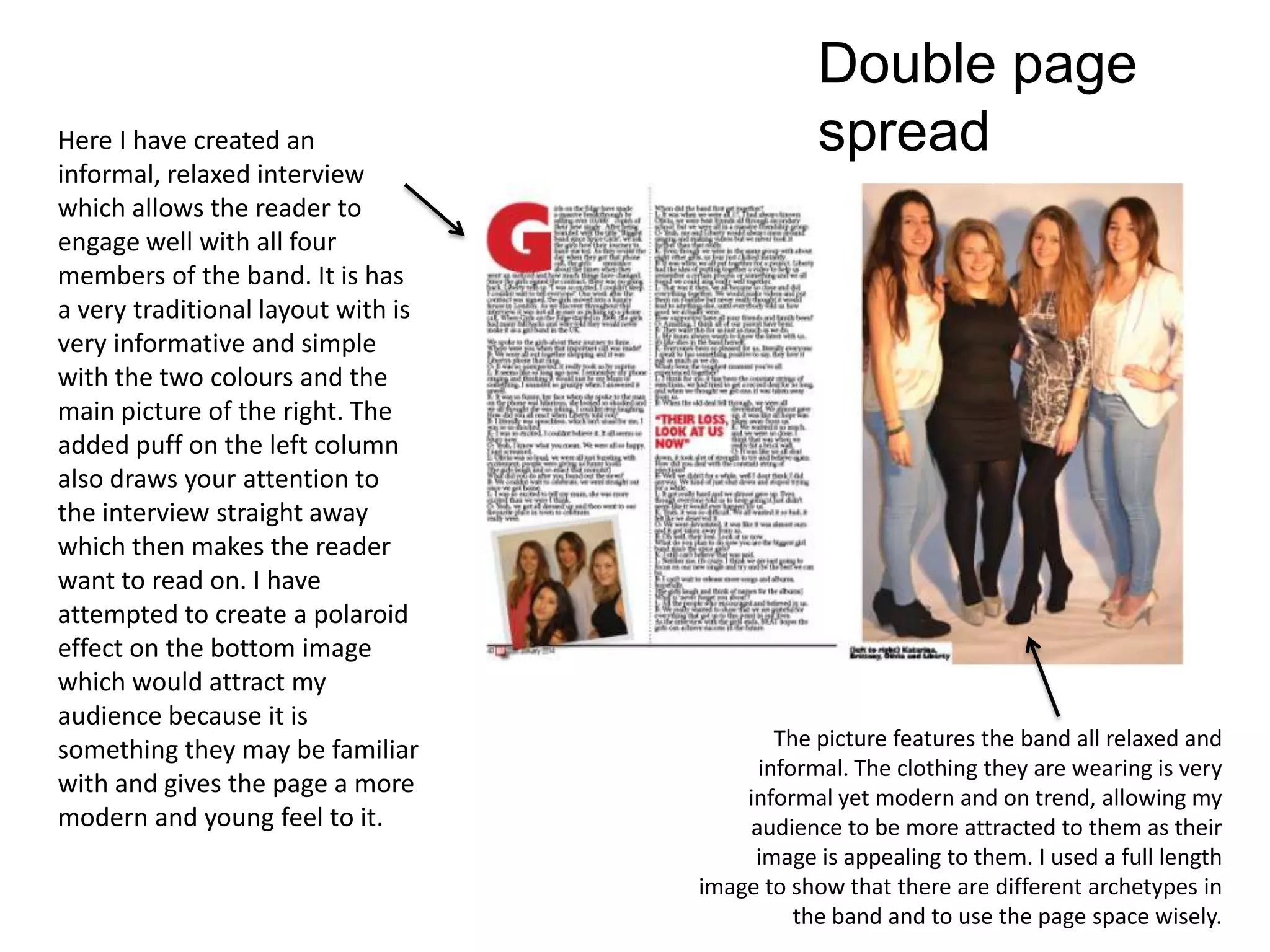
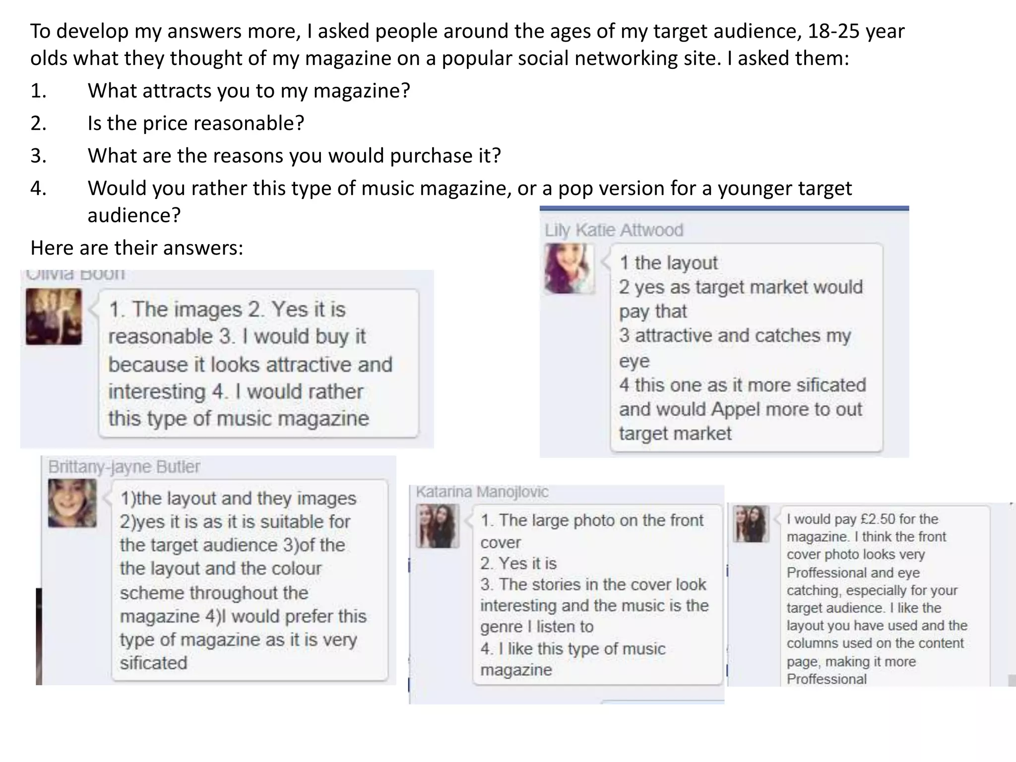
1. How did you attract/address
your audience?
Question 5
2. The front cover photo consists of models who are
around the age of 18-25 year olds, this allows my
target audience to connect with as they can relate
and associate themselves with their fashion and
their image. They are wearing on trend clothing
and are styled the way my target audience would
view themselves.
The masthead features a bright
red, a colour that is eye catching
and draws my reader in, it is
attractive and the BEAT stands out
the most from my cover.
My cover story is based on ‘Girls
on the Edge’, this is young, modern
girl band who my target audience
would be likely to listen to. They
are young and my audience would
associate themselves with them
because of their story of being
young singers who have achieved,
I have used relatable and familiar
language, e.g. slang, in order to
engage my reader.
The ‘puffs’ I have included on the
edge of the front cover have all
been related to music, carrying on
the genre and are all artists that
my target audience would be
attracted to, this therefore makes
them more attracted to the
magazine as they are not only
interested in the features girl
band, but would also be interested
in what is included throughout the
content of the magazine.
The pricing of my magazine
reflects what my target
audience can afford and
would be willing to pay. It
also reflects the quality of my
magazine .I know this by
asking people around the
target audience age.
Front Cover
3. My contents page reveals
what is inside my magazine
. I have chosen stories
relating to the target
audience and what they
would be interested in,
again drawing more of
their attention to my
product, making them
want to purchase it.
The montage of pictures
allows the audience to feel
more informal and has a
personal feel to the girl band
as it lets you see them each
individually, seeing how they
are similar to my target
audience.
There is a strong layout to my
contents page, allowing the
reader to flow around the
page in a ordered way without
getting them confused or
distracted. The fonts I have
used are clear and easy to
read and I have continued
with the house theme of red,
white and black, making my
magazine feel professional and
modern.
The review section
adds a little more to
my magazine that
other products may
not have, it included
more specific
information on music
that they would be
interested in. it is
something that
attracts and intrigues
my target audience.
Contents
page
4. Double page
spreadHere I have created an
informal, relaxed interview
which allows the reader to
engage well with all four
members of the band. It is has
a very traditional layout with is
very informative and simple
with the two colours and the
main picture of the right. The
added puff on the left column
also draws your attention to
the interview straight away
which then makes the reader
want to read on. I have
attempted to create a polaroid
effect on the bottom image
which would attract my
audience because it is
something they may be familiar
with and gives the page a more
modern and young feel to it.
The picture features the band all relaxed and
informal. The clothing they are wearing is very
informal yet modern and on trend, allowing my
audience to be more attracted to them as their
image is appealing to them. I used a full length
image to show that there are different archetypes in
the band and to use the page space wisely.
5. To develop my answers more, I asked people around the ages of my target audience, 18-25 year
olds what they thought of my magazine on a popular social networking site. I asked them:
1. What attracts you to my magazine?
2. Is the price reasonable?
3. What are the reasons you would purchase it?
4. Would you rather this type of music magazine, or a pop version for a younger target
audience?
Here are their answers: