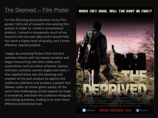
1. The Deprived – Film Poster
For the Planning and production of my Film
poster I did a lot of research into existing film
posters in order to create a conventional
product. I aimed to incorporate much of my
research into my own idea as this would help
me reach a higher level of quality, and a more
effective overall product.
I began by analysing Posters that shared a
common theme with my movie narrative and
began researching into their codes and
conventions such as colour schemes, layouts,
and even common camera angles and shots. I
then applied these into the planning and
creation of my own product to capture the
audiences attention and produce a poster that
follows codes of similar genre poster. At the
same time challenging certain aspects to make
it innovative, and leave the audience intrigued,
and asking questions, making it an even more
effective promotional tool.
2. Inspirational posters
These two posters promoting one of my groups
biggest inspirational films, The Road , I found
where the ones that inspired my piece the most. I
liked the idea of having a faceless character on the
poster, which adds to the code of enigma of the
narrative, I was intrigued by this challenge of
convention and wanted to use it in my own poster.
So I decided to base my own idea largely on the
structure of the bottom image, with the
protagonist walking away from the camera.
Although, apart from the main image, I did not
take much more from these posters as my further
inspiration, like colour scheme, layout and multi
platform links came from other promotional
devices.
3. Further Inspiration
Similar to the road in genre and certain themes is The
Book of Eli. In both the road posters and in the Book of
Eli they clearly represent a post-apocalyptic world,
with essences of destruction, decay and degradation
which are seen in the backgrounds to give some
narrative of the poster. I needed to replicate this but to
a slightly different narrative. The two show a world
that has been eradicated, where as I wanted mine to
show the themes of nature, and how when the world
of men destroys themselves, nature will slowly retake
its place. I did this by having my main image in a rural
location with a dilapidated house in the background,
and to remove this from the nuclear theme I included
trees and birds, to show other than human the rest of
the world is in a relative state of norm, following the
human downfall into chaos.
This poster in particular influenced my placing of the
texts on the page, for example it shows the title
overlapping the body of Eli, which otherwise would be
just dead space, and also it does not cover up any large
details, which is what I tried, and successfully achieved
in my own poster, only covering up dead spaces and no
key imagery.
4. How does my product challenge conventions
of real media products?
I think in my product there are a few areas in particular
where I have challenged conventions of real media
products. For example, in the posters I researched like The
Road colour is not used to give the idea and feel of
hopelessness and death, but in mine I felt that by changing
the shade of the sky from a light grey to a faded purple/red
it would enhance the themes of blood and death further.
Also can be seen as a use of pathetic fallacy, representing
an mood or theme in the weather, or in my terms,
representing death and blood in the sky., as it is looming
over the character and the rest of human kind.
Another area is the way I have represented my main image
and the character, he is seen facing away from the camera
giving a greater sense of enigma to the narrative leaving
the audience asking important questions and giving
possible hints to later narratives and themes.( E.g. the
map) Another possibly more subtle but still non
conventional is the placing of the title. As it is not
centralised, it does not abide by the vast majority of
posters I have looked at, as I wanted to, like the book of Eli
did, fill in only the areas of space that would not
compromise any other details of the poster.
5. CONCLUSION
In conclusion I believe I have planned and created an effective
promotional poster that both conforms to codes and conventions but
also in areas challenges forms to allow my product to be imaginative
and individual among most similar genre posters. I have used and
developed conventions to fit in and bide by my own narrative and
themes, to which I think I have done successfully and overall I am very
pleased with the outcome.