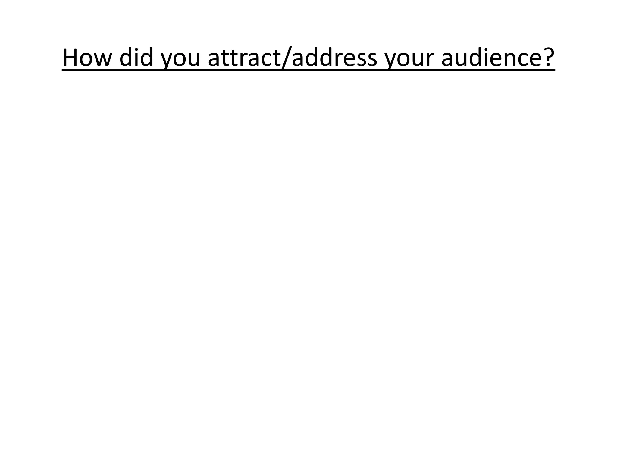
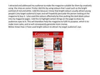
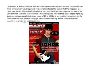
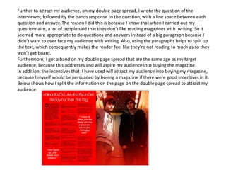
The author attracted their young audience for their music magazine through creative use of design elements. Bright colors like red and white were used to catch the eye, and black text was used to highlight important information. A guitar was featured on the cover as a common music magazine symbol. Question and answer interviews with bands were used instead of dense paragraphs to avoid overwhelming readers with text. A band the same age as the target audience was featured to inspire them. Incentives were also included to motivate purchases. The layout split information across pages to break up the text.