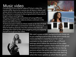
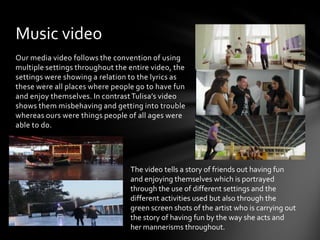
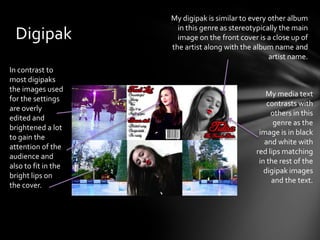
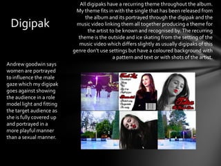
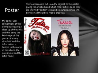
Musicthe original video of Tulisa’s video the
Compared to
            video
scenes differ due to our scenes are all done in black and
white which is the same as the dresses she has on which
fits a theme in contrast to the original which have lots of
bright colours and lighting.
We have followed the convention of using different
outfits throughout the video to show a contrast in the
black and white dresses.
Andrew Goodwin believes there needs to be lots of close
ups which will make a connection with the audience if
they’re looking directly into the camera and also we
develop the motif of the artist giggling and just enjoying
herself throughout the video.
                                    We used a green screen background and chose not
                                    to put a background on this so the artist stands out
                                    more and there is more focus on her which
                                    contrasts to the original which has 3 different
                                    settings which follow the storyline of the video.
                                    Andrew Goodwin explains there needs to be genre
                                    characteristics and our video fits this by having
                                    sections where the artist is on their own singing
                                    the lyrics of the song and also the artist dancing
                                    when the music speeds up which fits this genre.
Music video
Our media video follows the convention of using
multiple settings throughout the entire video, the
settings were showing a relation to the lyrics as
these were all places where people go to have fun
and enjoy themselves. In contrast Tulisa’s video
shows them misbehaving and getting into trouble
whereas ours were things people of all ages were
able to do.


                                 The video tells a story of friends out having fun
                                 and enjoying themselves which is portrayed
                                 through the use of different settings and the
                                 different activities used but also through the
                                 green screen shots of the artist who is carrying out
                                 the story of having fun by the way she acts and
                                 her mannerisms throughout.
My digipak is similar to every other album
                       in this genre as stereotypically the main
  Digipak              image on the front cover is a close up of
                     the artist along with the album name and
                                                    artist name.
In contrast to
most digipaks
the images used
                                                   My media text
for the settings
                                                   contrasts with
are overly
                                                    others in this
edited and
                                                     genre as the
brightened a lot
                                                image is in black
to gain the
                                                  and white with
attention of the
                                               red lips matching
audience and
                                                in the rest of the
also to fit in the
                                                  digipak images
bright lips on
                                                    and the text.
the cover.
All digipaks have a recurring theme throughout the album.
                           My theme fits in with the single that has been released from
                               the album and its portrayed through the digipak and the
 Digipak                   music video linking them all together producing a theme for
                                 the artist to be known and recognised by. The recurring
                            theme is the outside and ice skating from the setting of the
                            music video which differs slightly as usually digipaks of this
                          genre don’t use settings but have a coloured background with
                                             a pattern and text or with shots of the artist.
Andrew goodwin says
women are portrayed
to influence the male
gaze which my digipak
goes against showing
the audience in a role
model light and fitting
the target audience as
she is fully covered up
and portrayed in a
more playful manner
than a sexual manner.
The font is carried out from the digipak to the poster
                         giving the artist a brand which many artists do so they
  Poster                 are known by certain texts and colours creating a link
                         between all the artists media products.


My poster uses
conventions of this
genre by showing a
close up of the artist
and this being the
key image of the
poster. It is very
simplistic and the
information is
limited to the name
of the album, the
date its out and the
artist name.

Evaluation q1

  • 2.
    Musicthe original videoof Tulisa’s video the Compared to video scenes differ due to our scenes are all done in black and white which is the same as the dresses she has on which fits a theme in contrast to the original which have lots of bright colours and lighting. We have followed the convention of using different outfits throughout the video to show a contrast in the black and white dresses. Andrew Goodwin believes there needs to be lots of close ups which will make a connection with the audience if they’re looking directly into the camera and also we develop the motif of the artist giggling and just enjoying herself throughout the video. We used a green screen background and chose not to put a background on this so the artist stands out more and there is more focus on her which contrasts to the original which has 3 different settings which follow the storyline of the video. Andrew Goodwin explains there needs to be genre characteristics and our video fits this by having sections where the artist is on their own singing the lyrics of the song and also the artist dancing when the music speeds up which fits this genre.
  • 3.
    Music video Our mediavideo follows the convention of using multiple settings throughout the entire video, the settings were showing a relation to the lyrics as these were all places where people go to have fun and enjoy themselves. In contrast Tulisa’s video shows them misbehaving and getting into trouble whereas ours were things people of all ages were able to do. The video tells a story of friends out having fun and enjoying themselves which is portrayed through the use of different settings and the different activities used but also through the green screen shots of the artist who is carrying out the story of having fun by the way she acts and her mannerisms throughout.
  • 4.
    My digipak issimilar to every other album in this genre as stereotypically the main Digipak image on the front cover is a close up of the artist along with the album name and artist name. In contrast to most digipaks the images used My media text for the settings contrasts with are overly others in this edited and genre as the brightened a lot image is in black to gain the and white with attention of the red lips matching audience and in the rest of the also to fit in the digipak images bright lips on and the text. the cover.
  • 5.
    All digipaks havea recurring theme throughout the album. My theme fits in with the single that has been released from the album and its portrayed through the digipak and the Digipak music video linking them all together producing a theme for the artist to be known and recognised by. The recurring theme is the outside and ice skating from the setting of the music video which differs slightly as usually digipaks of this genre don’t use settings but have a coloured background with a pattern and text or with shots of the artist. Andrew goodwin says women are portrayed to influence the male gaze which my digipak goes against showing the audience in a role model light and fitting the target audience as she is fully covered up and portrayed in a more playful manner than a sexual manner.
  • 6.
    The font iscarried out from the digipak to the poster giving the artist a brand which many artists do so they Poster are known by certain texts and colours creating a link between all the artists media products. My poster uses conventions of this genre by showing a close up of the artist and this being the key image of the poster. It is very simplistic and the information is limited to the name of the album, the date its out and the artist name.