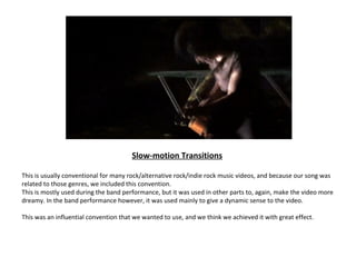
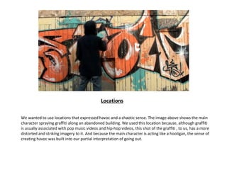
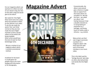
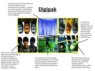
What ways does your media
product use, develop or challenge
  forms and conventions of real
        media products?
          Harrison Twinn
Music Video     Narrative/Band Performance

              Throughout the music video, we presented
              both a narrative and a band performance
              with the use of cross-cutting and parallel
              editing to achieve this. This is usually done
              in alternative rock/ indie rock music
              videos, and some of them related to those
              genres might sometimes blend the
              performance with the narrative – e.g. Foo
              Fighters – My hero (though this is quite
              unconventional).

              The conventions we used contributed to
              creating the upbeat atmosphere
              throughout the duration of the video, such
              as colourful settings and fast-paced
              performances.

              We also wanted to show our capabilities
              with our instruments during the band
              performance as well as making the lighting
              lively as well as bright and colourful.
Split-screens


At certain points, we wanted to show the
two ‘sides’ of the main character doing
different things so that we could convey our
interpretation of going out and staying
indoors. To do this, we used split-screens to
show both of the main character’s sides
when parallel editing and cross-cutting
were getting repetitive.

The concept of split-screens are very
conventional in other music videos, mostly
related to the pop genre. But the concept
we used them for seemed to put a twist on
the conventions. Usually, the artist of the
pop genre would use split-screens for
reasons that contribute to their image. But
our music video uses split-screens to show
the two narratives of one person. In short,
we think that we used this technique to an
unconventional level.
Visuals
There were a few points in the song where we wanted to have
some visual effects that would make the video seem more dream-
like, especially when the song reaches its toned-down parts.

This technique is conventional for creating dreamy transitions in
other music videos. It could be used for many things, including
flashbacks, memories etc. We used this so that we could make the
‘going-out’ side of the main character feel as if he was in ecstasy –
the band performance also has this to flesh out the music video
more.

Some music videos would use this to cross-dissolve from one
sequence to the next. But we used this for single sequences as well
as others.
Slow-motion Transitions

This is usually conventional for many rock/alternative rock/indie rock music videos, and because our song was
related to those genres, we included this convention.
This is mostly used during the band performance, but it was used in other parts to, again, make the video more
dreamy. In the band performance however, it was used mainly to give a dynamic sense to the video.

This was an influential convention that we wanted to use, and we think we achieved it with great effect.
Locations

We wanted to use locations that expressed havoc and a chaotic sense. The image above shows the main
character spraying graffiti along an abandoned building. We used this location because, although graffiti
is usually associated with pop music videos and hip-hop videos, this shot of the graffiti , to us, has a more
distorted and striking imagery to it. And because the main character is acting like a hooligan, the sense of
creating havoc was built into our partial interpretation of going out.
For our magazine advert, we
wanted it to reflect not only
                                Magazine Advert      Conventionally, the
                                                     album name would
                                                     give a theme or maybe
on our chosen song, but also
on the other songs we would                          take an aspect from
give to the album.                                   the tracks which are
                                                     included in it. We did
We made the ‘One Night                               this here – we called
Only’ band name into a way                           our album ‘Lost
which we wanted to reflect                           Feeling’ because it had
on the ridicule in our video.                        a double entendre to
To do this we made the                               it; losing feeling of
words ‘One’ and ‘Only’                               enjoyment as a
normal as they are, but                              teenager, and losing
made the word ‘Night’                                touch of reality under a
inverted so that it would                            stimulus – e.g. alcohol.
reflect on this whilst still
being readable.
Other artists would have                            Many artists use their
this kind of style for their                        own image to promote
band/stage name.                                    a product on a
                                                    magazine advert. We
 We put a review on our                             have done this with
 magazine advert which                              each of the band
 is another promotional                             members in our music
 method.                                            video.


                                                  This is the label used by
A website for the band                            ‘Vertigo Records’ who take
is usually given for                              on other alternative/indie
people to go to for more                          rock bands like One Night
background information                            Only.
or for discography.
The picture of the icicles could be said
          to be self-explanatory and


                                                          Digipak
          metaphorical for our album – coldness
          can mean numbness – losing feeling.
          Some artists of other genres use this
          idea of using imagery as metaphors
          for their digipaks.


                                                                                                          To reflect the
                                                                                                          theme of the
                                                                                                          digipak further, we
                                                                                                          wanted to create a
                                                                                                          ‘cold’ feeling for
                                                                                                          the front cover
                                                                                                          whilst showing
                                                                                                          expression in the
                                                                                                          band members.


Again, like our magazine
advert, we used the image of
the band members to
promote the digipak. We                              The track-list we created includes      We used the same fonts for
used more visuals with the                           song titles that reflect on the theme   the band name and digipak
digipak though – expressing                          we were going for, which is quite a     name that we used in our
the theme of the songs on                            common convention among other           magazine advert –
the tracklist – loss of                              artists of the alternative/indie rock   conventionally, fonts could be
enjoyment, insanity etc.                             genre.                                  good to brand a band name.

Music Video Evaluation

  • 1.
    What ways doesyour media product use, develop or challenge forms and conventions of real media products? Harrison Twinn
  • 2.
    Music Video Narrative/Band Performance Throughout the music video, we presented both a narrative and a band performance with the use of cross-cutting and parallel editing to achieve this. This is usually done in alternative rock/ indie rock music videos, and some of them related to those genres might sometimes blend the performance with the narrative – e.g. Foo Fighters – My hero (though this is quite unconventional). The conventions we used contributed to creating the upbeat atmosphere throughout the duration of the video, such as colourful settings and fast-paced performances. We also wanted to show our capabilities with our instruments during the band performance as well as making the lighting lively as well as bright and colourful.
  • 3.
    Split-screens At certain points,we wanted to show the two ‘sides’ of the main character doing different things so that we could convey our interpretation of going out and staying indoors. To do this, we used split-screens to show both of the main character’s sides when parallel editing and cross-cutting were getting repetitive. The concept of split-screens are very conventional in other music videos, mostly related to the pop genre. But the concept we used them for seemed to put a twist on the conventions. Usually, the artist of the pop genre would use split-screens for reasons that contribute to their image. But our music video uses split-screens to show the two narratives of one person. In short, we think that we used this technique to an unconventional level.
  • 4.
    Visuals There were afew points in the song where we wanted to have some visual effects that would make the video seem more dream- like, especially when the song reaches its toned-down parts. This technique is conventional for creating dreamy transitions in other music videos. It could be used for many things, including flashbacks, memories etc. We used this so that we could make the ‘going-out’ side of the main character feel as if he was in ecstasy – the band performance also has this to flesh out the music video more. Some music videos would use this to cross-dissolve from one sequence to the next. But we used this for single sequences as well as others.
  • 5.
    Slow-motion Transitions This isusually conventional for many rock/alternative rock/indie rock music videos, and because our song was related to those genres, we included this convention. This is mostly used during the band performance, but it was used in other parts to, again, make the video more dreamy. In the band performance however, it was used mainly to give a dynamic sense to the video. This was an influential convention that we wanted to use, and we think we achieved it with great effect.
  • 6.
    Locations We wanted touse locations that expressed havoc and a chaotic sense. The image above shows the main character spraying graffiti along an abandoned building. We used this location because, although graffiti is usually associated with pop music videos and hip-hop videos, this shot of the graffiti , to us, has a more distorted and striking imagery to it. And because the main character is acting like a hooligan, the sense of creating havoc was built into our partial interpretation of going out.
  • 7.
    For our magazineadvert, we wanted it to reflect not only Magazine Advert Conventionally, the album name would give a theme or maybe on our chosen song, but also on the other songs we would take an aspect from give to the album. the tracks which are included in it. We did We made the ‘One Night this here – we called Only’ band name into a way our album ‘Lost which we wanted to reflect Feeling’ because it had on the ridicule in our video. a double entendre to To do this we made the it; losing feeling of words ‘One’ and ‘Only’ enjoyment as a normal as they are, but teenager, and losing made the word ‘Night’ touch of reality under a inverted so that it would stimulus – e.g. alcohol. reflect on this whilst still being readable. Other artists would have Many artists use their this kind of style for their own image to promote band/stage name. a product on a magazine advert. We We put a review on our have done this with magazine advert which each of the band is another promotional members in our music method. video. This is the label used by A website for the band ‘Vertigo Records’ who take is usually given for on other alternative/indie people to go to for more rock bands like One Night background information Only. or for discography.
  • 8.
    The picture ofthe icicles could be said to be self-explanatory and Digipak metaphorical for our album – coldness can mean numbness – losing feeling. Some artists of other genres use this idea of using imagery as metaphors for their digipaks. To reflect the theme of the digipak further, we wanted to create a ‘cold’ feeling for the front cover whilst showing expression in the band members. Again, like our magazine advert, we used the image of the band members to promote the digipak. We The track-list we created includes We used the same fonts for used more visuals with the song titles that reflect on the theme the band name and digipak digipak though – expressing we were going for, which is quite a name that we used in our the theme of the songs on common convention among other magazine advert – the tracklist – loss of artists of the alternative/indie rock conventionally, fonts could be enjoyment, insanity etc. genre. good to brand a band name.