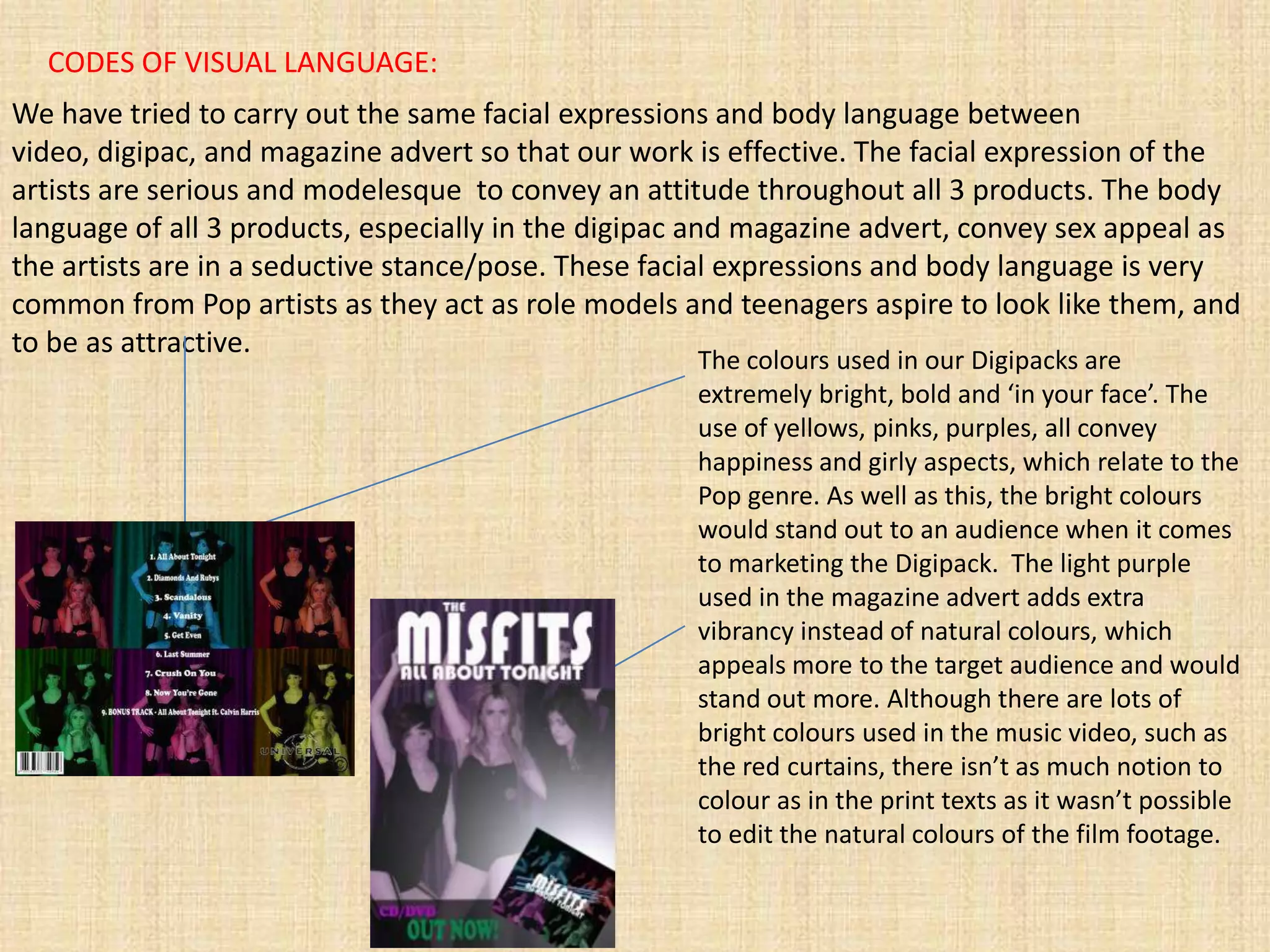
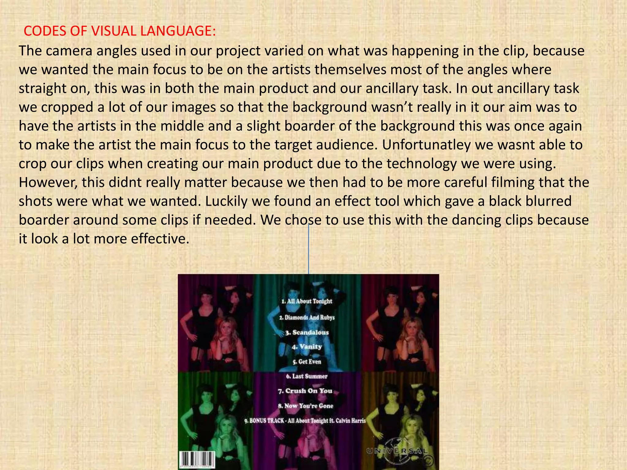
EVALUATION QUESTION 2:

   How effective is the
 combination of your main
product and ancillary tasks.
The aim of the project we have completed is to promote our
artists through a variety of 3 products: Music video, Digipac,
     and a magazine advert suitable for ‘Mizz’ magazine.

 In reality, these products would all be produced by the same
record company marketing team and would use similar source
 material to give uniform and coherent identity to update and
       develop the already established style of the artist.

Therefore, to be effective there has to be similar use of media
  language in all 3 products and they all must carry similar
     connotations, something which we have tried to do
                    throughout our project.
CODES OF VISUAL LANGUAGE:
We have tried to carry out the same facial expressions and body language between
video, digipac, and magazine advert so that our work is effective. The facial expression of the
artists are serious and modelesque to convey an attitude throughout all 3 products. The body
language of all 3 products, especially in the digipac and magazine advert, convey sex appeal as
the artists are in a seductive stance/pose. These facial expressions and body language is very
common from Pop artists as they act as role models and teenagers aspire to look like them, and
to be as attractive.
                                                     The colours used in our Digipacks are
                                                     extremely bright, bold and ‘in your face’. The
                                                     use of yellows, pinks, purples, all convey
                                                     happiness and girly aspects, which relate to the
                                                     Pop genre. As well as this, the bright colours
                                                     would stand out to an audience when it comes
                                                     to marketing the Digipack. The light purple
                                                     used in the magazine advert adds extra
                                                     vibrancy instead of natural colours, which
                                                     appeals more to the target audience and would
                                                     stand out more. Although there are lots of
                                                     bright colours used in the music video, such as
                                                     the red curtains, there isn’t as much notion to
                                                     colour as in the print texts as it wasn’t possible
                                                     to edit the natural colours of the film footage.
CODES OF VISUAL LANGUAGE:
Throughout all 3 products we mainly used close up and mid shots. This was so the main
attraction and focus would be on the artist themselves, whether it was focusing on the
singing or acting. On the odd occasion, during our digipac photo shoot, we chose to use
long shots, this was when the clips that was being shot contained all three artists, we
chose to do this to show the different locations in the video and also to give the video a
variation of shots.
                                       The font and layout we chose for our print texts were
                                       very funky and ‘pop’ like so it worked with our chosen
                                       genre. We chose to use different lyrics of the song on
   Mid shot                            our ancillary task so they both combined together
                                       effectively.


                    Long shot
CODES OF VISUAL LANGUAGE:
The lighting we used varied throughout the video as it contained different times of the day.
When the focus was on the dancing we used as much lighting as possible to portray a live
performance feeling. However when shots were taken in the house and other locations we just
used natural light to make it more realistic. In our ancillary task we used as much lighting effect
as possible to make it more visually interesting and brighter on the eye.

 In our main product we used everyday props like
 hair spray, brushes and various other things to
 create a real life feeling. We also used a car to make
 the video more realistic. We used these props so it
 would bring in the attention of our target audience
 because these are the things they would most
 commonly use everyday. Our ancillary task didn’t
 use quite as many props as our main task because
 we wanted the pictures to be simple and only have
 the focus on the artist. However, we combined the
 clothing in the main product and ancillary task very
 well because the clothes worn in the photo shoot
 were the clothes worn in the dance shots in each
 clip of the music video. Doing this showed that they
 both linked together. The clothes that we wore the
 most often in our music video was the outfit we also
 wore in the ancillary task, this showed that it
 effectively combined in both tasks.
CODES OF VISUAL LANGUAGE:
The camera angles used in our project varied on what was happening in the clip, because
we wanted the main focus to be on the artists themselves most of the angles where
straight on, this was in both the main product and our ancillary task. In out ancillary task
we cropped a lot of our images so that the background wasn’t really in it our aim was to
have the artists in the middle and a slight boarder of the background this was once again
to make the artist the main focus to the target audience. Unfortunatley we wasnt able to
crop our clips when creating our main product due to the technology we were using.
However, this didnt really matter because we then had to be more careful filming that the
shots were what we wanted. Luckily we found an effect tool which gave a black blurred
boarder around some clips if needed. We chose to use this with the dancing clips because
it look a lot more effective.
REPRESENTATION/IMAGE
In the music industry, the way in which an artist is represented to their fans is vital to achieve
commercial success. Popular music is very much part of our shared popular culture and is about
a lot more than just music, especially with a youth audience.
Myself, as a fan, I don’t just like artists for their music, I also appreciate the fashion style,
celebrity status, and performance skills of the artist, which is why there are somethings we tried
to connote throughout our 3 products.
Whilst creating our music video and ancillary task our group noticed that it isn’t just the music that is the
main attraction when working in the music industry. We had to put a lot of thought in what visually attracts
the audience, especially when have a youth target audience. Because we had a specific target audience we
had to include specific specialties, such as sex appeal, we did this to keep the audience interested and also
something for them to aspire to.
Fans often relate very closely to the representations of artists, these may influence how they
percieve themselves and others. They may base their choices on their like for an artist such as
how to dress, do their make-up, their attitude, places they go, and certainly their singing and
dancing.
This is why we chose to use a situation/narrative in our music video that could happen in real life to
somebody suitable as our target audience. We thought having a story line of girl going through a breakup
was a good idea because youths could relate to it. We combined our story line of teenagers well throughout
our main product and ancillary task.

Evaluation question 2 Powerpoint

  • 1.
    EVALUATION QUESTION 2: How effective is the combination of your main product and ancillary tasks.
  • 2.
    The aim ofthe project we have completed is to promote our artists through a variety of 3 products: Music video, Digipac, and a magazine advert suitable for ‘Mizz’ magazine. In reality, these products would all be produced by the same record company marketing team and would use similar source material to give uniform and coherent identity to update and develop the already established style of the artist. Therefore, to be effective there has to be similar use of media language in all 3 products and they all must carry similar connotations, something which we have tried to do throughout our project.
  • 3.
    CODES OF VISUALLANGUAGE: We have tried to carry out the same facial expressions and body language between video, digipac, and magazine advert so that our work is effective. The facial expression of the artists are serious and modelesque to convey an attitude throughout all 3 products. The body language of all 3 products, especially in the digipac and magazine advert, convey sex appeal as the artists are in a seductive stance/pose. These facial expressions and body language is very common from Pop artists as they act as role models and teenagers aspire to look like them, and to be as attractive. The colours used in our Digipacks are extremely bright, bold and ‘in your face’. The use of yellows, pinks, purples, all convey happiness and girly aspects, which relate to the Pop genre. As well as this, the bright colours would stand out to an audience when it comes to marketing the Digipack. The light purple used in the magazine advert adds extra vibrancy instead of natural colours, which appeals more to the target audience and would stand out more. Although there are lots of bright colours used in the music video, such as the red curtains, there isn’t as much notion to colour as in the print texts as it wasn’t possible to edit the natural colours of the film footage.
  • 4.
    CODES OF VISUALLANGUAGE: Throughout all 3 products we mainly used close up and mid shots. This was so the main attraction and focus would be on the artist themselves, whether it was focusing on the singing or acting. On the odd occasion, during our digipac photo shoot, we chose to use long shots, this was when the clips that was being shot contained all three artists, we chose to do this to show the different locations in the video and also to give the video a variation of shots. The font and layout we chose for our print texts were very funky and ‘pop’ like so it worked with our chosen genre. We chose to use different lyrics of the song on Mid shot our ancillary task so they both combined together effectively. Long shot
  • 5.
    CODES OF VISUALLANGUAGE: The lighting we used varied throughout the video as it contained different times of the day. When the focus was on the dancing we used as much lighting as possible to portray a live performance feeling. However when shots were taken in the house and other locations we just used natural light to make it more realistic. In our ancillary task we used as much lighting effect as possible to make it more visually interesting and brighter on the eye. In our main product we used everyday props like hair spray, brushes and various other things to create a real life feeling. We also used a car to make the video more realistic. We used these props so it would bring in the attention of our target audience because these are the things they would most commonly use everyday. Our ancillary task didn’t use quite as many props as our main task because we wanted the pictures to be simple and only have the focus on the artist. However, we combined the clothing in the main product and ancillary task very well because the clothes worn in the photo shoot were the clothes worn in the dance shots in each clip of the music video. Doing this showed that they both linked together. The clothes that we wore the most often in our music video was the outfit we also wore in the ancillary task, this showed that it effectively combined in both tasks.
  • 6.
    CODES OF VISUALLANGUAGE: The camera angles used in our project varied on what was happening in the clip, because we wanted the main focus to be on the artists themselves most of the angles where straight on, this was in both the main product and our ancillary task. In out ancillary task we cropped a lot of our images so that the background wasn’t really in it our aim was to have the artists in the middle and a slight boarder of the background this was once again to make the artist the main focus to the target audience. Unfortunatley we wasnt able to crop our clips when creating our main product due to the technology we were using. However, this didnt really matter because we then had to be more careful filming that the shots were what we wanted. Luckily we found an effect tool which gave a black blurred boarder around some clips if needed. We chose to use this with the dancing clips because it look a lot more effective.
  • 7.
    REPRESENTATION/IMAGE In the musicindustry, the way in which an artist is represented to their fans is vital to achieve commercial success. Popular music is very much part of our shared popular culture and is about a lot more than just music, especially with a youth audience. Myself, as a fan, I don’t just like artists for their music, I also appreciate the fashion style, celebrity status, and performance skills of the artist, which is why there are somethings we tried to connote throughout our 3 products. Whilst creating our music video and ancillary task our group noticed that it isn’t just the music that is the main attraction when working in the music industry. We had to put a lot of thought in what visually attracts the audience, especially when have a youth target audience. Because we had a specific target audience we had to include specific specialties, such as sex appeal, we did this to keep the audience interested and also something for them to aspire to. Fans often relate very closely to the representations of artists, these may influence how they percieve themselves and others. They may base their choices on their like for an artist such as how to dress, do their make-up, their attitude, places they go, and certainly their singing and dancing. This is why we chose to use a situation/narrative in our music video that could happen in real life to somebody suitable as our target audience. We thought having a story line of girl going through a breakup was a good idea because youths could relate to it. We combined our story line of teenagers well throughout our main product and ancillary task.