By looking at few music video of pop genre on YouTube we were able to spot the usual
conventions by identifying the mise-en-scene.
 Locations were not the main focus for most of the time as most Pop music video were
shot in a green room and mainly used effects such as flashing and took priority over the
artist appearance by giving the main role throughout the music video the camera where
most like to follow them through long shot, close up, zoom, tracking, panning. Most Pop
music video will would have a dance number whereby the artist will join in with the
choreography by having back up dancers behind them. The lighting were almost always
bright with minimal use of dark light, however some Pop music video did have a dark
light at the beginning of the their video to introduce the artist, the light did increase in
time. Most Pop artist will wear very bright coloured costumes and female pop artist were
mostly dressed in provocative ways. The music was always upbeat with the use of drums,
keyboards and string. This gave us an idea of how our music should look like; through
editing we were able to create a bright atmosphere as well professional looking effects.

Through Andre Goodwin’s analysis of music video, a music video demonstrates genre
characteristics through stage performance and dance routine. He also states that the
there should be a relationship between lyrics and visuals as well as between music and
visuals.

As soon as we heard the song by the artist and learning a bit about him through artist
research we decided the song fits best in Pop genre as the song sound upbeat and could
easily be transformed to a Pop music video.
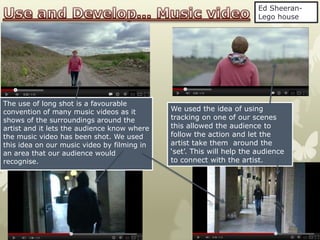
Ed Sheeran-
                                                                       Lego house


The use of long shot is a favourable
convention of many music videos as it        We used the idea of using
shows of the surroundings around the         tracking on one of our scenes
artist and it lets the audience know where   this allowed the audience to
the music video has been shot. We used       follow the action and let the
this idea on our music video by filming in   artist take them around the
an area that our audience would              ‘set’. This will help the audience
recognise.                                   to connect with the artist.
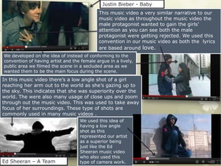
Justin Bieber - Baby
                                            This music video a very similar narrative to our
                                            music video as throughout the music video the
                                            male protagonist wanted to gain the girls’
                                            attention as you can see both the male
                                            protagonist were getting rejected. We used this
                                            convention in our music video as both the lyrics
                                            are based around love.
We developed on the idea of instead of conforming to the
convention of having artist and the female argue in a lively,
public area we filmed the scene in a secluded area as we
wanted them to be the main focus during the scene.
In this music video there’s a low angle shot of a girl
reaching her arm out to the world as she’s gazing up to
the sky. This indicates that she was superiority over the
world. The were also many usage of close ups and zoom
through out the music video. This was used to take away
focus of her surroundings. These type of shots are
commonly used in many music videos .
                                   We used this idea of
                                   having a low angle
                                   shot as this
                                   represented our artist
                                   as a superior being
                                   just like the Ed
                                   Sheeran music video
                                   who also used this
Ed Sheeran – A Team                type of camera work.
Both the advert defocused     As you can see both advert
    the background to make the
    artist stand out and look
                                  has both the name of the
    more rounded                  artist and the date of the
                                  release date of the album.
This advert
has a very
distinct colour                                                       On my
scheme which                                                          advert I
is red as its                                                         included
consistent                                                            more
through out                                                           details
the advert.                                                           such as
Whereas I                                                             shops and
tried not to                                                          sites that
stick with one                                                        the
colour but took                                                       audience
advantage of                                                          can
the colour on                                                         purchase
the hat; this                                                         the album
flattered the
artist face as it
looks more
rounded and               I got the idea of including the CD of the
light as the hat          album to let the audience know how it
is of bright              looks like so when they go to purchase it
colours
                          they’ll know which one it is.
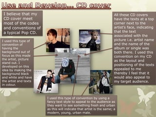
I believe that my                                                    All these CD covers
 CD cover meet                                                        have the texts at a top
 most of the codes                                                    corner next to the
 and conventions of                                                   artist’s face, indicating
 a typical Pop CD.                                                    that the text
                                                                      associated with the
I used this type of                                                   picture i.e. artist name
convention of                                                         and the name of the
having the                                                            album or single was
background out of                                                     both there. I used this
focus as this made                                                    convention on my CD
the artist, picture
                                                                      as the layout and
stand out. I
developed on this
                                                                      positioning of the texts
idea by making the                                                    appealed to me
background black                                                      thereby I feel that it
and white and have                                                    would also appeal to
the artist and texts                                                  my target audience.
in colour.


                       I used this type of convention by using a
                       fancy text style to appeal to the audience as
                       they want to see something fresh and urban
                       as this will indicate that artist is the same; a
                       modern, young, urban male.
As a group we decided to go with a different approach with music
     video and challenge some of the code and conventions of a pop.
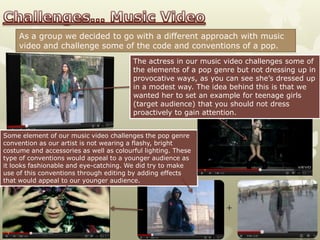
                                         The actress in our music video challenges some of
                                         the elements of a pop genre but not dressing up in
                                         provocative ways, as you can see she’s dressed up
                                         in a modest way. The idea behind this is that we
                                         wanted her to set an example for teenage girls
                                         (target audience) that you should not dress
                                         proactively to gain attention.


Some element of our music video challenges the pop genre
convention as our artist is not wearing a flashy, bright
costume and accessories as well as colourful lighting. These
type of conventions would appeal to a younger audience as
it looks fashionable and eye-catching. We did try to make
use of this conventions through editing by adding effects
that would appeal to our younger audience.


                                                                  +
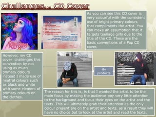
As you can see this CD cover is
                                                 very colourful with the consistent
                                                 use of bright primary colours
                                                 that compliments the artist. You
                                                 can make an assumption that it
                   +                             targets teenage girls due to the
                                                 title of the CD. These are the
                                                 basic conventions of a Pop CD
                                                 cover.

However, my CD
cover challenges this
convention by not
using as much                                             My
primary colours                                        products
instead I made use of
neutral colours such
as black and white
with some element of
primary colours on      The reason for this is; is that I wanted the artist to be the
the clothes.            main focus by making the audience pay very little attention
                        to the background and focus their eyes on the artist and the
                        texts. This will ultimately grab their attention as the only
                        colour present are on the artist and texts, as a result they will
                        have no choice but to look at the artist and read the texts.
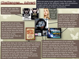
Here are some music advert from Pop artists, I’m
                                              going to look at the different codes and conventions
                                              in each advert and identify how my advert
                                              challenges some of their conventions.
As you can see the
texts are positioned
differently.
                                                                          I used minimal effects on
                                                                          my advert as I wanted to
                                                                          keep it simple. However,
                                                                          some of these advert
The picture are of many                                                   took advantage of their
different size and how they                                               advert and used effects
are positioned are different                                              to their full potential.
as my advert solely focuses
on the artist face and texts;
showing the consumers the
importance of the
information that they are
presented with.

                                                     I showed the importance of my artist by
This advert does not show the audience a picture     having him positioned on the centre of the
of the artist as she’s very well known. The advert   advert; indicating the importance of the
shows that by just the mention of her name the       artist, I also showed this by having the texts
audience will already know who she is as she         surround him. Whereas the other advert had
reached the at a point of her career of being        positioned the artist at a corner of the advert
successful and an international pop star,            and by exaggerating its texts by having
however, my artist has not reached that point        bright and bold lettering. Whereas I tried to
yet which is why both a picture of him and the       keep mine simple with minimal texts styles.
name is given away on the advert

Evaluation: Part 1

  • 2.
    By looking atfew music video of pop genre on YouTube we were able to spot the usual conventions by identifying the mise-en-scene. Locations were not the main focus for most of the time as most Pop music video were shot in a green room and mainly used effects such as flashing and took priority over the artist appearance by giving the main role throughout the music video the camera where most like to follow them through long shot, close up, zoom, tracking, panning. Most Pop music video will would have a dance number whereby the artist will join in with the choreography by having back up dancers behind them. The lighting were almost always bright with minimal use of dark light, however some Pop music video did have a dark light at the beginning of the their video to introduce the artist, the light did increase in time. Most Pop artist will wear very bright coloured costumes and female pop artist were mostly dressed in provocative ways. The music was always upbeat with the use of drums, keyboards and string. This gave us an idea of how our music should look like; through editing we were able to create a bright atmosphere as well professional looking effects. Through Andre Goodwin’s analysis of music video, a music video demonstrates genre characteristics through stage performance and dance routine. He also states that the there should be a relationship between lyrics and visuals as well as between music and visuals. As soon as we heard the song by the artist and learning a bit about him through artist research we decided the song fits best in Pop genre as the song sound upbeat and could easily be transformed to a Pop music video.
  • 3.
    Ed Sheeran- Lego house The use of long shot is a favourable convention of many music videos as it We used the idea of using shows of the surroundings around the tracking on one of our scenes artist and it lets the audience know where this allowed the audience to the music video has been shot. We used follow the action and let the this idea on our music video by filming in artist take them around the an area that our audience would ‘set’. This will help the audience recognise. to connect with the artist.
  • 4.
    Justin Bieber -Baby This music video a very similar narrative to our music video as throughout the music video the male protagonist wanted to gain the girls’ attention as you can see both the male protagonist were getting rejected. We used this convention in our music video as both the lyrics are based around love. We developed on the idea of instead of conforming to the convention of having artist and the female argue in a lively, public area we filmed the scene in a secluded area as we wanted them to be the main focus during the scene. In this music video there’s a low angle shot of a girl reaching her arm out to the world as she’s gazing up to the sky. This indicates that she was superiority over the world. The were also many usage of close ups and zoom through out the music video. This was used to take away focus of her surroundings. These type of shots are commonly used in many music videos . We used this idea of having a low angle shot as this represented our artist as a superior being just like the Ed Sheeran music video who also used this Ed Sheeran – A Team type of camera work.
  • 5.
    Both the advertdefocused As you can see both advert the background to make the artist stand out and look has both the name of the more rounded artist and the date of the release date of the album. This advert has a very distinct colour On my scheme which advert I is red as its included consistent more through out details the advert. such as Whereas I shops and tried not to sites that stick with one the colour but took audience advantage of can the colour on purchase the hat; this the album flattered the artist face as it looks more rounded and I got the idea of including the CD of the light as the hat album to let the audience know how it is of bright looks like so when they go to purchase it colours they’ll know which one it is.
  • 6.
    I believe thatmy All these CD covers CD cover meet have the texts at a top most of the codes corner next to the and conventions of artist’s face, indicating a typical Pop CD. that the text associated with the I used this type of picture i.e. artist name convention of and the name of the having the album or single was background out of both there. I used this focus as this made convention on my CD the artist, picture as the layout and stand out. I developed on this positioning of the texts idea by making the appealed to me background black thereby I feel that it and white and have would also appeal to the artist and texts my target audience. in colour. I used this type of convention by using a fancy text style to appeal to the audience as they want to see something fresh and urban as this will indicate that artist is the same; a modern, young, urban male.
  • 7.
    As a groupwe decided to go with a different approach with music video and challenge some of the code and conventions of a pop. The actress in our music video challenges some of the elements of a pop genre but not dressing up in provocative ways, as you can see she’s dressed up in a modest way. The idea behind this is that we wanted her to set an example for teenage girls (target audience) that you should not dress proactively to gain attention. Some element of our music video challenges the pop genre convention as our artist is not wearing a flashy, bright costume and accessories as well as colourful lighting. These type of conventions would appeal to a younger audience as it looks fashionable and eye-catching. We did try to make use of this conventions through editing by adding effects that would appeal to our younger audience. +
  • 8.
    As you cansee this CD cover is very colourful with the consistent use of bright primary colours that compliments the artist. You can make an assumption that it + targets teenage girls due to the title of the CD. These are the basic conventions of a Pop CD cover. However, my CD cover challenges this convention by not using as much My primary colours products instead I made use of neutral colours such as black and white with some element of primary colours on The reason for this is; is that I wanted the artist to be the the clothes. main focus by making the audience pay very little attention to the background and focus their eyes on the artist and the texts. This will ultimately grab their attention as the only colour present are on the artist and texts, as a result they will have no choice but to look at the artist and read the texts.
  • 9.
    Here are somemusic advert from Pop artists, I’m going to look at the different codes and conventions in each advert and identify how my advert challenges some of their conventions. As you can see the texts are positioned differently. I used minimal effects on my advert as I wanted to keep it simple. However, some of these advert The picture are of many took advantage of their different size and how they advert and used effects are positioned are different to their full potential. as my advert solely focuses on the artist face and texts; showing the consumers the importance of the information that they are presented with. I showed the importance of my artist by This advert does not show the audience a picture having him positioned on the centre of the of the artist as she’s very well known. The advert advert; indicating the importance of the shows that by just the mention of her name the artist, I also showed this by having the texts audience will already know who she is as she surround him. Whereas the other advert had reached the at a point of her career of being positioned the artist at a corner of the advert successful and an international pop star, and by exaggerating its texts by having however, my artist has not reached that point bright and bold lettering. Whereas I tried to yet which is why both a picture of him and the keep mine simple with minimal texts styles. name is given away on the advert