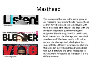
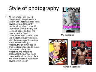
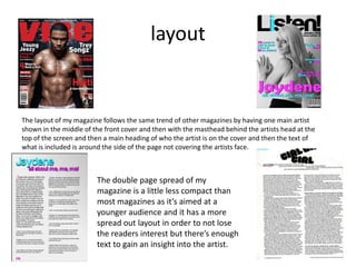
In what ways does your media product use, develop or challenge
        forms and conventions of real media products?
Who the codes and conventions need
           to appeal to
My magazine is made for teenage girls interested in
r&b/pop music and also that are interested in
fashion and the gossip about the people associated
with this genre. It had to appeal to them through
the colour scheme, the types of pictures that were
used and also the content that was included. My
magazine challenges some of the conventions such
as colour schemes but sticks to the majority of the
codes and conventions such as style of photo and
the costumes the artists are in and also the layout
of the cover.
Conventions of a magazine
    •   Masthead
    •   Fonts
    •   Writing style
    •   Colour scheme
    •   Cover lines
    •   Pull quotes
    •   Style of photography
    •   Page numbers
    •   Bar code, issue number
        and price.
Front cover
The images on the front cover
are similar as it focuses on one
person who the main article
inside the magazine is about.
Both images have a medium
long shot of the artist which is
the main article but we have a
different use of colours as the
other magazine has a dark
background and three set
colours for the text which links
into mine for having a theme of
three set colours but my image
is in black and white which is
challenging normal conventions
of a pop/R&B magazine although
it has bright coloured text on the
page.
Masthead
                    The magazines that are in the same genre as
                    my magazine have similarities to my masthead
My magazine         as they have both used the same layout with
                    their masthead at the top of the page with the
                    model in the picture partly covering the
                    magazine. Blender magazine has used a bold
                    black text upon a black background to make it
                    stand out and Vibe have used a bold red text
                    upon a black background which gives the
                    same effect as blender, my magazine also fits
                    this as its got a grey background with a black
                    text but it differs to the other magazines to
                    make it more noticeable as the letter ‘I’ is in a
Other magazines     different colour.
Writing style
•   The writing style on the inside
    of the magazine differs from
    the front cover as it’s very
    structured and has a clear
    layout into columns so it’s
    presented well to the                        My magazine
    audience and is easily
    understood. The layout
    makes it easier for the reader
    to find different paragraphs in
    the interviews and makes the
    double page spread more eye
    catching to the readers as it’s
    not trying to grab your
    attention as the cover lines
    on the front cover do, it’s for
    you to read.

                                       Other magazines
Colour scheme
The magazines have three main
colours on the front cover, My
magazine has used black, blue
and pink, the other magazine
has used black, yellow and
white and the last magazine has
used Black, gold and blue. A
main colour to be used on
magazines is black as it stands
out more and makes the text
clearer on a light background
although the middle example
has a black background with
bright coloured text over it.
Whereas mine and the last
magazine have a light
background with the bright
coloured text over the top to
make it stand out more.
Style of photography
•   All the photos are staged
    photos with one person in a
    studio, the shots taken for front
    covers are predominantly
    medium long shots or a mid
    shot which shows mainly the
    face and upper body of the
    person on the front
    cover, Most front covers show       My magazine
    the model having eye contact
    with the camera which makes
    it more eye catching to
    readers, the photos need to
    grab readers attention to make
    them want to buy the
    magazine. My magazine
    challenges the normal front
    cover as the picture is in black
    and white whereas most front
    covers are in colour.

                                         Other magazines
Props and costumes
My magazine was very simple, I used
basic colours for the outfit which was
black and white with no prints as I
wanted a plain picture so the text on
the cover would stand out and be more
effective. I used a young girl to show
the target market it was aimed at so
the audience feel they can relate to the
person being interviewed inside. On
the inside pages I added colour to the
pictures but kept the colour scheme by
putting a pink top on her and she had a
leopard print cardigan on as the
pictures were all on one side and I
wanted them to be bolder than on the
front cover.
layout


The layout of my magazine follows the same trend of other magazines by having one main artist
shown in the middle of the front cover and then with the masthead behind the artists head at the
top of the screen and then a main heading of who the artist is on the cover and then the text of
what is included is around the side of the page not covering the artists face.


                        The double page spread of my
                        magazine is a little less compact than
                        most magazines as it’s aimed at a
                        younger audience and it has a more
                        spread out layout in order to not lose
                        the readers interest but there’s enough
                        text to gain an insight into the artist.

Q1

  • 1.
    In what waysdoes your media product use, develop or challenge forms and conventions of real media products?
  • 2.
    Who the codesand conventions need to appeal to My magazine is made for teenage girls interested in r&b/pop music and also that are interested in fashion and the gossip about the people associated with this genre. It had to appeal to them through the colour scheme, the types of pictures that were used and also the content that was included. My magazine challenges some of the conventions such as colour schemes but sticks to the majority of the codes and conventions such as style of photo and the costumes the artists are in and also the layout of the cover.
  • 3.
    Conventions of amagazine • Masthead • Fonts • Writing style • Colour scheme • Cover lines • Pull quotes • Style of photography • Page numbers • Bar code, issue number and price.
  • 4.
    Front cover The imageson the front cover are similar as it focuses on one person who the main article inside the magazine is about. Both images have a medium long shot of the artist which is the main article but we have a different use of colours as the other magazine has a dark background and three set colours for the text which links into mine for having a theme of three set colours but my image is in black and white which is challenging normal conventions of a pop/R&B magazine although it has bright coloured text on the page.
  • 5.
    Masthead The magazines that are in the same genre as my magazine have similarities to my masthead My magazine as they have both used the same layout with their masthead at the top of the page with the model in the picture partly covering the magazine. Blender magazine has used a bold black text upon a black background to make it stand out and Vibe have used a bold red text upon a black background which gives the same effect as blender, my magazine also fits this as its got a grey background with a black text but it differs to the other magazines to make it more noticeable as the letter ‘I’ is in a Other magazines different colour.
  • 6.
    Writing style • The writing style on the inside of the magazine differs from the front cover as it’s very structured and has a clear layout into columns so it’s presented well to the My magazine audience and is easily understood. The layout makes it easier for the reader to find different paragraphs in the interviews and makes the double page spread more eye catching to the readers as it’s not trying to grab your attention as the cover lines on the front cover do, it’s for you to read. Other magazines
  • 7.
    Colour scheme The magazineshave three main colours on the front cover, My magazine has used black, blue and pink, the other magazine has used black, yellow and white and the last magazine has used Black, gold and blue. A main colour to be used on magazines is black as it stands out more and makes the text clearer on a light background although the middle example has a black background with bright coloured text over it. Whereas mine and the last magazine have a light background with the bright coloured text over the top to make it stand out more.
  • 8.
    Style of photography • All the photos are staged photos with one person in a studio, the shots taken for front covers are predominantly medium long shots or a mid shot which shows mainly the face and upper body of the person on the front cover, Most front covers show My magazine the model having eye contact with the camera which makes it more eye catching to readers, the photos need to grab readers attention to make them want to buy the magazine. My magazine challenges the normal front cover as the picture is in black and white whereas most front covers are in colour. Other magazines
  • 9.
    Props and costumes Mymagazine was very simple, I used basic colours for the outfit which was black and white with no prints as I wanted a plain picture so the text on the cover would stand out and be more effective. I used a young girl to show the target market it was aimed at so the audience feel they can relate to the person being interviewed inside. On the inside pages I added colour to the pictures but kept the colour scheme by putting a pink top on her and she had a leopard print cardigan on as the pictures were all on one side and I wanted them to be bolder than on the front cover.
  • 10.
    layout The layout ofmy magazine follows the same trend of other magazines by having one main artist shown in the middle of the front cover and then with the masthead behind the artists head at the top of the screen and then a main heading of who the artist is on the cover and then the text of what is included is around the side of the page not covering the artists face. The double page spread of my magazine is a little less compact than most magazines as it’s aimed at a younger audience and it has a more spread out layout in order to not lose the readers interest but there’s enough text to gain an insight into the artist.

Editor's Notes

  • #5 http://www.slideshare.net/Alice-Wybrant/codes-and-conventions-7078200