The document discusses the creation of a music video, highlighting the use of established conventions in music videos, such as close-ups for lip-syncing, mise-en-scène elements, and editing techniques that align with the hip-hop/rap genre. It also covers the conventions of a digipak and an advertisement, explaining how the author incorporated them to create a professional look while aligning with the target audience's expectations. The analysis emphasizes the importance of visual and lyrical cohesion in attracting viewers and establishing the artist's persona.
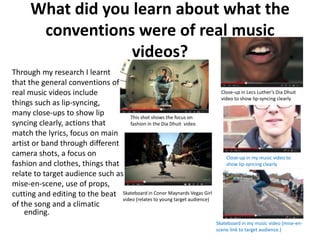
![What did you learn about real music
genre conventions?
The genre of my chosen song, Party on Fifth Ave by Mac Miller is Hip-Hop/ Rap.
Through analysis of real music videos that are of the same genre I picked out a
number of conventions that they use.
MISE-EN-SCENE LIGHTING
(This refers to EDITING - Bright lighting
SHOTS the arrangement of - Jump cuts (Used to create a
- Close Ups MOVEMENT performers and props in a (They are particular
- Extreme close ups - Tilts scene for predominant mood, usually a
(These are used to show - Tracking a production of a media as they allow a fun, happy and
lip-syncing clearly) - Pans text) sudden cheery
- Medium Shots - Cranes - Alcohol change from mood)
(These shots are used to (These are used - Cigarettes/ Smoke one scene to - Dull lighting
emphasise emotions to follow and - Fashionable clothing another which (Usually used when
about the lyrics to make trace the artist [hats, trainers, latest
is song is not as up-
or fashion trends]
them more easily important in beat to create a
band and also - Main artist surrounded by
understandable and Hip-Hop/Rap sad, gloomy
many people
effective for the to put emphasis music videos in atmosphere. It is
- A fun/happy/rebellious
audience) on certain order also used
and cool atmosphere
- Long shots things to highlight sometimes to show
(These are used to relate to
(These are used to such as fashion the target audience and that the drug use, like a
emphasise extravagant or or to show also usually have a extravagant life smoke
very 'street' locations in popularity or relation with the lyrics or is being effect for example
the music videos) locations) the concept of the song) lived) can make a scene](https://image.slidesharecdn.com/evaluationquestion12nd-130421103329-phpapp02/85/Evaluation-Question-1-4-320.jpg)