
More Related Content
What's hot
Viewers also liked
Viewers also liked (19)
Similar to Evaluation -beth wright
Similar to Evaluation -beth wright (20)
Recently uploaded
Recently uploaded (20)
Evaluation -beth wright
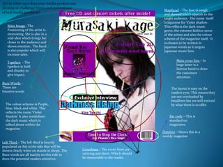
- 1. Q1) In what ways does your media product use, develop or challenge forms and conventionsof real media products? Masthead – The font is rough and skewed which appeals to the target audience. The name itself is Japanese for Violet shadow. This reflects the dark music genre, the extreme fashion sense of the artists and also the colour scheme of the magazine itself. It is chosen to be written in Japanese words as it targets Japanese music fans. Main Image –The Positioning of the artist is interesting. She is also in a mid-shot which brings her closer to the audience and shows emotion.. The band is also popular which will increase sales. Main cover line – In large letter is a famous band to draw the customers attention. Typeface - The typeface is bold and chunky to give impact. Buzz Words – These are Emotive words The layout is easy on the readers eyes. This means they are not overloaded by headlines but are still enticed by what there is to offer. The colour scheme is Purple, blue, black and white. This reflects the name ‘Violet Shadow’ It also symbolises the dark music which is talked about within the magazine. Bar code – This is standard on magazines. Dateline – Shows this is a weekly magazine Left Third – The left third is heavily populated as this is the side that will be shown clearly when on stands in shops. The Buzz words are all mainly on this side to draw the potential readers attention. Coverlines – The cover-lines are enticing and short. Which should be memorable to the reader.
- 2. Q1) In what ways does your media product use, develop or challenge forms and conventionsof real media products? Paragraphs: The writing is separated into paragraphs to make it easy to find the information needed Guttenberg: The Title is in the top left corner along with a small image. The eye is immediately drawn to this corner first. Headings: each paragraph is labelled with a heading to make it easy to find each article and also to space out each section easier. Emphasis: A box is drawn around the most important cover line on the page to give emphasis to it. Type face – The type face is bold for the titles and all is in a simple, easy to read house style. Colour scheme: This is the house style colour scheme picked by the audience via the questionnaire Images: there are many small images on the page which was preference by the target audience.
- 3. Q1) In what ways does your media product use, develop or challenge forms and conventionsof real media products? Headline: In large letters is an unusual title, that has connotation of darkness and so connects to the bands name ‘darkness Rising’ Introduction: introduces who they are interviewing and also promotes the band’s album. Main Image: Is strong and shows eye contact which allows the reader the interpret emotion from the image Images: As specified on the questionnaire. People wanted many small images. These are in a variety of shots. (close-ups, medium shots, and long shots It also varies in colours and lighting. Typeface - In the main body, the writing is clear and easy to read. Whereas in the title it is fancy and more angelic, which matches the headline Information: In the top paragraph, the reader is given the past history of the band and their success. This is for people who may not have heard of them. Colour scheme: Is in House style of the magazine. It uses the colours Black, white, and purple. As well as red (which is a main colour used on the front cover. Paragraphs: As stated in the questionnaire results, the audience preferred shorter paragraphs in a ‘Q & A’ style. This has been achieved on the Quotes: These quotes are interesting and draw the reader in to read the article. They are highlighted using white boxes and a bright purple font colour.
- 4. Q2) How does your media product represent particular social groups? The target audience is directed at fans of J-rock and visual kei music. The colour scheme was chosen using the statistics taken from the target audience., However before this was done, the colours of red, blue, purple, black and white were chosen primarily because they are bold and dramatic and suit this darker , rock genre of music. This ‘alternative’ Style of music represented stars visually with outrageous outfits, hair styles and make-up . An example of this is that Kira Tenshi is shown wearing a red and black tutu with a black corset, which represents her individualism. The fact is also has a pocky stick (a Japanese sweet) hanging out of her mouth shows her playful childish attitude and flirty nature. It also represents vis-kei fans as being young/immature. In most images she has direct eye contact and this shows confidence and boldness, this is also shown by their exaggerated poses in photos. The magazine also represents the playful bold nature of this genre of music (and so the nature of the fans themselves) with bold unusual fonted text. It is also made clear that the fans of j-rock music are expected to also be fans of Japanese culture itself by using Japanese language in certain areas of the magazine.
- 5. Q3) What kind of media institution might distribute your media product and why? The company I have picked most likely to distribute my magazine is Uncooked Media. This is due to the fact that their aren't any well-known J-rock/visual-kei magazines in the UK that are made in the UK. However there is an amine/Japanese film and music magazine made called NEO (uncooked media) which is extremely popular. This company are most likely to distribute Murasaki Kage as they already have experience in Japanese magazines and know how to advertise this type to the general public. Because there are no companies in the Uk that create J-rock magazines, I focused on a rock magazine that had the same house style I was going to focus on. This magazine was kerrang. However I would not chose Bauer media group as my first choice to distribute my magazine as they have no personal experience in the Japanese music market. Whereas, although only to a small degree, Uncooked media does.
- 6. Q4) Who would be the audience for your media product? I sent a questionnaire to known fans of Japanese music and asked them to fill it in, from this audience research I deduced that my target audience would be: Fans of visual-kei, j-rock, and anime music Both males and females Mainly between the ages of 16-17 I then focused on their preferences to be able to create a magazine they would enjoy. They specified they would prefer: A monthly magazine This font The colour scheme black with purple, blue and white Short paragraph and lots of images Interviews not reviews Darker appearances for their artists.
- 7. Q5) How did you attract/address your audience? To create a magazine that successfully attracts my audience by representing the bands/artists in a glamorous and intriguing way. It must also look professional and each element must fit comfortable on the page without looking as though it has been placed there to fill space. The front cover main image must have depth and use an interesting pose to attract the reader. The headlines themselves must be clear and concise, making it easy for the reader audience to see from a distance. The colour scheme is dark which gives connotations of tough, heavy rock music. It also has connotations of ‘coolness’ and popularity which symbolises what readers aspirations are. The colour blue specifically symbolises a cool and relaxed attitude whereas the red contrasts with this stands out and gives impact to the headlines in the magazine
- 8. Q6) What have you learnt about technologies from the process of constructing this product? I learnt how to crop pictures to allow the crucial facial features of the person to land on the line, this gives the picture a comfortable look. The use of Photoshop to edit pictures using filters to create focus on the person. Example: The girls eye line lands along the top horizontal line I learnt to set up a blog and manage it so the work (posts) look neat and are organised. This also allowed me to learn time management skills as I needed to hit certain deadlines for the coursework. I learnt how to draw the attention of an audience using the Guttenberg principal. And also how to maximise the use of the left third as this is the side most used throughout magazines.
- 9. Q7) Looking back at your preliminary task, what do you feel you have learnt in the progression from it to the full product? From my ancillary to my finished project, I have learnt how to create a professional looking project by taking intriguing eye-catching images that portray the appropriate emotions and attitudes of the stereotypes. I have also learnt how to place each element so it harmonises with the other elements on the page. By experimenting with Photoshop I have created a neat project. The ancillary project was a practise run of creating magazines and so needed definition and more striking elements on the cover. Because it was not directly aimed at a specific audience that was researched beforehand it was harder to determined specific elements that would be needed. If I was to create my to create this project again I would spend longer on the smaller details and designs to create more interesting backgrounds. I would also take even more photos than I originally took to give myself a larger variety to choose from.