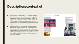
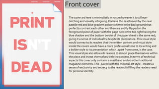
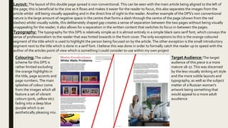
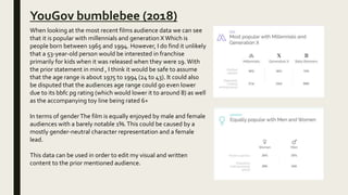
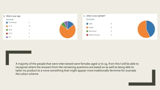
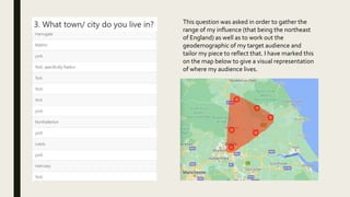
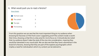
RESEARCH
Ben Dix
EXISTING PRODUCTS:
FORGE ISSUE 16; PERSPECTIVE
Description/ context of
■ FORGE is a quarterly art magazine based out of NewYork
City. Each issue has a compilation of photographs,
illustrations and words centred around a singular theme,
mainly relating to personal issues and or existential
emotions i.e.. Trust, fate, paranoia etc these are then
visualised on the inside cover by artist KendraYee
Gatefold.The aim of this fanzine is to give exposure to
young artists and celebrate the work of artists making an
impact on their respective fields via direct interviews and
displays of their art-work. Since relocating to NewYork
City, FORGE also has a strong focus on the Brooklyn DIY
music and art community. In edition to publishing the
magazine every three months, FORGE also publishes
individual zines by several emerging cartoonists,
photographers, and writers. FORGE is entirely run by
Matthew James-Wilson, who is a student at Parsons
School of Design.
■ The cover here is a piece of art from an artist featured later in the
zine (Haley Dawn Muir) as the art on the cover is stylistically
different not much can be said about the zines aesthetic as it is
not constant however, having the subject of the piece have
abstract proportions, inconsistent patterns and scratchy and
fuzzy colour style (as well as a predominantly primary colour
scheme) conveys the sense of individuality and an ”indie”
aesthetic. Doing this would allow the audience to relate to this as
the individuality applies to the media theory of the explorer
psycho graphic as they seek individualism and value the
difference between more mainstream brands. I would like to tap
into this audience for my project and would do so by having an
effect of the cover art being painted to an effect . Another more
unconventional feature that makes it feel ‘indie’ is the lack of any
traditional magazine cover features, i.e. no cover lines, strap
lines or headlines. In doing this the creators of the zine give a
sense of exclusivity in the sense that only the reader knows
what's happening inside which directly relates to the uses and
gratifications theories need for personal identity in the sense
that it allows the reader to be apart of an exclusive group.The
last thing I see of note within the front cover is the lack of a non-
conventional masthead; non-conventional in the sense that its
within a button , off to upper left third and is only about a size 35
bubble font.This gives it a very light one and heavily plays into
the indie aesthetic previously mentioned.
Front cover
Double page spread
Layout- The Lay out of the double page spread is clearly ordered in a clear uniform manor.
This can be seen in the minimal visual content (one text box, headline and image) being placed in the centre of their
pages. I see this as beneficial to the page as it doesn’t take focus away from the purpose of the page (which is to
interview the artist). Having the image take up an entire page signifies to the reader that the person pictured is
important and gives them a good look at who the article is based around.
Typography- Forge is a fanzine based around artists so having the headline being a shaky hand drawn font fits the
natural and human motif of the fanzine, which makes it feel more personal which I will consider for use within my
fanzine; this is then matched by the sans serif font used through out implying modernity and formality.The use of bold
text as a way of segmenting the question and answer without having the Q:… A:… format; this use of bold will be
something to consider for my fmp
Colouring-The colour
scheme features a very
,limited colour palette
with white blue and
black being the main
contributors;The lack of
an extravagant colour
scheme could be to not
distract the reader from
the article. Body and the
use of a grid pattern
reflects that
Target Audience: The target
audience for this piece would
be 15-20 year old's (backed up
by the simplistic design
philosophy ;how the blue
squares on a white
background seem like math's
exercise books and the
headlines content and styling
mentioned earlier)
PRINT ISN'T DEAD™
ELEMENT 001
Description/context of
■ Print isn’t dead is a fanzine that is a collection of other
zines and interviews with their creators. It was published
by the people of print company (founded in 2008 at the
Brighton University) in August 2014 with the intent of
showcasing outstanding illustration and design work
demonstrating and pushing the boundaries of print in all
forms.
■ In terms of content; Print isn’t dead contains original
photography and artwork from the creators featured
within the zine.The written content mainly consists of
interviews and articles with/based on individual creatives
and (if applicable) the companies they created or work
with, i.e page 34s’ article on Masha Kovalevskaya from
white walls problems
Front cover
The cover art here is minimalistic in nature however it is still eye-
catching and visually intriguing. I believe this is achieved by the near
pastille red and blue gradient colour scheme in the background that
perfectly contrast each other and then are subtly flipped on the
foreground piece of paper with the page turn in the top right having the
blue shadow and the bottom border of the paper sheet is the same red;
giving it a sense of individuality despite its plain nature.This visual style
would convey to its readers that the written content and visual style
inside the covers would have a more professional tone to its writing and
a bolder style to its presentation which ,apart from some, is the case.
This visual style also allows its readers to almost place themselves within
the piece and invest themselves with the content. In terms of technical
aspects this cover only contains a masthead and no other traditional
magazine elements.This -paired with the minimal art style- creates a
sense of exclusivity and secrecy to the reader; fulfilling the readers need
for personal identity
Layout: The layout of this double page spread is non-conventional. This can be seen with the main article being aligned to the left of
the page; this is beneficial to the zine as it flows and makes it easier for the reader to focus, this also separates the images from the
article whilst still being visually appealing and in the direct line of sight to the reader. Another example of the DPS’s non conventional
nature is the large amount of negative space in the centre that forms a slash through the centre of the page (shown from the red
slashes) whilst visually subtle, this deliberately shaped gap creates a sense of separation between the two pages without being visually
unappealing for the reader; it also allows for a separation in the written content that switches its focus in-between the pages.
Typography: The typography for this DPS is relatively simple as it is almost entirely in a simple black sans serif font, which conveys the
sense of professionalism to the reader that was hinted towards in the front cover.The only exceptions to this is the orange coloured
segment of the title which is used to highlight the person being focused on by the article. The other exception is the small introductory
segment next to the title which is done in a serif font. I believe this was done in order to formally catch the reader up to speed with the
author of the articles point of view which is something I could consider to use within my own project
Colouring:The colour
scheme for this DPS is
rather limited excluding
the orange highlights in
the title, page accents and
page numbers. The main
splashes of colour come
from the images which all
feature a set of vibrant
colours (pink, yellow etc)
fading into a deep blue
/purple which is an
aesthetically pleasing mix.
Target Audience:The target
audience of this piece is a more
mature 18-27.This was discerned
by the less visually striking art style
and the more subtle layouts and
typography; as well as the subject
matter of a Russian woman's
artwork being something that
would appeal to a more adult
auudience
TRANSFORMERS
THEATRICAL POSTERS
The transformers the movie(1986),Transformers (2007), Bumblebee(2018)
TheTransformers the movie (1986): This movie poster follows very closely to
established conventions as well as most modern techniques which is interesting due to it
being released 35 years ago.The most obvious technique used here is the triangle
composition (shown with the red triangle) which entails that everything within the
triangle is important to the movie as well as its ‘height’ and centeredness with the main
focus centering on the main character with the main antagonist taking the highest point
within the triangle. Another thing to note with the composition is the use of rule of thirds
(shown in the white lines), as standard with most modern movie posters the title and the
billing block being positioned on the lower thirds, the middle thirds showing the
protagonists and the upper thirds showing the antagonists and tagline (however the
tagline is interchangeable between the upper and lower thirds). Something of note is the
use of iconography significant to the series, that being the autoboot symbol in the title
this is mainly significant to help audiences quickly identify with the product. In terms of
colour theory there is a large use of blue and orange , another convention that has
become more popular in modern movie posters.This usage is done to make the visuals
pop and feel almost ‘alive’ in nature.These colours ,orange and blue, are complementary
within colour theory however commonly are associated with opposing thematic
concepts like fire and ice, land and sea etc.
The poses taken by the protagonists is also
conventional of sci-fi posters of the time, the action
of firing a weapon directly upwards can be seen in
the posters for Tron and star wars.This
compositional format and colour usage is something
that I can use for image assets in my FMP.
Transformers (2007):The theatrical poster for this film is, in my opinion is kind of
just a nothing poster; in the sense that nothing is conveyed or visually striking in
anyway.The composition methods from the prior poster are used again however
they only highlight the flaws of the poster. One of the examples of this flaw is the
main human leads being at the point of the triangle and yet contradicting that by
being the smallest subject in view showing a lack of any importance. Within the
centre of the triangular grouping is optimus prime which makes sense, however he is
the only subject fully within the triangle which is just bad composition.The rule of
thirds is also a composition method that isn’t used successfully in this poster. An
example of this is that, for the most part, the central thirds have an insanely large
amount of negative space which is just wasted and creates a very empty feel to the
poster. Another fault of the use of the rule of thirds is the placement of the assets for
example: none of the subjects are placed solely in a third, always over the edge of
two; another example is how the main antagonist is pushed off to the side and takes
up less than 1/3 as well as being on level with the protagonists which –in terms of
narrative created in the poster- does not sell him being the main antagonist which
again just points to the flaws of the poster. It should also be noted that there is no
recognizable iconography in the poster which is another of the poster's failings as its
all-new designs which are unrecognizable from their earlier counter parts.The
colouring follows the teal and orange aesthetic mentioned prior which was
popularized with action movies around the time of this films release (mid 2000s).The
use of this colour scheme does work within this piece as it sets a contrast between
the earth setting in the lower third and the orbital view in the upper third. By looking
at this poster I can firmly see what I need to avoid when composing any shots or
creating any digital work for my FMP which is to make sure that there is recognizable
iconography and well thought out composition.
Bumblebee (2018):This poster is the most recent movie poster from the
franchise and is vastly superior to its prior versions in terms of colour,
composition and narrative. In terms of composition the triangular composition
is much more effective and clearer with the focus being pulled down from the
top with general relevance related to the characters position.The use of the
rule of thirds is also much better utilized here than in the prior poster.An
example of this is how the main protagonist solely takes up the upper thirds of
the poster connoting their importance to the narrative. Another example is the
usage of the lower thirds; normally they would be used solely for the billing
block, title or tagline, but here it is also used to quickly identify the setting of
the film with the iconographic golden gate bridge in the lower right third.
Another signifier of the narrative is in the lower left third sowing a
companionship between the female lead and bumblebee.The use of series
iconography is also used effectively with a sizeable autoboot symbol in the
upper right third as well as a large neon styled symbol placed behind the
subjects. Using these iconographic symbols allows the audience to quickly and
effectively register the topic of the poster which then allows them to take in
the other visual; this is useful as you wouldn’t know where someone would be
viewing the poster or for how long, i.e. bus shelter, billboards etc.The use of a
neon autoboot symbol is aesthetically pleasing and would be something ill
use within my FMP. The colour grading in this poster does still follow the
orange and blue colour scheme, however it is applied much more effectively
and subtly.The orange comes from a sun rise which then contextualizes the
deep blues in the background rather than a city that’s been colour shifted
orange.
SECONDARY
AUDIENCE RESEARCH
Transformers franchise
YouGov bumblebee (2018)
When looking at the most recent films audience data we can see
that it is popular with millennials and generation XWhich is
people born between 1965 and 1994. However, I do find it unlikely
that a 53-year-old person would be interested in franchise
primarily for kids when it was released when they were 19. With
the prior statement in mind , I think it would be safe to assume
that the age range is about 1975 to 1994 (24 to 43). It could also
be disputed that the audiences age range could go even lower
due to its bbfc pg rating (which would lower it to around 8) as well
as the accompanying toy line being rated 6+
In terms of genderThe film is equally enjoyed by male and female
audiences with a barely notable 1%.This could be caused by a
mostly gender-neutral character representation and a female
lead.
This data can be used in order to edit my visual and written
content to the prior mentioned audience.
AUDIENCE RESEARCH:
SURVEY
A majority of the people that were interviewed were females aged 17 to 19, from this I will be able to
recognize where the answers from the remaining questions are based on as well as being able to
tailor my product to a more something that might appear more traditionally feminine for example
the colour scheme
This question was asked in order to gather the
range of my influence (that being the northeast
of England) as well as to work out the
geodemographic of my target audience and
tailor my piece to reflect that. I have marked this
on the map below to give a visual representation
of where my audience lives.
From this question we can see that the most important thing to my audience when
browsing for fanzines is if the front cover is appealing and if the content inside is worth
their time, showing us that this is a key area for me to focus on. It should also be noted
that my audience doesn’t take the style of the zine into consideration, meaning they
would be interested in any visual style.We can also see that they have a disinterest in the
brand of a fanzine, showing that they are part of the explorer psychographic which
implies a need for individualism which my content can be tailored to.
This question is a little more self explanatory and just affirms that the social media side
of the product should use Instagram as a basis, which I believed would already be more
effective for promoting a print-based service.As for the two that voted for twitter it
could be assumed that these were choices based more on personal preference, so they
should most likely be viewed as anomalous results.
This question was used to gauge my audience's interests in the premise of the fanzine, with the
majority vote appearing largely positive (64%) affirming that the idea would resonate well with
my audience. With the information that people find learning about this topic interesting; I will be
able to appeal to the uses and gratifications theory’s need for information
With this question I know that for my written content my audience would prefer a good mix of
factual and personal contentThis can be done using a mix of literary techniques including
personal anecdotes; direct address and first-person mode of address appealing to the
personal side; and to appeal to the factual side more literal facts and statistics could be
mentioned as well as having the opposite writing style of the personal themed written
content.
These questions were tailored to
determine the colouring of the
fanzine that would best appeal to
my audience.The first one dictates
that I should have the colours be
lighter, which would corelate to a
traditional feminine colour scheme
which should appeal to my audience
which is mainly female.The second
question was made to see directly
which colour scheme the audience
would be most interested in; of
which red, grey and purple were the
top pick.This will be an easy thing to
tailer the assets and back grounds of
my fanzine to.
This question was made to gauge what
my audience would think of my desired
visual style. Of which 78% gave the
aesthetic a positive response.This could
be achieved in my project by using visual
filters/ affects on certain images, if not all
of the visual assets with slightly differing
styles to create a sense of individuality
between the different pages.
BIBLIOGRAPHY
■ BBFC (2018) Bumblebee. Available at: https://www.bbfc.co.uk/release/bumblebee-
film-qxnzzxq6vlgtotk4mje2 (Date viewed: 16 April 2021)
■ Ben Dix (2021) FMP Survey. Available at:
https://forms.office.com/Pages/ResponsePage.aspx?id=tuqM6noqsUiQN1uMegK40Uxh1EZvB4VKisVJD
nTbuENUM1FEVzQ4Uk1QSlNCVUZUUlFZT0VQREJHSi4u (Date viewed: 24 January 2021)
■ Issuu (2014) Print Isn't Dead.Available at:
https://issuu.com/peopleofprint/docs/printisntdeadissuu001coverpages(Date viewed: 13 April 2021)
■ Issuu (2017) FORGE. Issue 16: Perspective.Available at: https://issuu.com/forgeartmag/docs/issuu16
(Date viewed: 25 January 2021)
■ Joblo (2021) movie posters. Available at: https://www.joblo.com/movie-posters/ (Date viewed 15 April
2021)
■ Tv tropes (2021) Orange/Blue Contrast. Available at:
https://tvtropes.org/pmwiki/pmwiki.php/Main/OrangeBlueContrast (Date viewed 15 April 2021)
■ YouGov (2020) Bumblebee.Available at: https://yougov.co.uk/topics/media/explore/movie/Bumblebee
(Date viewed 16 April 2021)

Research draft 2

  • 1.
  • 2.
  • 3.
    Description/ context of ■FORGE is a quarterly art magazine based out of NewYork City. Each issue has a compilation of photographs, illustrations and words centred around a singular theme, mainly relating to personal issues and or existential emotions i.e.. Trust, fate, paranoia etc these are then visualised on the inside cover by artist KendraYee Gatefold.The aim of this fanzine is to give exposure to young artists and celebrate the work of artists making an impact on their respective fields via direct interviews and displays of their art-work. Since relocating to NewYork City, FORGE also has a strong focus on the Brooklyn DIY music and art community. In edition to publishing the magazine every three months, FORGE also publishes individual zines by several emerging cartoonists, photographers, and writers. FORGE is entirely run by Matthew James-Wilson, who is a student at Parsons School of Design.
  • 4.
    ■ The coverhere is a piece of art from an artist featured later in the zine (Haley Dawn Muir) as the art on the cover is stylistically different not much can be said about the zines aesthetic as it is not constant however, having the subject of the piece have abstract proportions, inconsistent patterns and scratchy and fuzzy colour style (as well as a predominantly primary colour scheme) conveys the sense of individuality and an ”indie” aesthetic. Doing this would allow the audience to relate to this as the individuality applies to the media theory of the explorer psycho graphic as they seek individualism and value the difference between more mainstream brands. I would like to tap into this audience for my project and would do so by having an effect of the cover art being painted to an effect . Another more unconventional feature that makes it feel ‘indie’ is the lack of any traditional magazine cover features, i.e. no cover lines, strap lines or headlines. In doing this the creators of the zine give a sense of exclusivity in the sense that only the reader knows what's happening inside which directly relates to the uses and gratifications theories need for personal identity in the sense that it allows the reader to be apart of an exclusive group.The last thing I see of note within the front cover is the lack of a non- conventional masthead; non-conventional in the sense that its within a button , off to upper left third and is only about a size 35 bubble font.This gives it a very light one and heavily plays into the indie aesthetic previously mentioned. Front cover
  • 5.
    Double page spread Layout-The Lay out of the double page spread is clearly ordered in a clear uniform manor. This can be seen in the minimal visual content (one text box, headline and image) being placed in the centre of their pages. I see this as beneficial to the page as it doesn’t take focus away from the purpose of the page (which is to interview the artist). Having the image take up an entire page signifies to the reader that the person pictured is important and gives them a good look at who the article is based around. Typography- Forge is a fanzine based around artists so having the headline being a shaky hand drawn font fits the natural and human motif of the fanzine, which makes it feel more personal which I will consider for use within my fanzine; this is then matched by the sans serif font used through out implying modernity and formality.The use of bold text as a way of segmenting the question and answer without having the Q:… A:… format; this use of bold will be something to consider for my fmp Colouring-The colour scheme features a very ,limited colour palette with white blue and black being the main contributors;The lack of an extravagant colour scheme could be to not distract the reader from the article. Body and the use of a grid pattern reflects that Target Audience: The target audience for this piece would be 15-20 year old's (backed up by the simplistic design philosophy ;how the blue squares on a white background seem like math's exercise books and the headlines content and styling mentioned earlier)
  • 6.
  • 7.
    Description/context of ■ Printisn’t dead is a fanzine that is a collection of other zines and interviews with their creators. It was published by the people of print company (founded in 2008 at the Brighton University) in August 2014 with the intent of showcasing outstanding illustration and design work demonstrating and pushing the boundaries of print in all forms. ■ In terms of content; Print isn’t dead contains original photography and artwork from the creators featured within the zine.The written content mainly consists of interviews and articles with/based on individual creatives and (if applicable) the companies they created or work with, i.e page 34s’ article on Masha Kovalevskaya from white walls problems
  • 8.
    Front cover The coverart here is minimalistic in nature however it is still eye- catching and visually intriguing. I believe this is achieved by the near pastille red and blue gradient colour scheme in the background that perfectly contrast each other and then are subtly flipped on the foreground piece of paper with the page turn in the top right having the blue shadow and the bottom border of the paper sheet is the same red; giving it a sense of individuality despite its plain nature.This visual style would convey to its readers that the written content and visual style inside the covers would have a more professional tone to its writing and a bolder style to its presentation which ,apart from some, is the case. This visual style also allows its readers to almost place themselves within the piece and invest themselves with the content. In terms of technical aspects this cover only contains a masthead and no other traditional magazine elements.This -paired with the minimal art style- creates a sense of exclusivity and secrecy to the reader; fulfilling the readers need for personal identity
  • 9.
    Layout: The layoutof this double page spread is non-conventional. This can be seen with the main article being aligned to the left of the page; this is beneficial to the zine as it flows and makes it easier for the reader to focus, this also separates the images from the article whilst still being visually appealing and in the direct line of sight to the reader. Another example of the DPS’s non conventional nature is the large amount of negative space in the centre that forms a slash through the centre of the page (shown from the red slashes) whilst visually subtle, this deliberately shaped gap creates a sense of separation between the two pages without being visually unappealing for the reader; it also allows for a separation in the written content that switches its focus in-between the pages. Typography: The typography for this DPS is relatively simple as it is almost entirely in a simple black sans serif font, which conveys the sense of professionalism to the reader that was hinted towards in the front cover.The only exceptions to this is the orange coloured segment of the title which is used to highlight the person being focused on by the article. The other exception is the small introductory segment next to the title which is done in a serif font. I believe this was done in order to formally catch the reader up to speed with the author of the articles point of view which is something I could consider to use within my own project Colouring:The colour scheme for this DPS is rather limited excluding the orange highlights in the title, page accents and page numbers. The main splashes of colour come from the images which all feature a set of vibrant colours (pink, yellow etc) fading into a deep blue /purple which is an aesthetically pleasing mix. Target Audience:The target audience of this piece is a more mature 18-27.This was discerned by the less visually striking art style and the more subtle layouts and typography; as well as the subject matter of a Russian woman's artwork being something that would appeal to a more adult auudience
  • 10.
    TRANSFORMERS THEATRICAL POSTERS The transformersthe movie(1986),Transformers (2007), Bumblebee(2018)
  • 11.
    TheTransformers the movie(1986): This movie poster follows very closely to established conventions as well as most modern techniques which is interesting due to it being released 35 years ago.The most obvious technique used here is the triangle composition (shown with the red triangle) which entails that everything within the triangle is important to the movie as well as its ‘height’ and centeredness with the main focus centering on the main character with the main antagonist taking the highest point within the triangle. Another thing to note with the composition is the use of rule of thirds (shown in the white lines), as standard with most modern movie posters the title and the billing block being positioned on the lower thirds, the middle thirds showing the protagonists and the upper thirds showing the antagonists and tagline (however the tagline is interchangeable between the upper and lower thirds). Something of note is the use of iconography significant to the series, that being the autoboot symbol in the title this is mainly significant to help audiences quickly identify with the product. In terms of colour theory there is a large use of blue and orange , another convention that has become more popular in modern movie posters.This usage is done to make the visuals pop and feel almost ‘alive’ in nature.These colours ,orange and blue, are complementary within colour theory however commonly are associated with opposing thematic concepts like fire and ice, land and sea etc. The poses taken by the protagonists is also conventional of sci-fi posters of the time, the action of firing a weapon directly upwards can be seen in the posters for Tron and star wars.This compositional format and colour usage is something that I can use for image assets in my FMP.
  • 12.
    Transformers (2007):The theatricalposter for this film is, in my opinion is kind of just a nothing poster; in the sense that nothing is conveyed or visually striking in anyway.The composition methods from the prior poster are used again however they only highlight the flaws of the poster. One of the examples of this flaw is the main human leads being at the point of the triangle and yet contradicting that by being the smallest subject in view showing a lack of any importance. Within the centre of the triangular grouping is optimus prime which makes sense, however he is the only subject fully within the triangle which is just bad composition.The rule of thirds is also a composition method that isn’t used successfully in this poster. An example of this is that, for the most part, the central thirds have an insanely large amount of negative space which is just wasted and creates a very empty feel to the poster. Another fault of the use of the rule of thirds is the placement of the assets for example: none of the subjects are placed solely in a third, always over the edge of two; another example is how the main antagonist is pushed off to the side and takes up less than 1/3 as well as being on level with the protagonists which –in terms of narrative created in the poster- does not sell him being the main antagonist which again just points to the flaws of the poster. It should also be noted that there is no recognizable iconography in the poster which is another of the poster's failings as its all-new designs which are unrecognizable from their earlier counter parts.The colouring follows the teal and orange aesthetic mentioned prior which was popularized with action movies around the time of this films release (mid 2000s).The use of this colour scheme does work within this piece as it sets a contrast between the earth setting in the lower third and the orbital view in the upper third. By looking at this poster I can firmly see what I need to avoid when composing any shots or creating any digital work for my FMP which is to make sure that there is recognizable iconography and well thought out composition.
  • 13.
    Bumblebee (2018):This posteris the most recent movie poster from the franchise and is vastly superior to its prior versions in terms of colour, composition and narrative. In terms of composition the triangular composition is much more effective and clearer with the focus being pulled down from the top with general relevance related to the characters position.The use of the rule of thirds is also much better utilized here than in the prior poster.An example of this is how the main protagonist solely takes up the upper thirds of the poster connoting their importance to the narrative. Another example is the usage of the lower thirds; normally they would be used solely for the billing block, title or tagline, but here it is also used to quickly identify the setting of the film with the iconographic golden gate bridge in the lower right third. Another signifier of the narrative is in the lower left third sowing a companionship between the female lead and bumblebee.The use of series iconography is also used effectively with a sizeable autoboot symbol in the upper right third as well as a large neon styled symbol placed behind the subjects. Using these iconographic symbols allows the audience to quickly and effectively register the topic of the poster which then allows them to take in the other visual; this is useful as you wouldn’t know where someone would be viewing the poster or for how long, i.e. bus shelter, billboards etc.The use of a neon autoboot symbol is aesthetically pleasing and would be something ill use within my FMP. The colour grading in this poster does still follow the orange and blue colour scheme, however it is applied much more effectively and subtly.The orange comes from a sun rise which then contextualizes the deep blues in the background rather than a city that’s been colour shifted orange.
  • 14.
  • 15.
    YouGov bumblebee (2018) Whenlooking at the most recent films audience data we can see that it is popular with millennials and generation XWhich is people born between 1965 and 1994. However, I do find it unlikely that a 53-year-old person would be interested in franchise primarily for kids when it was released when they were 19. With the prior statement in mind , I think it would be safe to assume that the age range is about 1975 to 1994 (24 to 43). It could also be disputed that the audiences age range could go even lower due to its bbfc pg rating (which would lower it to around 8) as well as the accompanying toy line being rated 6+ In terms of genderThe film is equally enjoyed by male and female audiences with a barely notable 1%.This could be caused by a mostly gender-neutral character representation and a female lead. This data can be used in order to edit my visual and written content to the prior mentioned audience.
  • 16.
  • 17.
    A majority ofthe people that were interviewed were females aged 17 to 19, from this I will be able to recognize where the answers from the remaining questions are based on as well as being able to tailor my product to a more something that might appear more traditionally feminine for example the colour scheme
  • 18.
    This question wasasked in order to gather the range of my influence (that being the northeast of England) as well as to work out the geodemographic of my target audience and tailor my piece to reflect that. I have marked this on the map below to give a visual representation of where my audience lives.
  • 19.
    From this questionwe can see that the most important thing to my audience when browsing for fanzines is if the front cover is appealing and if the content inside is worth their time, showing us that this is a key area for me to focus on. It should also be noted that my audience doesn’t take the style of the zine into consideration, meaning they would be interested in any visual style.We can also see that they have a disinterest in the brand of a fanzine, showing that they are part of the explorer psychographic which implies a need for individualism which my content can be tailored to.
  • 20.
    This question isa little more self explanatory and just affirms that the social media side of the product should use Instagram as a basis, which I believed would already be more effective for promoting a print-based service.As for the two that voted for twitter it could be assumed that these were choices based more on personal preference, so they should most likely be viewed as anomalous results.
  • 21.
    This question wasused to gauge my audience's interests in the premise of the fanzine, with the majority vote appearing largely positive (64%) affirming that the idea would resonate well with my audience. With the information that people find learning about this topic interesting; I will be able to appeal to the uses and gratifications theory’s need for information
  • 22.
    With this questionI know that for my written content my audience would prefer a good mix of factual and personal contentThis can be done using a mix of literary techniques including personal anecdotes; direct address and first-person mode of address appealing to the personal side; and to appeal to the factual side more literal facts and statistics could be mentioned as well as having the opposite writing style of the personal themed written content.
  • 23.
    These questions weretailored to determine the colouring of the fanzine that would best appeal to my audience.The first one dictates that I should have the colours be lighter, which would corelate to a traditional feminine colour scheme which should appeal to my audience which is mainly female.The second question was made to see directly which colour scheme the audience would be most interested in; of which red, grey and purple were the top pick.This will be an easy thing to tailer the assets and back grounds of my fanzine to.
  • 24.
    This question wasmade to gauge what my audience would think of my desired visual style. Of which 78% gave the aesthetic a positive response.This could be achieved in my project by using visual filters/ affects on certain images, if not all of the visual assets with slightly differing styles to create a sense of individuality between the different pages.
  • 25.
  • 26.
    ■ BBFC (2018)Bumblebee. Available at: https://www.bbfc.co.uk/release/bumblebee- film-qxnzzxq6vlgtotk4mje2 (Date viewed: 16 April 2021) ■ Ben Dix (2021) FMP Survey. Available at: https://forms.office.com/Pages/ResponsePage.aspx?id=tuqM6noqsUiQN1uMegK40Uxh1EZvB4VKisVJD nTbuENUM1FEVzQ4Uk1QSlNCVUZUUlFZT0VQREJHSi4u (Date viewed: 24 January 2021) ■ Issuu (2014) Print Isn't Dead.Available at: https://issuu.com/peopleofprint/docs/printisntdeadissuu001coverpages(Date viewed: 13 April 2021) ■ Issuu (2017) FORGE. Issue 16: Perspective.Available at: https://issuu.com/forgeartmag/docs/issuu16 (Date viewed: 25 January 2021) ■ Joblo (2021) movie posters. Available at: https://www.joblo.com/movie-posters/ (Date viewed 15 April 2021) ■ Tv tropes (2021) Orange/Blue Contrast. Available at: https://tvtropes.org/pmwiki/pmwiki.php/Main/OrangeBlueContrast (Date viewed 15 April 2021) ■ YouGov (2020) Bumblebee.Available at: https://yougov.co.uk/topics/media/explore/movie/Bumblebee (Date viewed 16 April 2021)