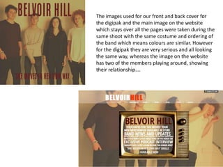
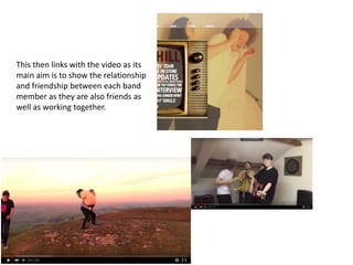
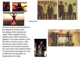
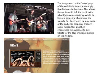
…Synergy…
All our products link together to help
sell them to our audience.
Music Video
Digipak
Website
The images used for our front and back cover for
the digipak and the main image on the website
which stays over all the pages were taken during the
same shoot with the same costume and ordering of
the band which means colours are similar. However
for the digipak they are very serious and all looking
the same way, whereas the image on the website
has two of the members playing around, showing
their relationship….
This then links with the video as its
main aim is to show the relationship
and friendship between each band
member as they are also friends as
well as working together.
The font used on both the title on
the digipak and text on the
homepage of the website are
called ‘white elephant’ (from
‘dafont.com’) which links them
together. The colour which is used
for both is also the same, a dark
red which is also used for some
costumes for the band. However
the main title of the website which
is at the top of each page so is not
as effective and would be an
improvement to make.
Lighting/filter
The image used on the ‘news’ page
of the website is from the same gig
that features in the video. This allows
the audience to link the music with
what their own experience would be
like at a gig as the photo from the
website has been taken by a member
of the audience then sent through
social media. This also then
encourages the audience to buy
tickets for the tour which are on sale
on the website.

Evaluation 2

  • 1.
    …Synergy… All our productslink together to help sell them to our audience. Music Video Digipak Website
  • 2.
    The images usedfor our front and back cover for the digipak and the main image on the website which stays over all the pages were taken during the same shoot with the same costume and ordering of the band which means colours are similar. However for the digipak they are very serious and all looking the same way, whereas the image on the website has two of the members playing around, showing their relationship….
  • 3.
    This then linkswith the video as its main aim is to show the relationship and friendship between each band member as they are also friends as well as working together.
  • 4.
    The font usedon both the title on the digipak and text on the homepage of the website are called ‘white elephant’ (from ‘dafont.com’) which links them together. The colour which is used for both is also the same, a dark red which is also used for some costumes for the band. However the main title of the website which is at the top of each page so is not as effective and would be an improvement to make. Lighting/filter
  • 5.
    The image usedon the ‘news’ page of the website is from the same gig that features in the video. This allows the audience to link the music with what their own experience would be like at a gig as the photo from the website has been taken by a member of the audience then sent through social media. This also then encourages the audience to buy tickets for the tour which are on sale on the website.