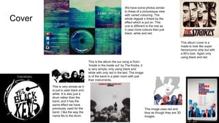
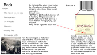
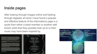
This document discusses and provides examples of different album cover designs for a digipak. It includes summaries of 5 different album covers, noting design elements like the use of color, images of the band, and song listings. It also provides details on what information is typically included on the back cover and inside pages, such as songwriting credits and a quote related to the band or their music.
2. Cover
This image uses red and
blue as though they are 3D
images.
This is the album the our song is from-
‘Inside in the inside out’ by The Kooks, it
is very simple, only using black and
white with only red in the text. The image
is of the band in a plain room with just
their instruments.
This album cover is a
made to look like super
heros/comic strip but with
a 60’s look. Again only
using black and red.
We have some photos similar
to these of a picturesque view
with varied colouring. The
whole digipak s linked by the
effect which is put on. This
one is different to the rest as
it uses more colours than just
black, white and red.
This is very simple as it
is just a uses black and
white. It is also just a
drum rather than the
band, and it has the
same effect we have
previously used for the
band. I like the way the
name fits to the drum.
3. Back
Song list:
She move in her own way
Big ginger afro
TV in the attic
Homesick
Chasing cars
Empty pepsi bottle
Blue
Last request
Rehearsal room
Barcode >
Here the songs are alone the
bottom but still in two columns,
with the band name and album
name at the top. The background
is plain but still matches the front
image as that has beige and
purple filter over the image which
is similar to ours. The font used for
the band name doesn’t match the
name on the front.
Here the main image is of the band in
black and white, however neither the
image nor the colours really match
the rest of the album but it still works.
The songs are listed down the right in
grey, which is difficult to read with
that background. The rights and
other text at the bottom is very small
here, and only just readable.
On the back of the album it must contain
the information on song rights, record
company, artist, release dates, where it
was made…
Ours will have:
‘ 2014&2015 QE Music Entertainment UK
& Rob Terry. All rights reserved. LC
00157. Art director by Beth Connolly &
Adam Trotman. Photography by Anya
Wagstaff’
Along with the logo of the record label.
4. Inside pages
After looking through images online and looking
through digipaks at home i have found a popular
and effective feature of the informations page is a
quote from either a band member or another well
known artist that they possibly look up to or their
music may have been inspired by.