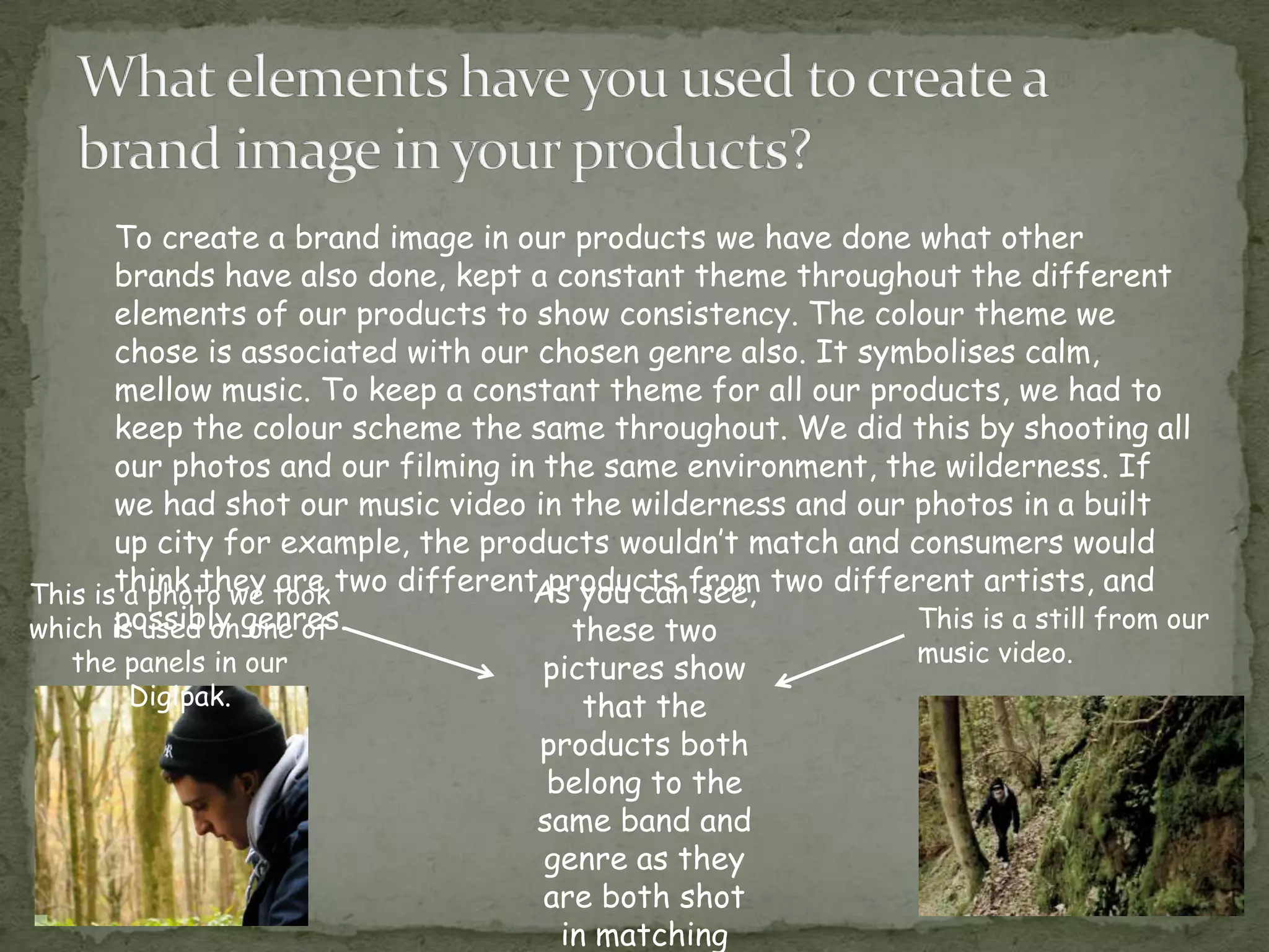
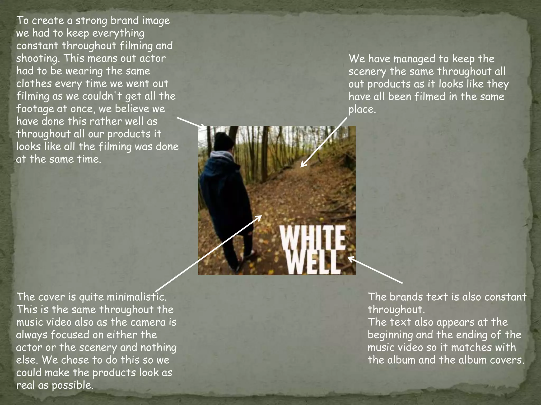
How effective is the combination of your main products and
                       ancillary tasks?
A brand image is the impression in the consumers mind of
a brand's total personality. Brand images are developed over
time, usually through advertising campaigns and a consistent
theme so that they are instantly recognised.


A brand image is important to make your product recognisable
and to make it look established, otherwise products that aren't,
generally don’t get noticed at all and consumers pick brands they
know and can trust. For example, if somebody was looking to buy
a drink of coke, they are most certainly going to pick Coca Cola
rather than a less established brand such as a supermarkets own
brand.
To create a brand image in our products we have done what other
       brands have also done, kept a constant theme throughout the different
       elements of our products to show consistency. The colour theme we
       chose is associated with our chosen genre also. It symbolises calm,
       mellow music. To keep a constant theme for all our products, we had to
       keep the colour scheme the same throughout. We did this by shooting all
       our photos and our filming in the same environment, the wilderness. If
       we had shot our music video in the wilderness and our photos in a built
       up city for example, the products wouldn’t match and consumers would
This isthink they took two different products from two different artists, and
        a photo we are              As you can see,
which is used on genres.
       possibly one of                 these two             This is a still from our
   the panels in our                                           music video.
                                    pictures show
       Digipak.                         that the
                                    products both
                                     belong to the
                                    same band and
                                    genre as they
                                    are both shot
                                      in matching
As you can see here, by keeping the
text in the same font, and by using similar
images and colour schemes we managed
to create two adverts (above) and two
Digipak panels (below) that look very similar.
To create a strong brand image
we had to keep everything
constant throughout filming and
shooting. This means out actor        We have managed to keep the
had to be wearing the same            scenery the same throughout all
clothes every time we went out        out products as it looks like they
filming as we couldn't get all the    have all been filmed in the same
footage at once, we believe we        place.
have done this rather well as
throughout all our products it
looks like all the filming was done
at the same time.


The cover is quite minimalistic.          The brands text is also constant
This is the same throughout the           throughout.
music video also as the camera is         The text also appears at the
always focused on either the              beginning and the ending of the
actor or the scenery and nothing          music video so it matches with
else. We chose to do this so we           the album and the album covers.
could make the products look as
real as possible.
The elements we used to create a brand image work very well.
This is because the panels of the Digipak and the album advert
look similar and look like they belong to the same product. We
used a lot of the scenery from where we shot our video as
backgrounds for our Digipak as this helps keep the constant
theme. The soft colours in the wild setting represent the Indie
genre.
We believe the overall response was a good one and believe that
the video and the other products we produced work well
together, as you can see a clear connection between them both
and they suit each other. Also you can see there is a clear brand
image being shown throughout both products.

Media evaluation – question 2

  • 1.
    How effective isthe combination of your main products and ancillary tasks?
  • 2.
    A brand imageis the impression in the consumers mind of a brand's total personality. Brand images are developed over time, usually through advertising campaigns and a consistent theme so that they are instantly recognised. A brand image is important to make your product recognisable and to make it look established, otherwise products that aren't, generally don’t get noticed at all and consumers pick brands they know and can trust. For example, if somebody was looking to buy a drink of coke, they are most certainly going to pick Coca Cola rather than a less established brand such as a supermarkets own brand.
  • 3.
    To create abrand image in our products we have done what other brands have also done, kept a constant theme throughout the different elements of our products to show consistency. The colour theme we chose is associated with our chosen genre also. It symbolises calm, mellow music. To keep a constant theme for all our products, we had to keep the colour scheme the same throughout. We did this by shooting all our photos and our filming in the same environment, the wilderness. If we had shot our music video in the wilderness and our photos in a built up city for example, the products wouldn’t match and consumers would This isthink they took two different products from two different artists, and a photo we are As you can see, which is used on genres. possibly one of these two This is a still from our the panels in our music video. pictures show Digipak. that the products both belong to the same band and genre as they are both shot in matching
  • 4.
    As you cansee here, by keeping the text in the same font, and by using similar images and colour schemes we managed to create two adverts (above) and two Digipak panels (below) that look very similar.
  • 5.
    To create astrong brand image we had to keep everything constant throughout filming and shooting. This means out actor We have managed to keep the had to be wearing the same scenery the same throughout all clothes every time we went out out products as it looks like they filming as we couldn't get all the have all been filmed in the same footage at once, we believe we place. have done this rather well as throughout all our products it looks like all the filming was done at the same time. The cover is quite minimalistic. The brands text is also constant This is the same throughout the throughout. music video also as the camera is The text also appears at the always focused on either the beginning and the ending of the actor or the scenery and nothing music video so it matches with else. We chose to do this so we the album and the album covers. could make the products look as real as possible.
  • 6.
    The elements weused to create a brand image work very well. This is because the panels of the Digipak and the album advert look similar and look like they belong to the same product. We used a lot of the scenery from where we shot our video as backgrounds for our Digipak as this helps keep the constant theme. The soft colours in the wild setting represent the Indie genre.
  • 7.
    We believe theoverall response was a good one and believe that the video and the other products we produced work well together, as you can see a clear connection between them both and they suit each other. Also you can see there is a clear brand image being shown throughout both products.